I still think Knuth’s Computer Modern is the most beautiful font (at least for academics). It somehow manages to just impress everybody who looks at it.
It’s a nice font for that and a decent alternative for more vanilla serif faces like Times. It looks a bit derivative of Bodoni, IMHO, and has a nice play of subtle flourishes and a good balance of thick and thins; but I realize it’s also designed with plenty of esoteric glyphs and symbols for stuff like scientific notation, etc.
Whooo… that’s sort of hard to address. Certainly everything you mention comes into play, and plenty more.
A good face must work on a lot of levels overall. Also, when designing a face, you really need to shape it toward what kind of usage you intend it for.
The broad strokes I find in really well designed fonts are ones that are well balanced, great color (especially if the designer took the time to create kerning pairs and ligatures), which really makes the job of typesetting easier, and will create a block of text that isn’t too noisy, with letters that when paired, create a natural flow as the eye follows the line of copy.
On a finer grain, the stems of the letters themselves, and how the designer chooses to miter them on corners or what have you, can be very subtle, but add so much character on a subconscious level.
For instance, let’s look at Comic Sans, compared to some of the more popular fonts used in comics today, if you can, compare them side-by-side in two browser tabs:
Boom, all the sudden, doesn’t Comic Sans seem pretty flat and boring? The reason is simple: Comic fonts are script fonts, that is, they’re designed to mimic the hand-writtend word. What strikes me more than anything, is the poor “penmanship” of Comic Sans. Hand lettering, like calligraphy is an art and skill all by itself. Lafayette really feels like it’s based off an pencil artist and letterer of comic books. It has deliberate flare and control, while still capturing the fluid stroke-work of a letterer with pen and ink. It has a pleasing character.
Now look back at Comic Sans. Stilted, with no sense of skill or personality. It’s almost too deliberate and forced. It’s doesn’t seem based off of a talented letterer at all, and more like an ammeter attempt at drawing the alphabit, letter by letter, without any care put into capturing the personality and organic flow that comic artists and letterers have honed over decades.
It doesn’t flow. The “strokework” is synthetic and flat. The characters themselves aren’t well drawn, and lacking personality, flow or expertise. They’re stiff cardboard cutouts, glommed together piecemeal, adding up to create an alphabet that doesn’t succeed in capturing the the genuine look of hand-lettering by a skilled and fluent draftsman whose pen flows from letter to letter creating words themselves, not to fill the slots in an alphabet.
I could go on, but I gotta get some sleep. But, as subjective as anything else is, typeface design is a wonderful and unsung artform. Personally, my tastes are bent toward clean and simple, but with just the right touches to give it some grace or character that is well crafted for its purpose. Never obnoxious or too gimicky (the umpteen trendy fonts that exploded during the 90s), or rarely something dated and boring like Garamond or Times.
Then, there are the classics. Helvetica, for me, is the blue jeans, or little black dress of the modern font world. Here’s one that’s ubiquitous and overused, and yet, it’s just a great font, when used well by good designers. Sure, it has its detractors, but it’s transcended into a classic, dependable and versitile face that works so well, because of its deceptive simplicity.
I’ll add more after I catch a few Zzzz… ![]()
That should read “ameture attempt” above. Damn autocorrect.
Some last parting words before I enter unconsciousness: anyone who uses Arial over Helvetica is dead to me. DEAD!
Now go buy this pack of cards…
So, Comic Sans is actually Charlie Sheen?! It’s all clear to me now…
Maybe he buys his coke from Brush Script.
See, Times New Roman is a solid typeface. It suffers from being ubiquitous, but that’s because it’s a damned good serifed font with excellent readability. IMHO, Minion and Times Roman are a little nicer and more elegant, but that doesn’t detract from TNR being a solid font. It’s exactly the kind of font I would expect to find on both a “Best Font” and “Worst Font” list. Unlike Comic Sans, I don’t think it suffers from any major technical and aesthetic flaws (although some have issue with its bold typefaces.)
Helvetica is another one in the same boat: a modern classic of a typeface, but suffers from overuse and ubiquity. It’s another font I’d expect to see both on “Best Font” and “Worst Font” lists. The only complaint you can really level against it is that its boring because it’s so common. That’s about it. I wouldn’t take anyone seriously who tries to argue that it’s a poorly designed font that suffers at a technical level (as opposed to Comic Sans.)
And anyone with even a passing interest in typefaces or graphic design needs to watch the documentary Helvetica. I found it thoroughly engaging.
I’m the sort of person that feels strongly about things that don’t bother other people. Much like 90% of all Dopers.
I find Arial to be very readable because it’s dull. I don’t pay attention to it. Whereas TNR is so ugly (to me) that I can’t focus on the content. And Arial is near the top of the drop down list, so there’s that.
I do want to watch that documentary. I’ve been meaning to. Thanks for the reminder.
I’ll admit that I don’t get this. Fonts create an aesthetic for your work and if someone is using a font beyond the basic standards (TNR, Helvetica, etc), I assume it’s because they’re trying to convey something additional above and beyond what the words say. Even the standards “say” something although I usually assume they’re saying “We’d like to present this information in as sterile a manner as possible without distraction from the typeface.”
Hobo
Arnold Boecklin.
I didn’t think I would care about fonts, but then I started looking and I fell in love with one.
Century Gothic. The letters are large, but the lines in the letters are small, making it much easier (for me at least) to read. It’s also how I write naturally, when I handwrite.
I think it’s just one of those things that, once you’ve been trained to notice it, suddenly you care about it.
Helevtica for headers
And Century Schoolbook for body text. This typeface, Century Schoolbook, is also the preferred one for briefs in the United States Supreme Court as well the Seventh Circuit Court of Appeals. It is considered highly legible, being designed for that purpose for the benefit of young and learning readers (hence the name “Schoolbook”). I’ve set the font size a little larger than I would typically use, but the next size smaller was too small. Also, please do notice that the header uses “sentence case” capitalization.
I’m not a particular fan of Century Gothic, but this past year at my job we were told that as part of our “green initiative” this font was encouraged for documents that were going to be printed out because the thin lines mean it uses less ink.
Zapfino
ITC Souvenir for the block.
I won’t hear anything bad about Hermann Zapf. You can do some pretty incredible work with Zapfino if you have one of the ultra-extended Open Type versions with all the contextual alternates.
Semi-related: I’m trying to scrape together some extra cash because I found a full range of unused, unopened Melior (another Zapf face) matrices.
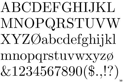
Times New Roman ------ the quick brown fox jumped over the lazy dog THE QUICK BROWN FOX JUMPED OVER THE LAZY DOG
Century Schoolbook - the quick brown fox jumped over the lazy dog THE QUICK BROWN FOX JUMPED OVER THE LAZY DOG
I just finished my Master’s Thesis (barg) and I’ve been using Times New Roman as my default, partly because you can get a lot of words per page. This article explains why lawyers prefer Century Schoolbook, partly because page limits were abandoned for word limits. I’m not sure I’m ready to change. I do like the fancier Q though.
Generally, I don’t go beyond the basics of TNR or Helvetica. As noted in the OP, the dope and other spots will occasionally yield up fierce opinions about typefaces without any background. Eventually I got curious.
I suppose it’s like Joe Biden eating a sandwich.