A no-longer-recent thread on reading and some election signs I’ll come back to made me think about how I’ve yet to grow accustomed to pavement text being arranged to be read “bottom to top”.
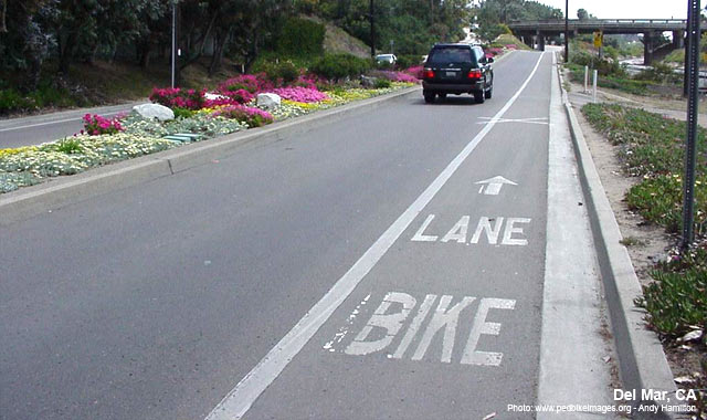
If the words “bike lane” are painted on the pavement with BIKE being the first word you drive over and LANE the second, the presumed intention is that you will read the closest word first, but my brain will interpret it as “lane bike” every time.
The election signs I mentioned were similarly arranged along the right side of the road with one word per sign and intended to be read as you approached them, but I initially read them left to right as I do the rest of the time.
Part of that I assume is that such markings, and the practice of splitting up a message in that fashion is unusual in Norway and I just haven’t lived in the US long enough to get used to it.
What say those of you who’ve grown up with such markings? Do you read them the correct way? Even if it’s a message you haven’t driven over or past innumerable times?
In my culture we read from top to bottom so when I see a sign like you mentioned, I’ll read it as “LANE BIKE”. Then, because I’m not a robot, I can see it makes no sense that way and, since I’ve seen this kind of thing before, I can understand that, regardless of what they wrote, they intended, “BIKE LANE”.
Why they want me doing mental arithmetic like this while I should be focused on the road, I can’t imagine but it’s not as if I can’t parse it at all
I know how you are SUPPOSED to read them, but the last 2 weeks I’ve driven the same strip of road, and etc time I read “BLOCK NOT DO.” I’ve never found such messages optimal. They get the message across, but almost always cause me a momentary dissonance.
Same. When I was a kid I always used to wonder why two of the streets we most frequently took had lettering painted on them reading “HOUSE FIRE” and “ZONE SCHOOL SLOW” respectively.
Similarly, these yellow-and-black signs they put on automatic doors have always looked to me like they say “AUTOMATIC CAUTION DOOR.”
I bike a lot in traffic. I appreciate bike lanes, but I do wonder how dim the signage designers are. Do they really think we come upon one line of type and are utterly unable to see the word above it?
(For anyone who hasn’t seen these, here’s one).
The distance between lines of type, for cars or bikes, are never enough to justify:
It makes complete sense to me. I read the one that is closest bc that’s the easiest one to read. Not interested in trying to read the words that are several yards away from me that may be blurred or sight hindered.
So… these signs are perfect for people whose vision is so bad they shouldn’t be driving? I guess that makes sense, they probably need to be reminded that they are driving in a bike lane.
No. I can see just fine as is evidenced by my lack off car accidents.
Furthermore, I’m gonna side with civil engineers as to what kind of signage is safest for the public over a few people that are slightly annoyed by said signage.
I think it is quite possible you are right, and that the selection bias is strong in asking this specifically in the SDMB and in who chooses to reply. But I also find it entirely possible this norm was established many years ago on flimsy evidence and that any present day civil engineer is just doing what is expected because it’s the law, or regulation, or custom.
Having established that even some fraction of native drivers on US roads find this feature annoying I’m curious what the actual history is and if there’s any research on how many, like you, read the closest word first and perceives it as preceding the “above” word in reading order.
I guess I have never had a problem reading this in the correct order. That is unless you are in my state and come across one of these which will leave you scratching your noggin trying to figure out which order to read it and what the hell it’s trying to say.
This might be a good point if such signage was typical in other places, but it isn’t. The OP mentions Norway, and I can say that I’ve never seen such signs here in Canada. Seeing them when I drive in the US pretty much makes them stand out as unusual.
I don’t know about Canada, though I’ve been on two-week road trips there twice, but for Norway the reason isn’t so much that we don’t use “multi-line road text in the ‘wrong’ order”. We don’t really use road text, or sign text, for signs meant to be noticed while driving. It’s almost entirely pictograms with a certain level of standardization across Europe.
The US has pictograms as well, but compared with Europe there is a lot of text.
The same trend applies to pavement marking, with the added factor that amplifying signs with road markings are a lot less used except for “no passing” areas and similar.
If they’re spaced out enough, the order seems perfectly fine to me. Also, with Chicago-area traffic, sometimes you can’t see more than a line at a time, anyway, so it makes sense that way, too.

