Infinite Diversity for Immediate Cash. ^:dubious:^
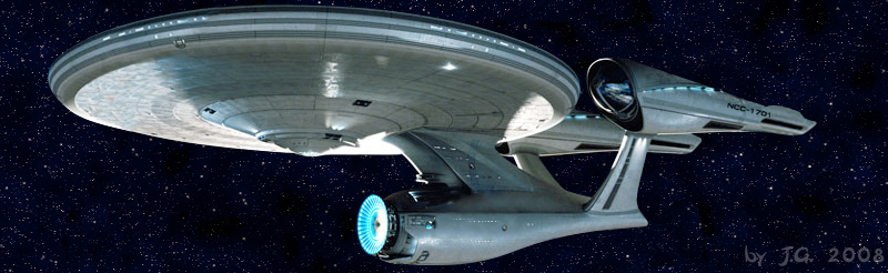
But the Federation ships of the 22nd and 23rd Centuries aren’t just about saucers and warp nacelles. Notice that the early starships had round warp nacelles; the rectangular ones didn’t show up until NCC-1701-A. And the main engineering/hangars/cargo/etc. section was relatively round, with narrow connecting tubes to the nacelles, and with a narrow connector to the main saucer. So the design shown for the “new” ship is completely out of character for the series.
SNORT…CBG Voice: “Actuallllleeee…the rectangular nacelles are a REFIT of NCC-1701. 1701-A is the ship that appears at the end of ST-IV.”
I’m not personally over-fretting over the Discovery’s design as a whole, because it actually has a legitimate, if slightly obscure, existing Trek heritage…some of Ralph McQuarrie’s concept art for the refit Enterprise for an early try at a Star Trek movie.
Obviously unused in the film, although study models did show up onscreen over the years, usually in background shots.
I always kinda liked it, actually. It has that classic, slightly blocky-grungy 70s-80s sci-fi design aesthetic. If not suitable for the Enterprise herself, certainly it would work as a ship in it’s own right. I’d hoped to somehow see it onscreen for awhile, now—and, well, to be honest, it’s also because I never likedthe designs of a lot of Trek ships after the mid-90s. Too visually “busy,” too many ugly angles and curves…lots of little things, mostly.
Which brings me back to Discovery. And I’m seeing bits of those little things are cropping in. The saucer section looks too much like a fancy hubcap; the seemingly copper-toned metal skin; the name and registry number appear to be written in the wrong typeface…little things, like I said. Something for a codger to worry about, probably. But it does give me pause.
So, they’re sticking with it.
From the other Discovery thread:
And then two posts later:
I don’t like it myself. But I’ll check out the show (if I can) because it is Star Trek.
I remember that from an old Starlog issue.
I hated it when it was new, too. It looks, for lack of a better term, old. It also looks lazy, and cheap. Like it should be on Buck Rodgers (with Gil Gerard).
Want to make it a Romulan design, I could see it. But it doesn’t look Federation.
I’m certainly not signing up for some special TV service in order to see this.
It’s hideous. And if this is supposed to take place between the destruction of the Kelvin and the launch of the Enterprise, it’s also completely wrong.
I thought Enterprise was the first practical for lack of a better word, warp drive.
I meant this gorgeous creature.
Discovery isn’t taking place in the universe where the Kelvin was destroyed.
It was still in service, though. Difference being, the first time around it didn’t run into Nero.
CBS All Access is, IMHO as a momentary specialist on streaming entertainment and its providers, a hilarious self-parody. For some reason, CBS decided its offerings were worth $7/month, when nearly every equivalent channel’s streaming offerings are free.
They even tried to pull the CW offerings behind the paywall at the start of this season - instead of shows appearing on Hulu the next day for a short run, and on Netflix when the season was complete, they pulled all new stuff behind the CBSAA shield. Except that you could still watch shows on the websites. (We kept up with the heroverse that way, only slightly less convenient than Hulu.) Then, very quietly, the shows returned to streaming on the CW streaming service. Oops, guess Oliver and company weren’t enough to draw pay viewers.
Trying to put a “premium” show like ST:d behind the paywall means they’re going to keep trying to compete with HBO, Showtime, Starz/Encore etc. instead of the other broadcast channels.
May the force be wit’em.
I suspect their plan will not “Live long and prosper”
Ug. It looks like Hank Hill - it’s got no ass, man.
What I mean is, because the engineering hull is so thin at the back, it’s unbalanced. it looks top heavy. And those light saber engines just don’t do it for me.
It’s pretty, though.
Face it, the “hot dogs on sticks” design never made much sense or looked graceful, no matter how smooth the curves or shiny the penis heads. And the saucer is an absurd waste of space and engineering complexity.
My main problem with the 2009 Enterprise is that the saucer is connected to the middle of the engineering section instead of the front like all other Enterprises. It just looks wrong.
Fuddy-duddies, all of youse. Bonk bonk, on the head.
Have Security put this man out the airlock.
On. The. Head.