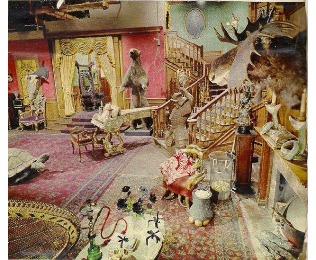
I came across this interesting picture of the interior of the Addams Family house, in color. The guadiness of the set was lost on the audience, of course, because they only saw it in black & white.
I figure that interior set designers in the B & W era could look at their job one of three ways:
Not give color a moment’s thought, since the audience wouldn’t see it.
Decorate as you would if the scene were in color, so the actors (at least) get a sense of place.
Look for colors combinations that look convincing on B & W film, regardless of how they look in real life.
I agree. Some of the “colors” you see in black and white film were actually quite garish in real life but were chosen because they worked well in black and white.
The same was true for make-up. Some of the actors and actresses you see in black and white films had the faces done up in strange shades of blue and green because those colors happened to look natural when filmed in black and white.
I believe so, too. In the black and white Superman serials and the black and white episodes of the George Reeves series, Superman’s costume was gray and brown so the contrast between his normally red trunks and cape and his blue bodysuit showed up better on camera.
This was why Some Like It Hot was filmed in B&W: the Daphne and Josephine makeup looked fake when they photographed it in color.
Not sure about the earliest days of TV, but when color TVs started to take off and sets were painted in more-or-less “natural” colors, the art directors would look at them through special glasses that showed how they’d appear in B&W. This was necessary at least until the late '60s, since the vast majority of TVs in the United States were still only B&W. (This was noted in The Making of Star Trek.)
Another example: in Doctor Who, the original TARDIS is supposed to be all white inside. But white produces too much glare in monochrome. So the set was actually green. It looked white onscreen.
Here’s some information. There’s a couple of colour photos that show its real colour.
Until they switched to color in season three the old 50s Superman series had George Reeves in a grey and brown suit to look better in B&W. Here’s the two side by side.
Some people remember Bette Davis’ shocking red gown in ‘Jezebel’. The color red was never shown in that black and white movie. I believe the real thing was a brownish color for filming purposes.
Not a Historian here but I did some set decorating in the 1980’2, we already had color. I was alwaays amazed at how crummy of a job could be done on painting surfaces that looked great on camera. The painters would come in and paint wood grain on the walls that looked like crap if you were standing next to it but on film looked rich and expensive.
The police cars on* Car 54 Where Are You?* were painted red, because the producers wanted to film on the streets of New York, and couldn’t risk them being confused with real NY police cars.
OTOH the sets for the* Dick Van Dyke Show* looked like they were actually meant to be shown in color.
Isn’t there now some issue of TV show set designs for the 1950s -> 1970s (not super detailed close up as HoneyBadgerDC mentioned) that were good enough for the analog era, but now look rather shabby on HD digital TV?
A while back, some friends and I volunteered to answer phones for a local PBS fund drive, and the set looked like grade-schoolers had decorated it. Looked good on TV, however.
“White” objects were usually pink, because white doesn’t photograph correctly in B&W.