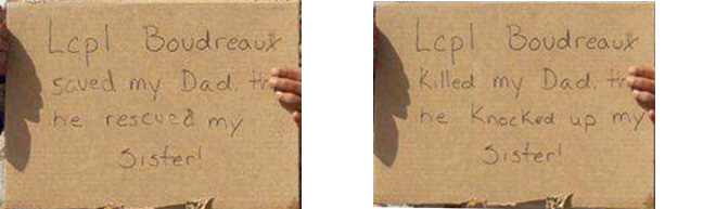
For those who don’t know, a picture has been making the rounds of the internet that has caused a great deal of offence particularly among Islamic people. It shows an American soldier with two smiling Iraqi children one of whom is holding a sign that says "Lcpl Boudreaux killed my Dad, th[en] he knocked up my sister!” There’s some background here.
The people I’ve talked to are satisfied that the picture is a hoax and was photoshopped from this. I expect that this is indeed the case but I must admit that, as far as I can tell, it could have gone the other way. I.e. the inoffensive picture could have been photoshopped from the offensive one just as easily as the other way around couldn’t it?
I’ve just checked snopes and there’s no word on it so how do I settle the question? What do I look for? Is there a doper who’s an expert on image manipulation?
As much as I would like to believe the other way, just looking at the evidence I see: 1) the inoffensive picture is grainier, indicating that the offensive one is the original, and 2) the inoffensive words don’t look like they’re written the same as the other words on the sign, and 3) the two occurrences of the letter “d” in the inoffensive words are not shaped like the ones in the other words.
It looks to me like the offensive one is the original.
More likely there is a completely inoffensive original, which someone has photoshopped to add “…killed my dad” etc, then another has photoshopped to replace “killed” and “raped” with more positive words.
I hate to say it, but I must agree with CurtC. It looks like the inoffensive picture is the Photoshopped fake. Notice that the words “saved” and “rescued” have a different slant than the rest of the words, and that they are a slightly different shade of grey. The writing on the offensive picture is all consistent.
The picture was probably taken as a joke. Maybe Lance Corporal Boudreaux really did save the kids’ father and sister. But since they can’t read a word of English, he decided to have a little fun.
I’m reminded of a picture that circulated during the run-up to the war. It showed the flight deck of an aircraft carrier. In the background was a plane, loaded and ready for takeoff. You could clearly see that someone had written the words “HIJACK THIS FAGS” on one of the bombs. Various people complained, and the picture got a quick airbrushing to remove the graffiti.
I’m not sure of that. I’ll concede that the "d"s in “Killed” and “Knocked up” look more like the "d"s in “Boudreaux” and “Dad” than those in “saved” and “rescued”, but that can be explained away in that the writer of the message (the kid holding the sign) was not a native speaker of English, which would make him less likely to have developed a particular handwriting style in that language.
The “hoax” version is smaller than the “original”, which would make it appear less grainy. This happens regardless of whether the image is changed otherwise, so I wouldn’t consider that to be evidence one way or another.
Granted, I don’t have any particular expertise in the field of photographic analysis, but I would deduce that the “hoax” version is really a hoax and the “original” is the genuine original. For one thing, there are darkness changes in the writing of the words “saved” and “rescued” that appear more consistent with actually being written on the cardboard and photographed, unlike the consistent darkness of the letters in “Killed” and “Knocked up”. I also can see some subtle flaws in the background surrounding the word “Killed” that would be consistent with a cut-and-paste job.
Of course, as others have mentioned, it’s entirely possible that both are fakes. A picure like that with someone holding a sign is a template for all sorts of mischief.
D
I have to admit, the “killed my dad” version looks a little more genuine, but with both photos being jpegged all to hell, I can’t definitely say one way or another. My guess is that it’s either a really bizarre joke by the soldier and cameraman and the offensive photo is genuine, or that neither photo is real.
Here’s another thing: When I cut the sign out in Photoshop and crop & rotate it so only the sign is visible, all the letters have pretty much a vertical slant. In the “saved my Dad” version, the words “saved” and “rescued” lean to the left compared to the rest of the words. In the offensive version, the slope of the letters seems consistent. Check the lowercase “d” in particular. In the word “Dad”, the slope is vertical, as well as with all the other lowercase letters that extend all the way up. In the “saved” version, both "d"s slope left. In the knocked up version, the "k"s and "d"s remain vertical. Also the “s” in saved looks off compared with the "s"es in “sister.” But the sample is too small to tell.
Another thing: The baseline is fairly consistent in the knocked up version. In the “saved” and “rescued” version, both those words stick out. Check it out here and draw your own conclusions:
Also, the lowercase “d” looks more inconsistent in the inoffensive version.
Zoom in. The writing on both appears to be added on later. The pattern of rips on the bottom of both are the same, while the location of the word “my” is different on the two signs. This means that one of those two lines was moved.
From my amateur graphologist days, the “d” on “saved” and “rescued” is not consistent with the rest of the letters. neither is the “s” in “saved” with the other s. The second “e” in “rescued” is not consistent with the other "e"s. The “raped” sign looks to be significantly more consistent with the individual letters.
I tried checking out the aliasing patterns on both. While the “clean” sign is more suspicious, the aliasing is generally consistent on both, but I’d lean towards the “saved” sign as being the altered one, although on this basis, I couldn’t be sure as the files were of different types and Photoshop didn’t give any clues as to the save history, which would have necessarily affected this.
You can see that “saved” has been cloned over before “killed” was added. (Look at the “d”, and you’ll see that there’s an “eraser mark” where a lighter area of the sign was cloned to cover it.
C&P from my post in the other thread:
(The double-compression is also very noticable inside the “D” in “dad” and under the “S” in “sister.”)
Larry, thanks for posting that animation. However, it works the other way for me. That clearly shows how the words “saved” and “rescued” are slanted differently than the rest of the words, while “killed” and “knocked up” are consistent.
Also, previously I mentioned that the “d” letters are not the same in “saved” and “rescued,” but didn’t say exactly why. If you make the letter the way I was taught in school, you first do the loop in a counterclockwise direction, and continue up to make the vertical bar, then down. In the two “d” letters in “Boudreaux” and “dad,” the loop part of the d starts down low, then goes around in a complete circle. In the words “saved” and “rescued,” the top of the loop starts higher and goes just horizontally, so the loop is not circular.
I don’t know enough about photo retouching to say much abou that aspect of the picture, but I can say a little the handwriting. I really don’t think either of the kids wrote the sign. If they know any writing system is is likely that they know arabic and not the roman alphabet. Since he either doesn’t know any alphabet or knows a completely different alphabet, it seems like anything he wrote would be much much messier.
I mean, if he didn’t know English how are you going to instruct him to write either sentence. It can be done, certainly, but it’s kind of a hassle and the end result is likely to be messy. I think probably he just wrote whatever message was actually on the cardboard and gave it to the kid.
I’m actually of the opinion that both are fake and there was something else on there originally.
*I suppose it is possible that the kid knows English, but I don’t think so.
I find the consistency between the letters in the offensive words and those in the common words to be an indicator of altering.
I know that if I were going to photoshop a sign to change a couple words, the first thing I’d do is copy the letters I could from elsewhere in the image. Then they’d be subjected to a little distortion to make them not look like simple clones. That’s because it’s usually easier and more convincing looking to use the writing already there, whether it’s the font on a billboard, or handwriting.
Also, taking the other side of the argument: If you take consistency to be a sign of authenticity, then you have to notice that the two instances of the letter “p” in the offensive sign are each written differently. The inoffensive sign only contains one “p,” so you can’t really compare. So, FWIW, there’s inconsistent lettering in both.
Here’s another thing that hasn’t been discussed yet: the context of the wording.
If you see a picture of a soldier with two kids holding a sign that says “Lcpl Boudreaux killed my dad and knocked up my sister,” you know what’s going on. The soldier was having a little (inappropria) fun with some local kids who obviously don’t read English.
But if you see a picture with a sign that says “Lcpl Boudreaux saved my dad and rescued my sister,” then that makes me go “WTF?” The wording is not put in a way that most people would write it. They would say “saved my dad and sister.” I can’t imagine any native English speaker using this wording. (and whatever it actually said, it’s very obvious that: 1) the sign was written by the soldiers, and 2) the dad was not actually killed and the sister was not raped.)
This is just another of the pieces of evidence that point to the offensive version being the original. We now have these:
The words “saved” and “rescued” are not aligned with the other words, and the letters tilt to the left more than the other letters.
The “d’s” are inconsistent in “saved” and “rescued.”
The “saved” and “rescued” version of the picture is grainier, indicating that it’s secondhand.
The “killed” picture is slightly larger - look at the thumbnail of the kid in the blue shirt - the “saved” picture has been cropped a little.
The wording of the “saved” picture is clumsy.
The evidence pointing the other way, that the “saved” is the original:
The light area to the right of the “d” in “killed.”
The letter “u” in “up” does not match the “u” in “Boudreaux.”
On balance, at this point it looks like to me that the “killed” version is likely the authentic one.
I see what everyone’s talking about with this, but I disagree with the conclusion that light streak = clone tool. It seems more likely to me that the light streak was a real-life inconsistency in the cardboard (dent, discoloration, slight surface abrasion)–like the dark oil stain/smudge on the X in Boudreaux–and that the person who doctored it into the “nice” version cloned out that inconsistency. (Besides which, I can’t even see where on the sign the person would have cloned that light streak from … but can see plenty of places where the smooth, brown background could have been cloned from.)
Okay; here’s a version I’ve made - just above the “I” you can see a similar light patch - this is deliberately cloned by me from the right hand side of the cardboard. The board’s not a uniform shade, you just can’t spot the gradation without directly comparing it. Also, if the light patch were caused by a bump in the board, there would be a corresponding shadow; there isn’t. It just doesn’t look like texture to me, it looks like an artifact.
Hand lettering is not as consistent as mechanical reproduction, and a person altering “saved and rescued” would most probably blank those out and then work with the remaining “d’s”.
That’s simply not so, if you look at the original images, and the reinforced jpeg artifacts indicate exactly the opposite.
Both images have been cropped, and you will notice that the “saved” picture is cropped less on the right-hand side than the killed image.
The Marine Corp publishes a style guide, now? In my experience, language becomes less clumsy after editing.
I’ve improved the flippy animation (more carefully aligned, a bit slower, and a full 256-colour palette,) and a careful examination should be convincing. (You may need to refresh the page/image, because it has the same location and filename as the smaller version, so your browser may fish it out of your cache if you looked at it before.)
The aforementioned “d” area on “killed”. You can clearly see that, in addition to perfectly conforming to the “d” from “saved,” in the “killed” version, there is no trace of anything resembling cloning where you would necessarily find it. The corrugation pattern is undisturbed where all the extending lines would have to be erased- the “K” and “LL” in “killed,” and the “K’s” in “knocked-up,” and the entirety of “MY.” Contrawise, the extending lines that had to be covered up to clone out “saved and rescued” all show disturbances. The “d” in “saved” is the most obvious, but you can also see imperfect cloning where the “d” in “rescued” was covered, and the corrugation pattern is altered in a line that conforms perfectly with where the tail of the “y” in “my” was erased, just beside the “p” in “up.” So there are literal traces of “saved and rescued” visible underneath “killed and knocked up,” while no such traces of “killed and knocked up” can be discerned in “saved and rescued.” Q.E.D.
You can also see the preexisting compression artifacts being reinforced in the “killed and knocked up” version.
