I’m an amateur when it comes to photoshop, but not a complete noob. I can make clones of myself, erase people from pictures, design realistic-looking aged postcards and letters and make minor modifications in pictures.
But right now I’m trying to create money from scratch. No, I’m not trying to actually make money, I’m trying to design a fictional bill (or series of bills) in photoshop.
What’s the best way to approaching designing bills like this? Would it be better to take one of these already-existing bills and modify them (they’re really intricate, I think it might be hard to modify them into anything without just blatantly ripping off the image) or to start from scratch?
I’m not trying to make a work of art here, just something that looks reasonable.
Thanks.
Edit: I have no idea if Cafe Society is the right place to put this. I’m creating something that’s sortof artistic, so I figured I’d put it here. Feel free to move it, mods, if it belongs elsewhere.
You might want to look for “photoshop brushes” that have elaborate patterns, perhaps Victorian or Art Deco styles, or smoky swirls, that you can find for free, such as at DeviantArt.
But you’re hoping for quite an elaborate piece of art, that even the professionals would find daunting to approach.
My thoughts…if you can find public domain images and clip art of the various elements (old photos of serious-looking men, borders and flourishes, appropriate fonts, etc.) you can take each element, desaturate them, add a colored photo filter, add a texture filter like crosshatch and then layer the elements together.
Play around with the Texturizer. That’ll give you a more realistic background texture. Play around with some of the settings in mentioned in this video
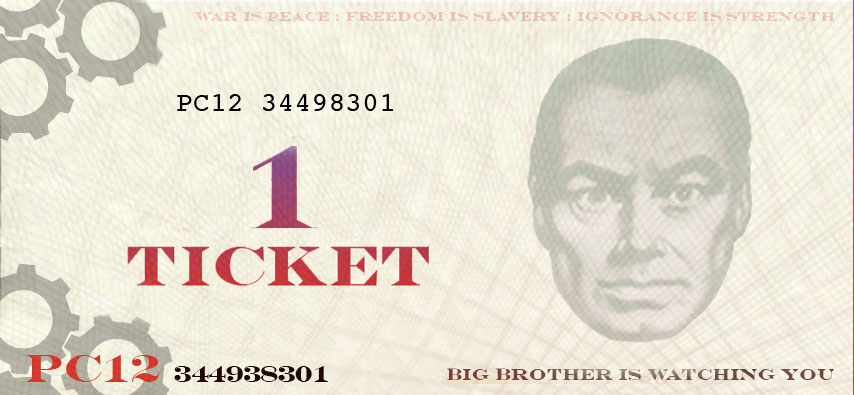
The currency is for a nation called Airstrip Sixteen on a game called NationStates. It’s based (read: ripped off of) Oceania, yes, but the nation itself is on an island.
Render->Fibers is a good start. Bills are usually folded, bent, and rolled much more in the short direction than the long one, so you get the noticeable vertical fatigue. Apply one vertical fibers to the “paper” layer of the bill itself, and use another (with a fair amount of blur) as an alpha channel on a saturation layer to get the color fade.
Thanks, BigT and TimeWinder. Not using my computer atm so I’ll have to wait until tomorrow to tinker around with it a bit more, but I’ll be sure to try out both of your suggestions.
You might want to try making a series of thin horizontal lines, about four or five pixels apart, and then distorting them with one of the distortion filters, and then layering them over each other into loops and swirls.
Then colour each layer using the Variations filter.
I would also play around with the positioning of the face. It doesn’t look quite right and balanced where’ it’s at now. I’d move it up a little bit. Also, I’d like to see how it would look rotated a little bit counter-clockwise to correct the vertical tilt.
I’ve added some design elements to make it a little less spartan, if not particularly more monetary. After adding the lines and adjusting the colours, I merged it and added the ‘canvas’ texture to the whole deal. Then did the ‘fiber’ trick mentioned above. For a final touch, I added some fake wear around the edges by playing with the ‘ripples’ distortion filter (see below for what I did specifically), then reduced the opacity and layered it onto the whole thing.
As to the rippling:
Step 1: Do a ‘large’ ripple, for a large percentage.
Step 2: Select the white, and do a ‘medium’ ripple.
Step 3: Deselect, and repeat step 2.
Step 4: Optionally, repeat step 3.
Step 5: Deselect, select the white again, then do a ‘small’ ripple.
Step 6: Optionally, repeat step 5.
In between any of these steps, you can, of course, back up and try a step again, if the results don’t work for you.
The biggest thing I’m noticing about your bill is how much blank space there is. If you look at the chinese bill you posted you’ll notice that most of the background is actually filled up with textures. I think it would make a big difference.