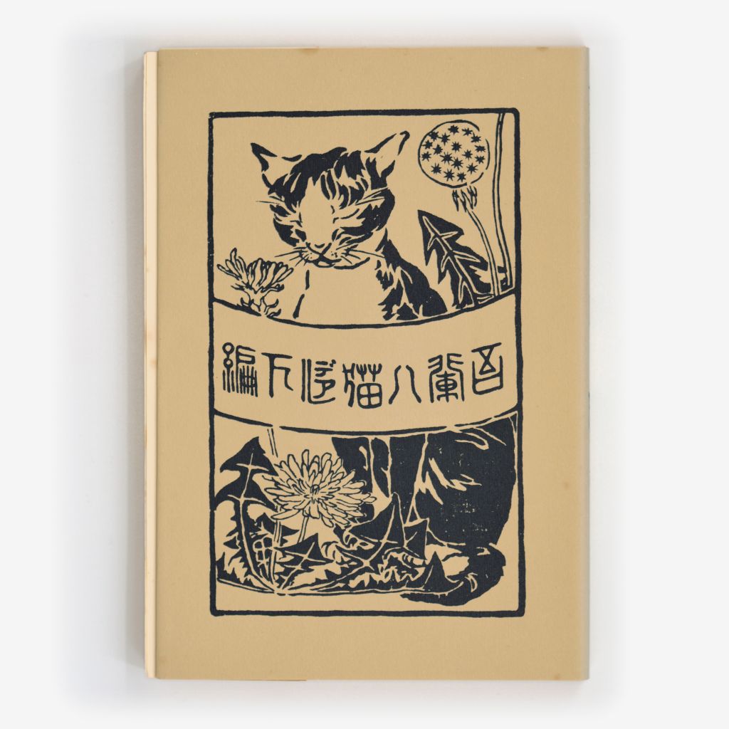
What is the final word? 下編 ??
Wikipedia says this story was originally published in ten installments, but the pictured cover is from a three-volume edition?
What is the final word? 下編 ??
Wikipedia says this story was originally published in ten installments, but the pictured cover is from a three-volume edition?
I have no idea about anything here, other than that I LOVE the picture!
It would appear that the cover was created by Goyō Hashiguchi: https://artsofjapan.com/en/profiles/hashiguchi-goyo
I am not averse to moving this thread to Cafe Society. The novel is called I Am a Cat by Natsume Sōseki.
The kanji (Chinese characters) used do seem to be archaic versions (Wikipedia calls them traditional forms, from before the orthographic reform that happened after WWII). I believe it is intended to be read right to left.
Going back to Wikipedia, they show the original title as 吾輩は猫である, “wagahai wa neko de aru.” So reading from right to left, we can identify 吾輩は猫 (in reverse, and where the “wa” appears to be katakana instead of hiragana). The last 3 characters on the left would then be traditional kanji instead of hiragana for “de aru.” So my conclusion is that all the writing consists of the title only, without the author’s name or the volume number (if any).
To confirm, I asked my Japanese husband, who was born in 1948, and he had no problem reading that even though the modern version was being taught when he was in school. He said everyone in his generation would still be able to read this because of all the older books that were still around.
If you look closely at the “5th character” it is “de aru” in katakana. The next two are “下編” (gehen) or lower chapter. The three volumes would be in order “上編” (jouhen) “upper chapter”, “中編” (chuuhen) “middle chapter” and “下編” (gehen) “lower chapter”.
Looking at Humbagger’s link above, the black cover clearly says “中編” for the middle chapter.
Here is a AI modified version with the banner removed and plausible details filled in.

Nice, thank you Darren!
It is not just that— the calligraphy, at least of the kanji, is meant to imitate the so-called “small seal script”, e.g. “cat”:
Regular/[whatever you have on your computer] script:
貓
Seal script:

The text of the book itself would obviously be in pre-spelling-reform Japanese, though what font is a good question. Perhaps there are scans of the original publication?
That does go hard.
Kind of a weird elbow or whatever that is on its right front leg.
Eeww, no. There’s no variable line weight in that added flower (which didn’t need adding in any case - there’s no missing stem to account for), it does not look right at all.
I do not believe for one single second that if you had been shown that image without seeing the first one or told that the second was altered you would ever have noticed anything inconsistent about that central portion.
Oh, I would have. It looks wrong.
The stem of the other flower that it added, that I likely wouldn’t spot. But the new flower? Just a completely different weight to it.
I’m sure that you believe that.
That bugged me too although I may not have noticed if not next to the original
I like Japanese woodcuts and sumi-e, and that new flower is just … subtly wrong for the way chrysanthemums and dandelions are portrayed in the genre. There’s conventions for how stuff like that are depicted.
I mean, yes, that pointy shoulder is also a travesty, but that’s not what drew my eye.
There’s a handy Pit Thread where you can continue that tack, if you’d like. I’ve said all I care to say to you in this one.
So a few months ago, I was at the Ringling Museum in Sarasota and they had a traveling exhibition of Japanese nudes (many of which were woodblock prints which is my current artistic obsession - would that I could win a really big lottery…).
I am almost positive that “Woman After the Bath” from your link was one of the displayed pieces.