Don’t know if this is the right forum for it, but it does involve art, so…
I am going to enter a picture in a landscape photography contest with our local camera club, but I can’t decide which to enter. Here are the URLs for the ones I am debating:
I have no claim to being an art critic, but personally I like # 4. I like the texture and the atmosphere, it has an interesting feel to it. Are they all at the Grand Canyon?
They’re all wonderful, the best to you in the competition.
http://www.pbase.com/rikwriter/image/51290991.jpg
Composition is weak. This shot is not about the landscape; the arch is not really integrated, byt the composition, into the landscape. This shot is very literal minded and is really only about the arch. Kind of clinical and cliche.
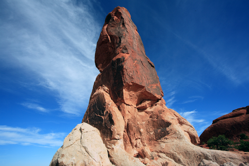
http://www.pbase.com/rikwriter/image/51512391.jpg
Centered composition is more likely to work against the subject than to present it dynamically. Especially in landscape. The centeredness of this composition renders this shot a one liner with phallic overtones; probly not your intent. AGain, this is a shot about the rock, not about the landscape. The landscape is more incidental than integrated.
http://www.pbase.com/rikwriter/image/52004881.jpg
Good contrast, great color. Nice use of the entire frame; none of it is wasted as incidental background, as in the previous photos. I’d crop the top 8% to 10%, to give the earth a more solid presence. That is, to emphasize the solidity of the earth’s presence in the shot, which is the strength of this composition.
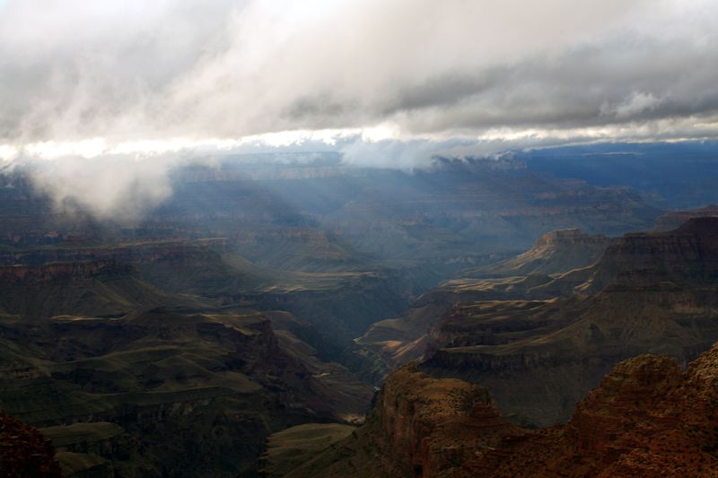
http://www.pbase.com/rikwriter/image/52440579.jpg
Not bad. I would recommend trying this one again under different lighting circumstances; the contrast between the shadow a the light, in this shot, weakens the composition. There’s interest in the shadows, but the brightness of the lighted cliff faces narrowed your aperture (assuming you’re working auto), which loses all that detail for you.
http://www.pbase.com/rikwriter/image/52004855.jpgGreat idea, but too much wrong with it. Would have been awesome if you’d caught the bird with its wings in an upswing. As it is, the line of the bird has a kind of bedraggled quality. Luck of the moment. And the black patch at the bottom below the bird throws off the composition. And something about the precise contrast in that area, but the degraded contrast in the rest of the shot, reads a bit off. I know that’s a factor of distance, but it doesn’t work very well in this composition.
Well, considering that the pro photographer who will be judging the contest has a picture framed exactly like this on the front page of his website, I don’t think he will hold that against me.
Dissenting opinion here-- #5 or #6. There isn’t enough . . . photographer in #4. It looks like any other of the many many shots that could be taken from that point. Too Hallmark card predictable. In a landscape contenst there will be 150 other entries just like that one with whatever selection of sunset/ clouds/ fog/ storm front/ sunrise, etc. The other two have a more interesting range of color and more interesting perspective-- more of a sense of presence in a place.
Here’s my take, for what it’s worth, which ain’t much.
Doesn’t quite do it for me. It’s a nice arch, but the arch is clearly what that picture’s all about. A big arch. Right smack dab in the middle of the picture. What’s going on in the rest of the picture? Not much from what I can see. Too much shadow.
Maybe it’s my computer, but the colors are all too washed out. Even if they weren’t, there’s nothing going on in this picture to interest me. The lower half is all dark, and the clouds in the upper half don’t really inspire much.
Oh, no, no! Way too centered on that huge phallic symbol you found. Nice rock, though.
Like others, I like this one the best. What’re those clouds doing? What’s that mist doing? What’s going on all over this picture? I could gaze at it for half an hour. It feels nice.
Tough to say what I don’t like, but too much shadow. And there’s something huge behind you casting a really big shadow across your photo and I’m a little more interested in what’s making that shadow than I am in the rest of the photo. But not in a good way.
Nice, but I wonder if that big hole in the middle of the picture needs to be in the middle of the picture. It would appear to be all about that big hole, but there isn’t much going on in that hole, if that makes any sense. I think I’d rather discover that hole, than have it placed right in front of me.
I kinda like 7. Hopefully the color in the original is more vivid. I like how the picture is divided in half, yet unlike 2, my eyes keep going back and forth. I look at the bird, and the bird makes me want to look at what else is going on, then I wonder what’s going on with that cloud bank on the left, then I go back to the bird, which invites me to reexamine the lower half again.
Without reading any other answers, so as not to let them affect me:
#6 (which has an extraneous comma before the .jpg, BTW) – though I’d recrop it so that the hole in the middle isn’t in the middle. The version I’m looking at is a bit over 9-1/2" wide – I’d take off about 2-1/2" on the left and about an inch on the right.
Who you callin’ a cheater, Willis? It’s perfectly possible to follow each of the links w/out reading the remainder of the posts (the OP fills my entire screen).
The rock-formation ones are just “ooh, look, a funny-shaped rock”.
What I like about nos. 4 & 7 is the way the clouds show the interaction between the weather, the athmosphere, and the terrain. They’re also the two that have a real sense of space, of immense distance. Personally, I prefer the crispness of no. 7, although I can understand the votes for 4, too.
I think #6 is the best for a landscape shot. It has a strong and natural feel to it. The combination of the close-by rock and bushes with the distant scenery through the hole gives a good impression of being out there.
#4 is a really great photo, though. It seems more on the ‘artistic’ side, since the incredible light (and how it is captured) is a major part of it. That may or may not be good in this particular contest. I guess it depends on how it’s judged.

 *
*