Four years ago, I came across a red/blue (Dem/Repub) map showing how the various counties in the USA voted. Has anyone seen one this time around?
Try this. About the fourth one down.
It may not be exactly what you’re after, but the site overall gives some good perspectives.
Here’s a better one.
That’s much better.
Holy crap, there’s a lot of red on that map. As well as some odd-shaped counties, particularly in the West. Guess I’m just accustomed to the Midwest squares.
Alaska and Oklahoma appear to be the only states without a single blue county.
The 2008 map of “Purple America” is the 2nd map down. This gives a much more accurate perception of the voting than the red and blue state maps.
On Purple America, Alaska is depicted a truly purple.
Beats me.
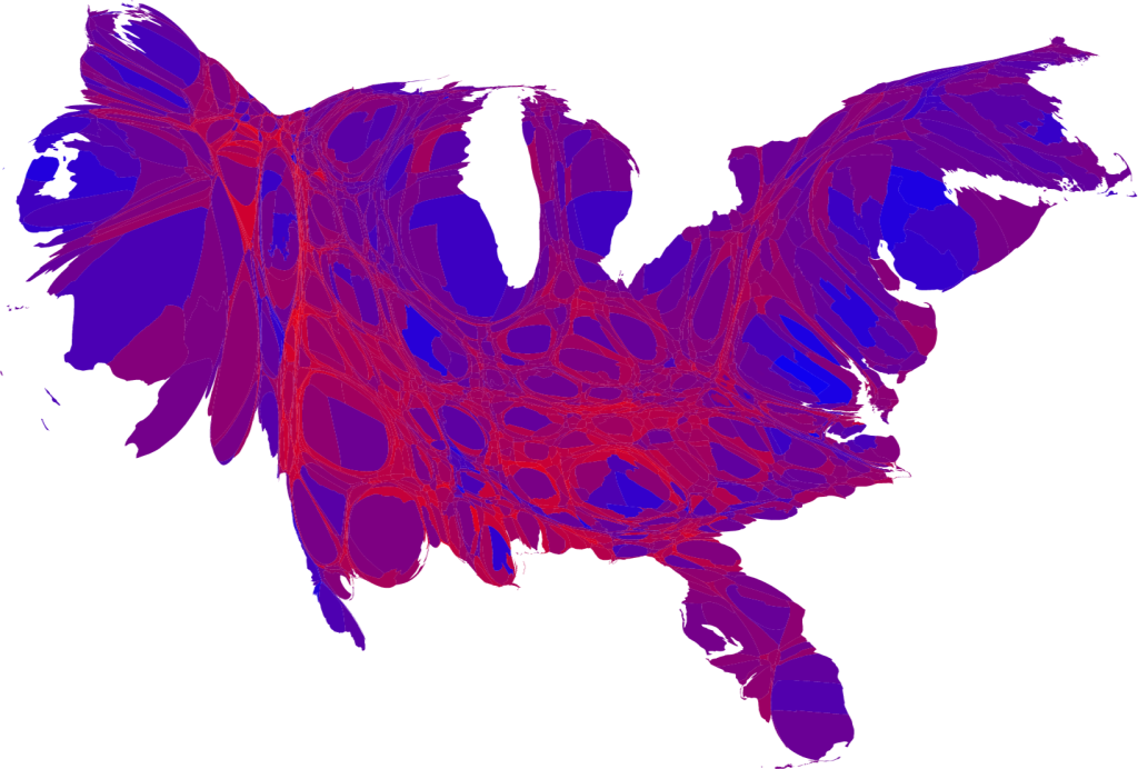
I think this is the best one. With the above linked maps, the county could have a difference of, say, 30 votes and would still be a solid red or blue, even though just under half the people in that county voted the opposite way.
A cartogram might be less misleading.
Oh yes. That’s much better. The other map made me think somebody didn’t count a few million votes.
Thanks to all who responded. Lots of cool stuff.
CNN.com has interactive maps which you can use to see individual voting totals for each county. Here is the US interactive map: http://www.cnn.com/ELECTION/2008/ Click on a state and then “Larger Map” to view individual counties. As an example, here is CA: County Results - Election Center 2008 - Elections & Politics from CNN.com As a bonus, you can look at how the other races went, not just presidential elections.
However, this one (the one taking into account population density and percentage of votes) is clearly an archaeopteryx.
I find it interesting that the area around the major urban centers tends towards Democrat and the more rural areas tend toward Republican.
It’s been that way for quite a few years now.
Ed