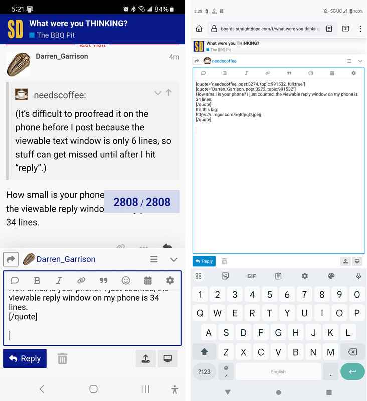
This conversation popped up in another thread. For some people posting from cell phones the reply box takes up only a fraction of the screen squeezed below part of the forum thread. For others (myself included) the reply box fills the whole screen (except for the part taken up by the keyboard). The left is an example of the tiny reply box, the right an example of the large one. While obviously the left screen is running at a lower resolution/size than the right, the left would still have quite a few more useful lines in the reply box if the box was full screen. Anyone know what settings are relevant here?
On my Android Samsung S10 w Google Chrome and using the “SD Light” theme, while I am actively typing the screen is divided about 50/50 into edit box on top and keyboard below. That’s tall enough for 9 lines of reply to be visible at the slightly above normal font size I use.
There a icon like a desktop display screen at lower right. Tapping that brings up the full screen preview window. Which on my device is about 23 lines tall. On that screen, the pencil icon at lower right switches back to the edit box + keyboard screen.
Now when I am looking upthread to read what someone else said, or I’m selecting text to quote from someone else’s post, during that time I have a short 5-1/2 line textbox at the bottom. Unless I click the downcaret at upper right to hide it completely.
So I suspect we don’t have a setting issue as much as folks imprecisely talking past each other. While trying to read or quote, you’re looking at both the existing thread and your post in progress through a soda straw. While typing the input box is bigger. And while previewing it’s bigger yet.
Late add: Looking at @Darren_Garrison’s right side example a few things jump out at me.
The keyboard takes up 1/3rd of the screen, and the rest of the chrome around the edit box is not even 10%. Leaving a hair over 50% of the total screen size for the edit box itself. On my device the edit box is about 22% of the total screen height. The rest is keyboard & chrome.
I could not possibly read that font size. I’d need the letters at least double the size, so half as many lines would fit. And of course twice as tall is also twice as wide, so fewer letters per line and more lines for any given blob of text. Overall, for the same size edit window, I’d see about 1/4th the characters / words that Darren does.
I just bought a new phone that’s not yet delivered. In the course of shopping I found that some phones are much taller / narrower than others. I bet a phone that’s relatively tall/narrow will display that page with the edit box relatively taller as everything else is a fixed size. Just eyeballing it, the shape of Darren’s phone seems to be about 20% taller versus the width compared to mine.
If I collapse the keyboard, I see the screen on the left. Click into the reply box (which automatically expands the keyboard), and the reply box also expands, so I see the screen on the right.
On desktop at least, there is a button in the top right that has two arrows pointing diagonally, looking something like this: ⭠ ⭢ (only diagonal).
If you click it, it switches the reply box to full screen mode, and the icon changes to ⭢⭠ (but still diagonal). Clicking that button restores you back to split screen mode.
I don’t see that button your screenshots, but maybe it would show up if you clicked the three line menu button. (≡).
Another idea, then. Use the browser menu to switch to Desktop mode. Then try to make a reply. If it opens in the full screen option, then click the button I mentioned to make split screen. Go ahead and save a draft (just in case) and then switch off Desktop mode.
Option 2: clear your cookies for this site. In Firefox, the option will show up if you tap the lock icon by the URL. Hopefully, the setting is stored locally and can be reset.
So the main problem seems to be the size of my phone’s keyboard, which eats into the edit screen space. I gained a few edit rows by removing the row of numbers that was above my letter keys, but that also moved 10 symbols to a different screen, including the square brackets, which I use a lot. So I put the number row back, and made the keys shorter instead, which got me 3 more rows for a total of 9 rows in the edit box. Which is a lot better when I’m trying proof a longer post. But now my keys are pretty short, so they’ll be trickier to type on.
I have typically used my PHONE control panel to adjust screen size and print size.
Right now, I used the triple bars on my BROWSER, at the bottom, and that provides a Text Size option for in the browser.
Adjusting that smaller gives a lot more lines inside the edit box.
Open a reply and get the first screen image in the OP. Touch the window to add text, and the second opens up, much more like Tage seconds image if my Browser text size is small.
I can’t read it all that small, so I need it larger. Then it looks like described by @LSLGuy .
Are you aware that you can install different keyboard apps? I used to use Fleksy, which is pretty fleksible in configurations. (I just stayed with the default Gboard on my latest phone.)
Yes, I I’m using the only one I’ve found to be adequate, although it’s losing features I liked, such as better contrast between the symbols on the letter keys.(White letters but gray symbols on a dark gray key make it really hard to distinguish a colon from a semicolon or a quote from a double quote) I haven’t looked into Fleksy yet. I think I need a taller phone!
What you are showing isn’t what @Darren_Garrison showed. His is the full screen reply box. The top banner turns white, and there is no trace of other posts.
It looks exactly like what happens when I click those buttons on my Desktop.
I’m not seeing any difference. My screenshot shows a full screen reply box, and there is no trace of other posts. I don’t know what you mean by the top banner turning white.
@needscoffee are you using the browser or the Discord app? I think you’re using the browser?
I see @Darren_Garrison is using his browser and he has full screen but have you tried using the app?
For me when I open the reply box in the app and my keyboard, it brings up a full screen for replying.
I know some people don’t like the app, so if you’re hesitant to try the app have you tried a different browser? I just tried it on Edge and when I hit “reply” and have the keyboard up, I do get the full tall reply box.
Hi ZJJ! I use the app. I have 9 lines in the reply box now that I’ve shrunk my keyboard. I could have another couple of lines if I removed the numbers from my keyboard layout, but I use them all the time.
The only way I can get the full screen like @Darren_Garrison is by viewing my post, but not while I’m actually editing it.
I use SwiftKey, but it’s not as configurable as it used to be, and my phone isn’t as large as I’d like.