Ok Steeler fans, let’s see what you know.
Ever since I was a little kid, the Steelers had the league standard block type uniform numbers (look at Green Bay’s uniforms now to get an idea of what I’m talking about). If I recall correctly, back in the 70’s most teams used this number “font”. Off the top of my head, the only teams I can think of that didn’t use the standard issue NFL font for their numbers wee the Chicago Bears (the font they used then is the same one they use today), and the St. Louis Cardinals (they had the same font, but the numbers on the front of the jersey were smaller than the back).
Anyway, two things happened to cause every other team to have their own uniform number font these days: expansion and Nike. So when Nike got ahold of the Steeler jersey, they made a few subtle changes… The numbers being the most noticeable.
Even back in the 70’s, the Steelers had their numbers on the Helmets. And the font used by the Steelers for the helmet numbers was different than the font on the Jerseys. (everyone following this so far?). Now, however, they match. Nike used the helmet number font and put that style on the jersey, giving the Steelers a most distinctive (and IMNSHO ugly) jersey numbers in the league. Adding the “slant” or putting the jersey numbers in italics makes it look even worse.
I don’t know if I would like the new numbers if they were straight up and down, since the newer jerseys have had them slanted from day one. So all I know is I hate the new jerseys, and have ever sine they switched to them sometime in the mid to late 90’s.
Which brings me to my question.l… Has anyone lose ever noticed that the Steeler helmet numbers were also slanted, and have been for years? Most of my friends think I’m off the beam until I show them a few pictures, and now a small debate has popped up amongst my Steeler brethren. So how about it, Steeler Dopers (or uniform junkies). Ever notice the helmet numbers on a slant? I always thought this was the reason Nike put the numbers on the jersey on a slant in the first place, but most folks don’t have a recollection of the helmets from back in the 70’s (when I first noticed them) or even now,
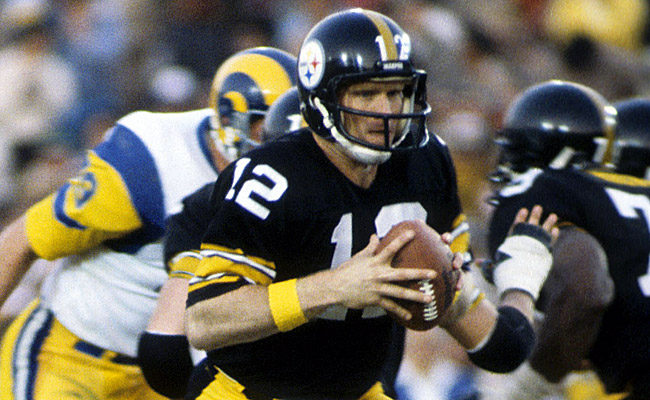
The best number you can tell is slanted is the number “10”. I noticed this originally on Roy Gerella’s helmet in the 70’s, and it has carried on ever since with players who where a two digit number in the 10-19 range.
I dug around in the web briefly and found a picture of Kordell Stewart, who wore “10” when he was with the Steelers. Here is a good picture of the front of Stewarts helmet, and you can clearly see that the “1” is slanted in the same direction as the jersey numbers, with the top of the “1” being closer to the yellow stripe on the helmet as the bottom of the “1”. Please resize the picture and you will get a clear look at what I am talking about.
So, here’s my question. Is this the reason Nike chose to slant the numbers on the jersey, or was that choice just a fluke of marketing? I will admit, on some players helmets, the slanting of the numbers is difficult, if not impossible to notice. Even in the Stewart picture I linked to, it is hard to see any slant in the “0”.
Anyone notice this before, and anyone know waif this is why the Steeler uniform numbers are slanted?
This Steeler fan would like to know.