This has been asked before, but over twenty years ago. What is the ugliest sports uniform?. I ask given some of Canada’s previous Olympic efforts.
For old times sake:
This has been asked before, but over twenty years ago. What is the ugliest sports uniform?. I ask given some of Canada’s previous Olympic efforts.
For old times sake:
I have to say, the Lingerie Football League’s uniforms didn’t do it for me. Maybe if they’d gotten rid of the helmets and shoulder pads.
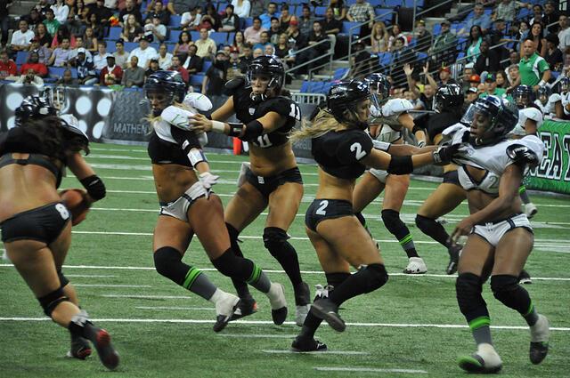
You don’t want them protected?
It was a dumb and regressive idea. But if you are going to throw together a Lingerie Sports League, and you come up with that, what wasted potential.
The Lingerie Touch Football League would have solved that problem.
The Astros were my first thought, but also any US Olympic team forced to wear cowboy paraphernalia at the opening ceremonies.
Any minor hockey league third or tribute jersey. Think Wild West sheriff or Ronald McDonald
That red and green maple leaf jersey (1910-1911) the Canadiens wore for the whatever anniversary was pretty horrible.
The MLB sleeveless jerseys that are scattered through the years.
The Houston Astros’ rainbow uniforms of 1975-86 were considered pretty butt ugly.
:no_upscale()/cdn.vox-cdn.com/uploads/chorus_image/image/66713947/AP_17299486750460.0.jpg)
When I think of ugly uniforms, the first thing that comes to mind is the Shawn Kemp (pictured), Zydrunas Ilgauskas-era Cleveland Cavaliers of the mid-1990s.

Hockey uniforms are all kind of ugly, but this Islanders jersey from a few yeas back, oh dear Jesus.
The uniform appears to be a Frankenoutfit with shoulders, torso and helmet/gloves taken from the uniforms of three different clubs.
I was still playing (mediocre) ice hockey during the mercifully brief “Cooperalls” period. None of us wanted to look like the 1983 Flyers. Since these long pants were reportedly so hot to wear and so different, soon the league required socks and short pants.
I’ve always considered the powder blue, polyester, pullover jersey the St. Louis Cardinals wore in the 1970s-80s to be a low point for the franchise. The old-time pillbox cap was the point-blank shot to the temple.

And occasionally the St. Louis Blues have not been true to their name.
https://b.fssta.com/uploads/2020/11/pi-nhl-blues-new-reverse-retro-jersey.vadapt.767.high.0.jpg
I actually liked them. Still do.
I may be the only one.
We in Australia have this award all sewn up!
1984 Olympics
!992 Olympics
2004 Olympics
Better those, I dare you!
Okay, those 1992 ones gave me a headache.
Similarly, the Atlanta Braves’ powder blue jerseys and pants are mercifully a thing of the past;:
:format(webp)/cdn.vox-cdn.com/uploads/chorus_image/image/68510317/528531016.jpg.0.jpg)
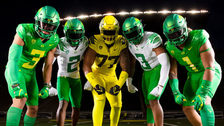
Powder blue is not as bad as lime green, though. If you ever thought that Nike’s reputation for evil was hyperbolic, consider the assault on the nation’s senses that they’ve perpetuated through their devil’s deal with the University of Oregon:
Of course, this could just be a symptom of a wider regional plague endemic to the Pacific Northwest; the Seattle Seahawks are also fond of dressing up their players as anthromorphized highlighters:
/cdn.vox-cdn.com/uploads/chorus_image/image/60413687/630033100.jpg.0.jpg)
I’m going to think of some bad “everyday” uniforms, as promotional/special-occasion uniforms kind of deserve their own category.
That said, in 1999, MLB did a “Turn Ahead the Clock” promotion, in which, instead of having the teams wear throwback uniforms, they wore putative “uniforms from the future,” which were pretty bad. A couple of examples:
https://lh3.googleusercontent.com/proxy/E_r9rFjEga79Z67KwcSh5Szidomq9KFox_vhg9FXPNnqYxJ8Xo776Df7Bs8HWNKCtc05MUarHSmFUe5Wsaub1Esc4VZqgZzgruxtyHVUlMNs9vGRj8hqy16rGCuPyw
I guess future humans are colourblind?
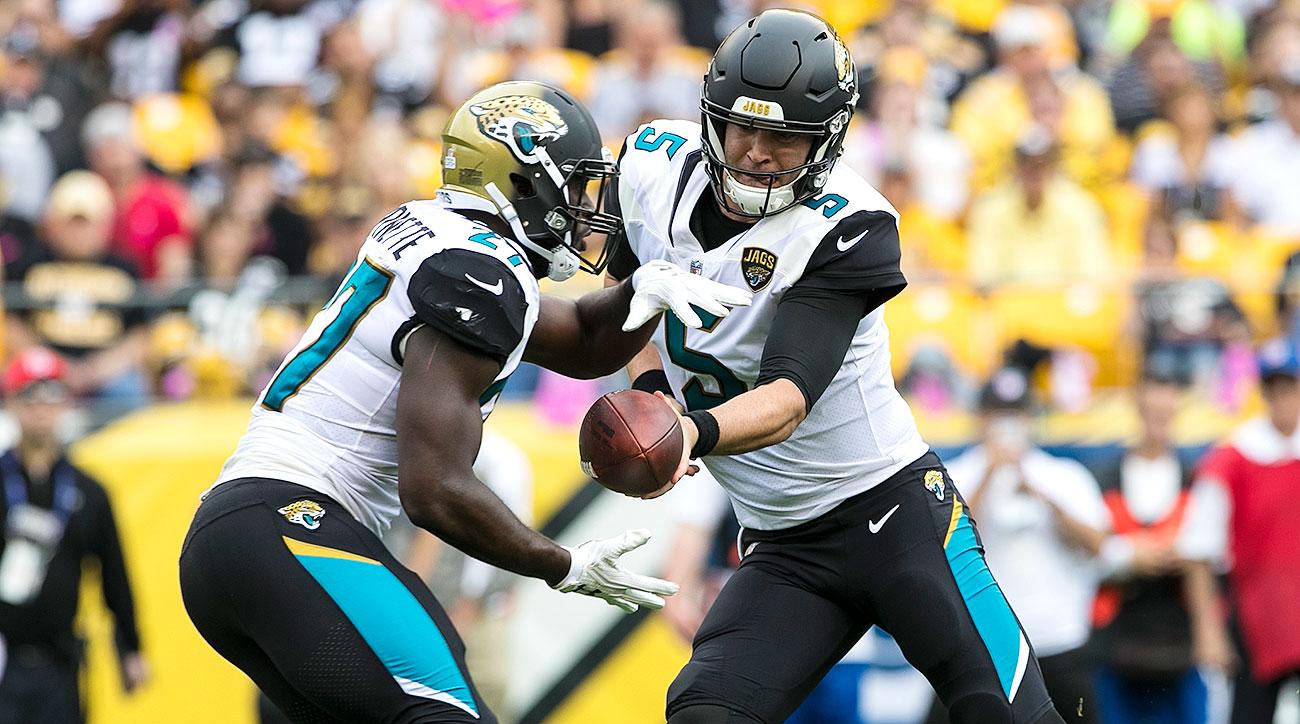
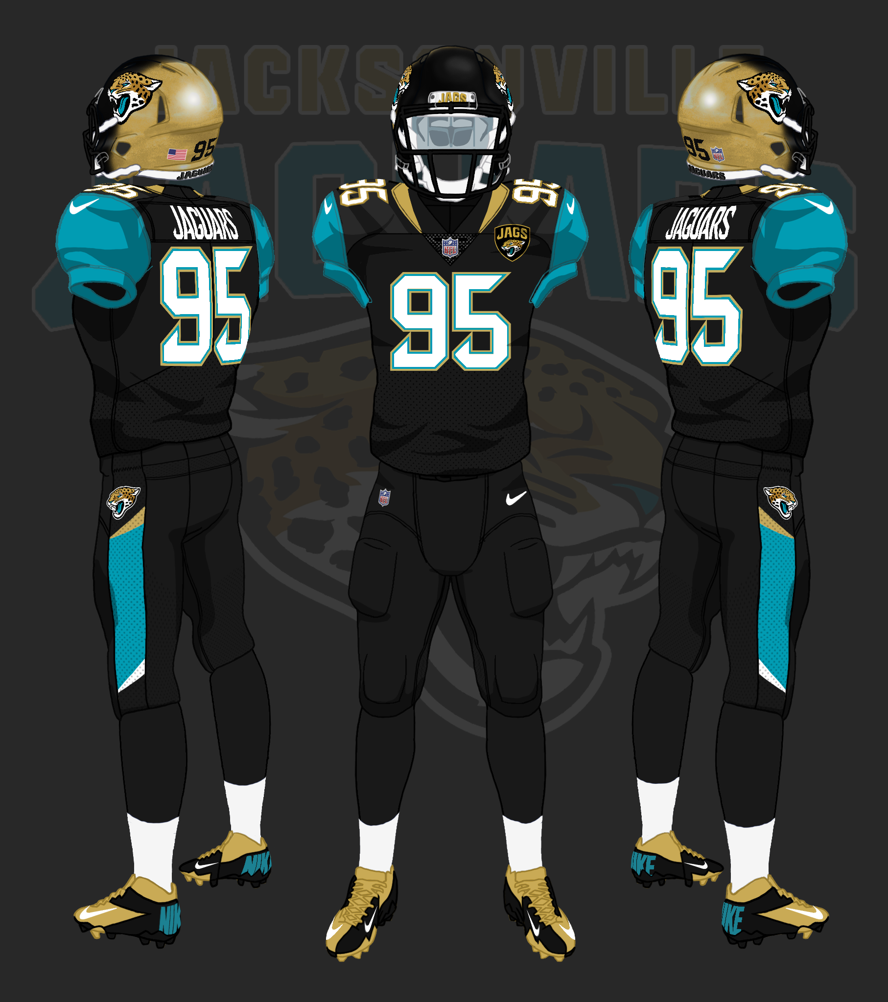
In the NFL, both the Buccaneers and the Jaguars were wearing some really awful unis a couple of years ago. The Bucs’ typeface was particularly horrible:


The Jaguars had an awful two-tone fade on the helmet, and a weird not-really-a-stripe on the pants.
