The Australians ‘92 uniforms are special. Must have been designed by a famous architect or summat.
I would think the worst thing about a Jacksonville Jaguars uniform is that it informs the viewer the player is employed by the Jacksonville Jaguars.
Anyway, I just now remembered the Vancouver Canucks’ “stick in rink” logo, which has actually served the team in two long stretches:
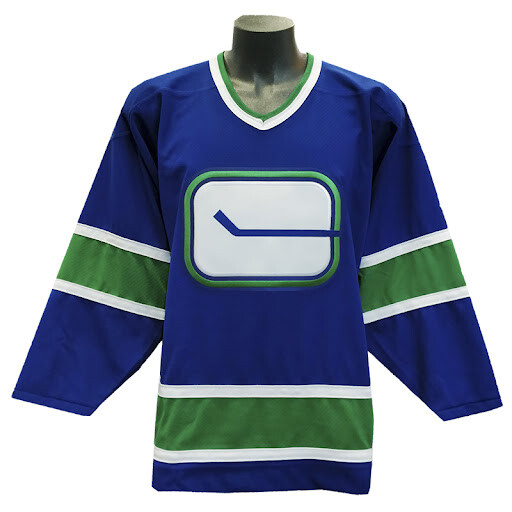
Yes, that is really a sweater they wore in professional hockey games, a logo that is just a hockey stick. It is the only example I can think of in a major North American professional sport where a team’s logo is exactly as appropriate for all a team’s opponents as it is for the team itself. It would be as if a basketball team’s entire logo was just a pair of shoes. Truly, this is a hockey team’s uniform that clearly, unambiguously states to the observer, “we are a hockey team.” I presume Vancouver fans would chant “LET’S GO HOCKEY.”
That reminded me! In those same 1992 Summer Games, the Lithuanian men’s basketball team was sponsored by the rock band The Grateful Dead (true story!), and the band provided the team with tie-dyed uniforms. They won the bronze medal in Deadhead gear. ![]()

In baseball, I’ll submit the Padres’ early '80s unis. “Welcome to Taco Bell, may I take your order?”

What that sweater needs on it is an angry fisherman.
The Raptors’ original road kit looks like a combination of a child’s duvet cover and the carpeting of a Las Vegas casino.

The Denver Broncos’ original uniforms were an ugly-ass combination of a mustard yellow jersey and a brown helmet and pants.
That’s an excellent example. My understanding is that the Broncos, who were strapped for cash in their early days, bought those uniforms from a defunct college all-star game. As ugly as the color combo is, it’s the vertically-striped socks that stand out as the “lowlight” of that kit.
I’ve also read that, when they retired those uniforms in 1962, they held a public burning of them. 
Challenge accepted
They remind me of that old joke about the naval captain who is faced with ten pirate ships.
“Number One, fetch my brown pants.”
You need a more mainstream example, that’s really on the fringe.
THAT is what you came up with for the Vancouver Cancuks?

I happen to like the hockey rink “C” with a border of forest green in an ocean of blue. Also the green and blue seem to be the colours of the “PNW” although Vancouver is really the south west.
That orange shit is an abomination. The orca wasn’t much better.
I like it, but can’t fully disagree.
No disrespect to our Ozzie cousins, but no, those don’t even crack the top 50. The 1984 unis are dated but cheerful, the '92 ones are mildly tacky, and the worst you can say about the '04s is that they’re aggressively bland.
You’re going to have to do much worse than that to earn a place in this conversation.
And, those Australian “uniforms” are from the Olympic opening ceremonies (which is a parade and stage show) – if they actually made their athletes compete in those, it’d be a different story.
::getting the warm fuzzies over the Canucks’ “V” jerseys::
A Godsend of Pulchritude.
Thank-you, whichever Higher Being was responsible.
I love all those uniforms. I think they were fantastic, and completely appropriate to symbolize those particular teams. The rainbow stripes of Houston, the brown and yellow of San Diego, the pillbox caps of Pittsburgh, and the giant, floppy collars of Chicago will always be the best icons for those teams in my mind.
With that huge, multicolored V pointing at the players crotch, it looks like the perfect costume for the opening scene of a gay porno movie!
Wow - those are really bad! They remind me of the female protagonist from the 80s miniseries “V”.
The Columbian women’s cycling kit of 2014 still takes the prize, by a mile.
