Yes and no. Maps do not usually focus on the oceans and seeing the coast of these countries linearly looks unfamiliar. The map is not complete since inland waters are not represented. From the coastline alone it is hard to get a sense of relative size. But from the perspective of the ocean, all may be well. It’s a strange but striking approach.
I remember once seeing a map where Sweden was labeled “Good Porn” and Japan was labeled “Very Bad Porn”.
Sounds like a very useful map
But that is not supposed to be a map of American Native American tribes before contact with Europeans, that is his idea of what American tribes would be like in 2015 if Europeans had never colonized. It is a “what if” , thus not “wrong”.
China, too. I think we should all just accept that the Vietnamese are badasses.
Also Cambodia and Laos lost to Vietnam
The title of the map is “North America Prior To Illegal Immigration,” which pretty strongly implies some reference to pre-1492 North America, so one can be forgiven for being rather confused as to what the map is meant to show.
Yes, but if you look closely it is dated 2015, so the idea is that no euro immigrations.
Some new interesting ones. And less so.
It does happen like that, tho.
Ms. Smart was convicted of murder in New Hampshire in 1991 but has been housed in Bedford Hills Correctional Facility for Women in Bedford, NY since 1993.
Two of the young men convicted in the same case served the bulk of their time in Maine.
I can list other cases; this does happen more often than most people realize.
Here’s a subway-style map of the Continental US Interstate system, as of October 2017:
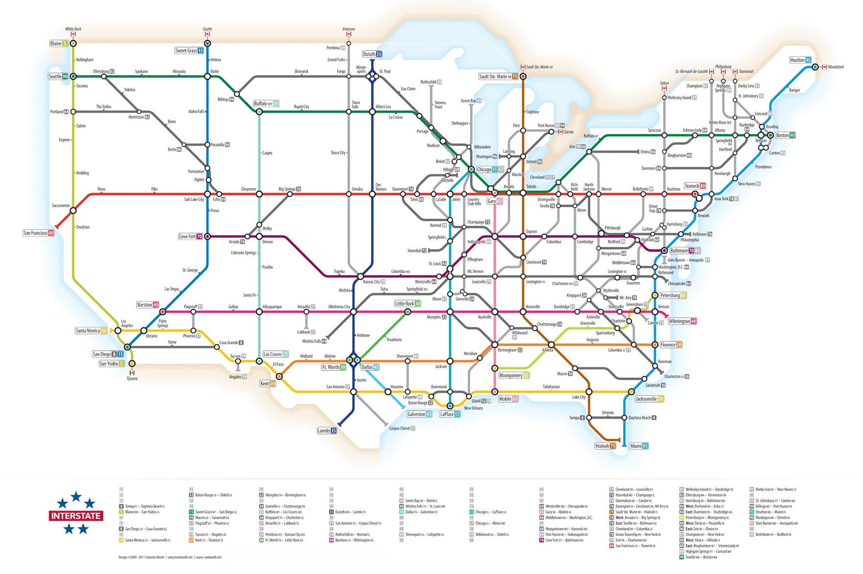
That reminds me of an exhibit I saw at the The New York Transit Museum about the evolution of the subway map. Early maps attempted to convey exactly where the subway lines went relative to above ground features. It was pretty revolutionary when one map designer realized that for a subway map the above ground world is extraneous information. All the map really needs to convey is the general direction the line goes, and where it stops.
Cool! I would love to have that for Europe!
That’s pretty cool. Surprised how many far flung stations I don’t really know. Canada is a big place, but America is about as wide and nearly as girthful. Not that I made that word up or anything.
I had heard that things were a little rough in Detroit, but thought things had improved? Guess it was just the weather. Maybe the availability of decent hummus in the southern half of the state.
I like it. I’m a cartographer/GIS programmer…and, but I digress.
Those maps where first developed by Harry Beck. For London’s Tube system (subway).
Much, much easier to read at a glance.
It’s a schematic.
From Wiki - Tube map - Wikipedia
The first diagrammatic map of London’s rapid transit network was designed by Harry Beck in 1931.[1][2] He was a London Underground employee who realised that because the railway ran mostly underground, the physical locations of the stations were largely irrelevant to the traveller wanting to know how to get from one station to another;
Now that I think about it, there is a Midwest, but not a Middle West. Maybe I am just badly informed. There isn’t going to be a civil war in the US anytime soon - but if there is, well, maybe we will get to rename some of the regions? It kinda has a ring to it. ![]()
Well that is a nice redditrabbit hole you sent me to.
Ain’t it great?