CGP Gray really likes one of the 3 finalists
The one he calls polaris tri-color
Brian
CGP Gray really likes one of the 3 finalists
The one he calls polaris tri-color
Brian
Looks like they’re down to the final choice, although there are details they still need to decide:
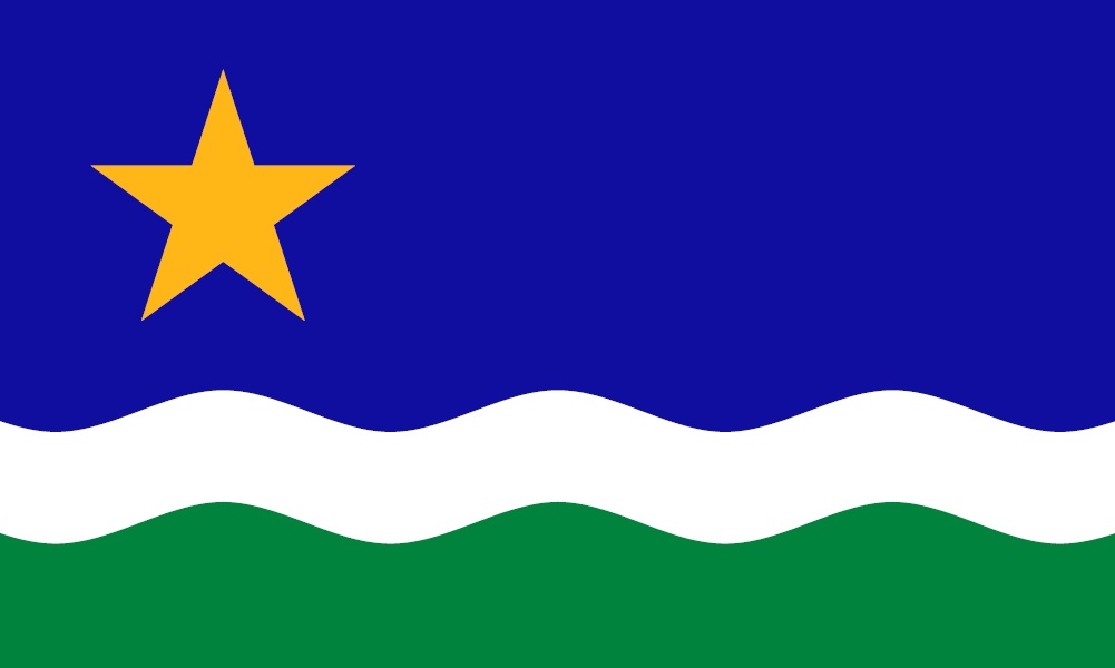
Personally, I like it. Especially the one with three different colored stripes. The star probably should be the one that was originally submitted for this, which had two different lengths of rays.
I agree with this. The stars in those four flags look more like a sun at first glance.
Aaaannd we’re done:
It looks like a credit union logo. I preferred the original star, too.
That’s cold. Spot-on, but stone cold.
I salute you, Good Sir.
I don’t get why they ruined it by removing the stripes. That was what made it look like a flag.
Umm, umm, this Minnesotan agrees with you. The original star please. Though, come to think of it, the original star looks more like the star in my credit union’s logo. True 'nuff.
Also, as a Minnesotan, I do despair the removal of green from the flag. Minnesota is lush with green during the summer.
I do like that our state’s outline is somewhat mimicked by the inverted triangle shape.
Yeah, the stripes were better. And I’m not a big fan of flags using two different shades of the same color (blue, blue, and white).
But hey, it’s not another seal-on-a-bedsheet, so there’s that.
One plus of the light blue – when the flag is vertical, you have the north star and Mississippi River flowing south. Apparently the star is the same is in the capitol
Brian
JUSTICE FOR LASER LOON!

The last I heard, the committee had made a choice of which flag to recommend to the legislature, but the legislature hadn’t accepted it, yet. Did I miss the final step? According to the last article I read, the legislature could make “tweaks” to the recommended flag - such are putting the stripes back.
Yes, anything could happen until signed into law. Even if approved or will not show up until May 11 (statehood day)
Brian
Disappointed in Minnesota - the version with the blue and green stripes is much more striking. This one looks a bit more generic. IMHO, of course, which - since I’m not a Minnesotan - means bupkis. Still, it’s better than the boring seal-on-a-blue-bedsheet they had before.
Laser Loon is not happy to be slighted in this way. You won’t like it when laser Loon isn’t happy. When Laser Loon isn’t happy, people die!

The new flag is meh. Not terrible, not great IMHO. Certainly not in the same league with my favorites: Ohio, New Mexico, Maryland, Indiana and Arizona.
So now the North Star is the Star of the West?
I liked the first design that started the discussion.
But I felt the star should be white and in the middle-top and have 32 waves representing Minnesota as the 32nd state. The one decided on is blah which is probably why it was chosen.
The winning designer also had versions with a somewhat asymmetrical dark blue, more true to the shape of Minnesota, with the star further “up” in the larger portion. They went with a totally symmetrical design so the flag could hang vertically or horizontally.
As a native of the state, I like it, even though some other designs were more interesting. I look forward to seeing it in a lineup with other state flags, such as the avenue of flags at Mount Rushmore, just to see how distinctive it looks.
Yes, I think it would be much better to have it be a more asymmetrical dark-blue mass, to more closely represent the outline of the state.
On that, I disagree. It’s evocative of the shape of the state, but it’s a very simple shape that evokes that shape. Simplicity here is more important than accuracy.
If they went with the three-stripe design, aligning the inflection with the boundary of the lower stripes would be simple and elegant.