Got no dog in the fight but the “northern lights over a river” impression works ok on a static representation … would look rather giddying when unfurled and flapping in the wind … and I understand there is a bit of that about up that way.
MN Flag is still being debated, but the basic design of the state seal has been approved:
I like it.
Brian


Me too.
Birds are good.
As someone from Minnesota, I’d say copying Canada is aspirational. We could certainly do worse. I wish the loon would have made it to the flag though.
It’s time to get rid of all the remaining CSA state flags- Georgia first.
But also Arkansas, Alabama, and Florida.
Not to mix metaphors, but Georgia’s flag is a sneaky dog whistle. They could have come up with a nice design like Mississippi. Their first attempt was widely ridiculed for how terrible a design it was, but the current one is sneaks in a CSA design in the hopes no one will notice.
Sneaky? Its damn obvious.
Blue and green, sure. But that last one, with the reversed chevron… The lines are fine for a flag, but those particular shades of blue and green are practically a cure for insomnia.
The bottom middle one, I think, isn’t bad, though it’d be improved by giving the concavities in the blue four-pointed star sharp corners instead of the slight curve that’s there now. You wouldn’t notice the difference, but it’d be that much simpler.
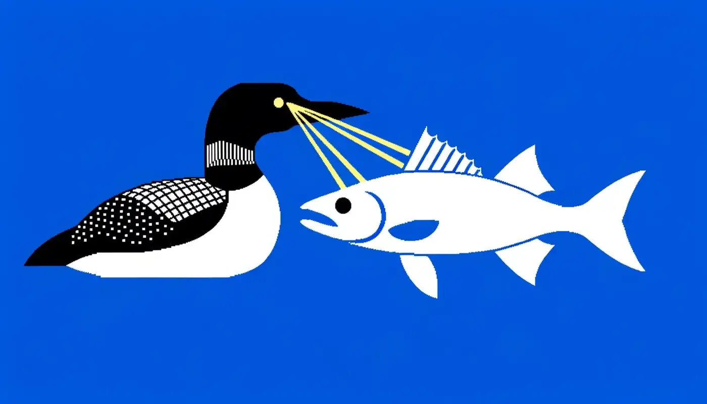
Y’know, it’s kind of an ass move to do the whole thing of birds with laser eyes w/o duly crediting New Zealand, who brought it up in their own flag kerfuffle from a couple years back.
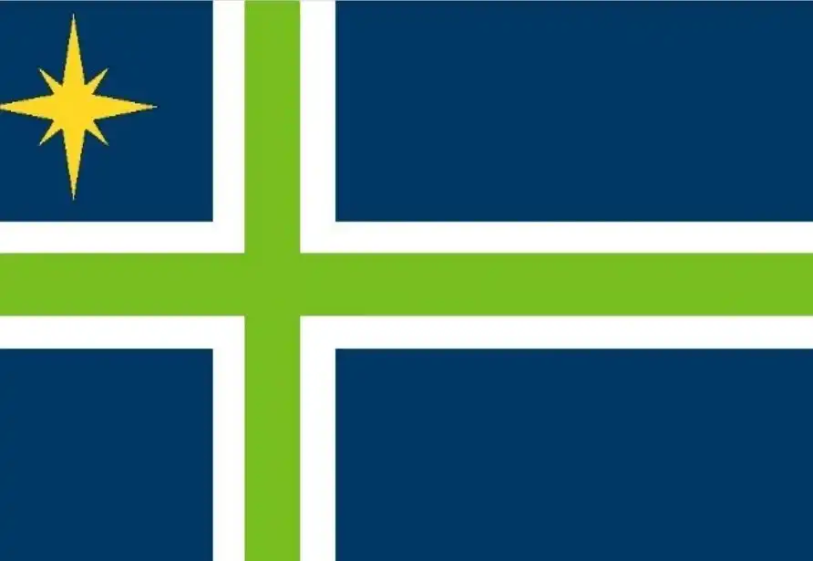
Of the ones that didn’t make the finals, I rather like the use of the Nordic Cross in this one, I assume meant as a nod to Minnesota’s Scandinavian heritage. The star in the upper left looks a bit out of place, though. ETA: And it would probably be better to have a flag that represented all Minnesotans, not just the ones with Scandinavian roots.
Of the loon based submissions, this one is rather nice. Probably a bit too detailed according to the rules of vexillology, though.
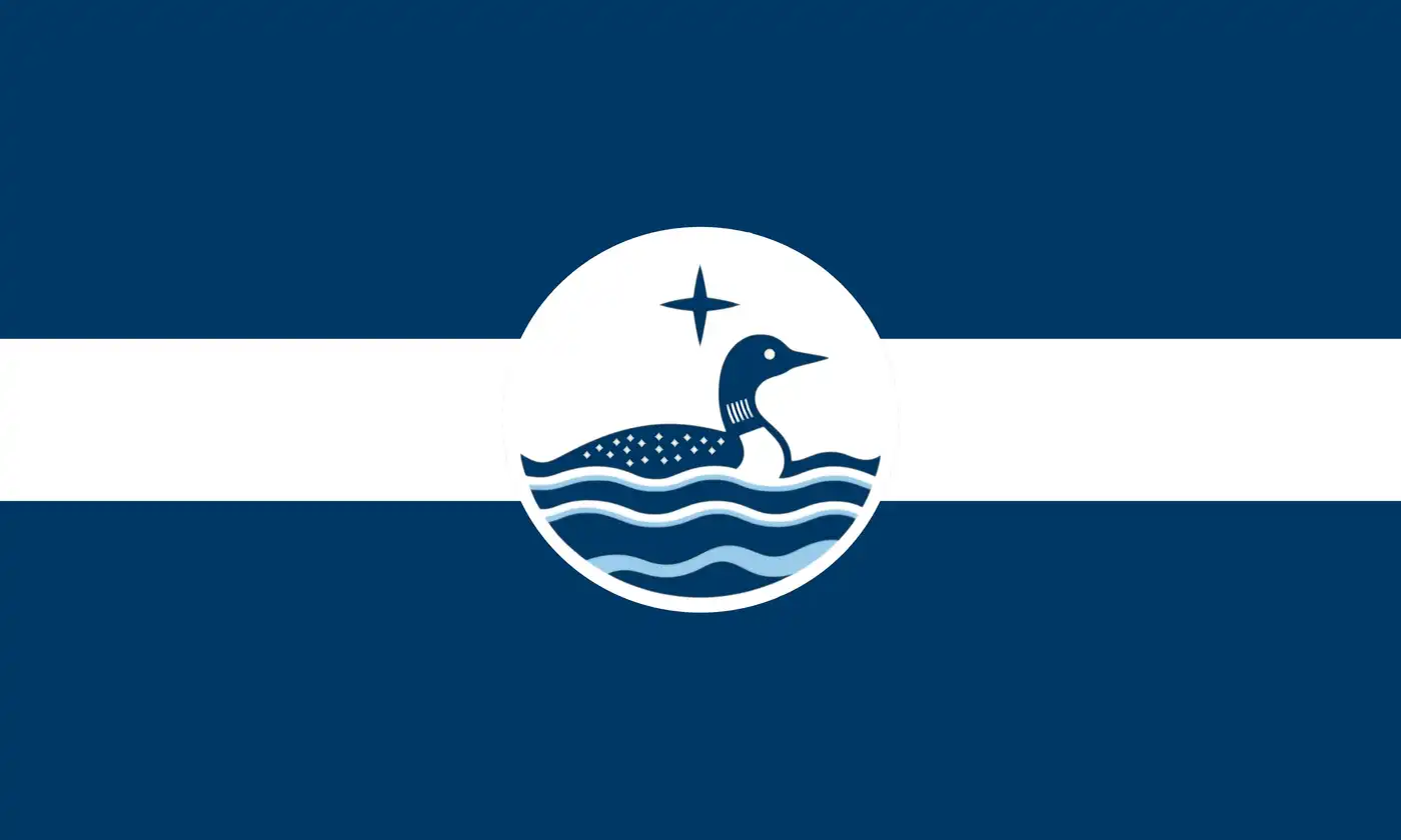
I like that one too, but it looks almost as if the designer decided to put a Canadian dollar coin in the middle. The resemblance might not be quite as striking if somehow it could be simplified.
I’d guess if you showed that flag to 20 random people, maybe 1 would know it’s based on a CSA flag. I showed it my Ph. D educated wife, and she didn’t know that it was based on a CSA flag.
That flag was one of joke submissions for the contest.
Someone must have been watching the CGPGrey channel.
As I and others mentioned in one of the old threads about that, if they had just reverted to the pre-1950s flag it would have been far less obvious.
That flag and the new flag are obvious call outs to the actual CSA flag- the stars and bars. The flag wil the cross was the battle flag, not the national flag.
But the current one is not an obvious call to the stars and bars, it IS the stars and bars, with the addition of the GA seal. The Pre-1950s flag would at least make some people wonder if they were ripping off Texas or NC.
The GA state flag totally IS a CSA symbol. And the Southerners who it’s aimed at totally know that. Both the Whites and the non-Whites.
There are probably many northerners and folks who’re not from the USA who would not recognize the flag’s provenance. As @gnarator said. But those folks are not the target audience the flag is aimed at.
The flag is what it is to tell southern non-Whites that they are not welcome in GA except as prisoners, and to tell the southern Whites that in the state government’s official opinion, the South in all its odious slaving traitorism lives on today and will rise again.
My wife is from Kentucky, with family in Arkansas. She did not recognize it as CSA flag. Everyone thinks this was the CSA flag, aka, the Confederate Flag:

I thought Georgia was being sneaky, especially compared to their '50s flag (or Mississippi’s).
That’s the Confederate battle flag. The current Georgia state flag is pretty clearly based on the Stars and Bars, the first Confederate national flag.