If I saw the 50 US state flags flying in random order, the ones I could pick out are Ohio, Washington, California, Maryland, Connecticut and Massachusetts.
Ohio’s flag is distinctive.
ETA: And New Mexico and Alaska.
If I saw the 50 US state flags flying in random order, the ones I could pick out are Ohio, Washington, California, Maryland, Connecticut and Massachusetts.
Ohio’s flag is distinctive.
ETA: And New Mexico and Alaska.
Yeah, you might think it’s great. You might think it’s terrible. But there’s just no way that you think it’s normal.
That’s the one with the fish poking it’s tongue out, yes, no?
I would have thought the primary mark of a good flag is that, in a military conflict your allies don’t fire on your troops because they can’t distinguish your sovereignty.
I think Ohio’s flag wins the “easiest to press into service as a superhero’s cape” contest.
Yet another point (well, two) in its favor!
Minnesota’s new flag designs are being reviewed by a panel today. The goal is to pick 5 finalists from the thousands of submissions, some of which are good, some bad, some hilarious, and some tongue firmly in cheek:
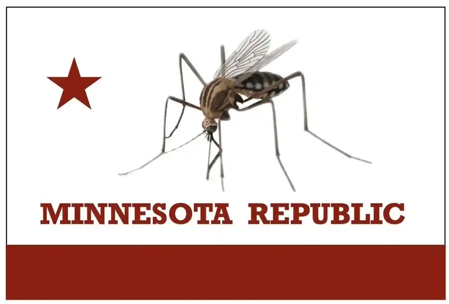
Should be clearly blood red. ![]()
California should have no objection. ![]()
Never Mind.
…and here are the finalists. Color me underwhelmed.
https://bringmethenews.com/minnesota-lifestyle/here-are-the-six-finalists-for-the-new-minnesota-state-flag
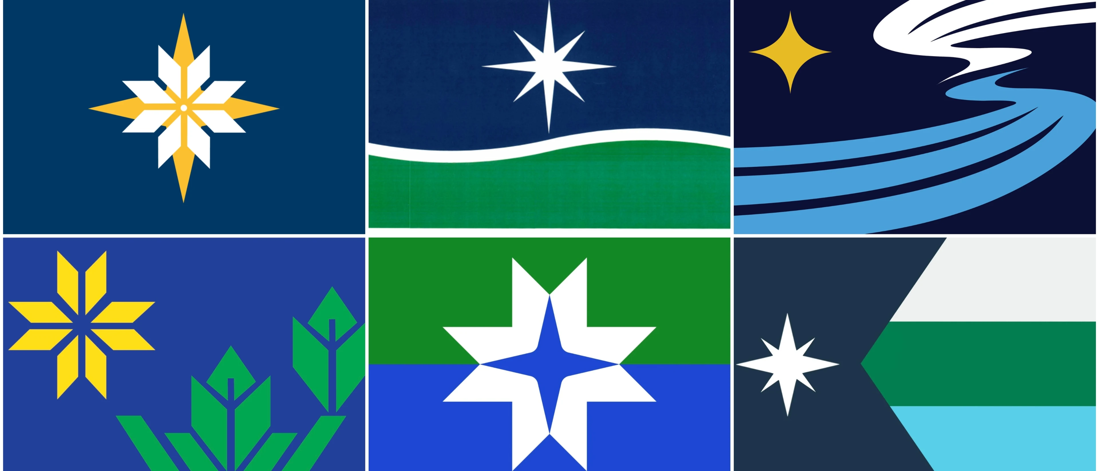
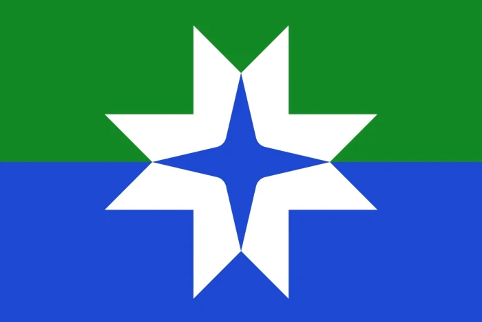
The two in the centre are not horrible. I presume the imbalance in the image in the middle bottom panel is from its being cut off, and not because the star-thing is off-centre.
I presume that there’s some sort of locally-well-known significance to eight-pointed stars. And also to drab, boring color schemes.
I like the three at the top, and the one in the middle of the bottom row; though shouldn’t green be down and blue be up if we’re trying to represent the grass and the sky?
Guess we’re not representing that.…
Apparently, “Star of the North” is a nickname that the government/tourism board uses.
shouldn’t green be down and blue be up if we’re trying to represent the grass and the sky?
I would speculate that the blue is supposed to represent lakes and rivers.
Yes, cut off. You can see the full design in the link:
Not really. The state motto is L’etoile Du Nord, Star of the North, so I presume they are stars, with some also doubling as snowflakes. Though I thought snowflakes have 6 sides.
Blue and green for lakes and forests, I presume.
Could be a lake in the forest, Land of 10,000 lakes and all.
I wonder if either the tilte needs to be changed, or have the Minnesota stuff moved to a new thread.
Anyways, I agree the choices are underwhelming. Aesthetically I most like the snowflake+star one, but to me it doesn’t quite look like a complete flag. The split wavy one looks the most flag like to me, though perhaps if the same colors were used with the one with the reverse chevron and three stripes, I would like that one.
Minnesota means “Cloudy/Sky-Tinted Waters” so many used it to represent “Minnesota”. I think others used it for the 10,000 Lakes or headwaters of the Mississippi River.
![]()
From the Land of Sky-Blue Waters
[several variations in the lyrics over the years]
Hamm’s, the beer refreshing
Hamm’s!
![]()
Apart from the fact that it deviates severely from the general principles of vexillology, I kind of like the one at the upper right.
The one in the upper left has the problem of putting white on yellow. There’s a very good reason that’s against the rules of heraldry and it applies to flags too. (It’s hard to distinguish the two colors from a distance.) The guy who designed it actually made a flag. I’ve seen it and it has that exact problem.