Colorado does that – but, oh so stylishly.
I almost mentioned that, too. That’s definitely a “Co”, there. It still shouldn’t be a pass, but they do get some points for hiding it.
I do disagree with the premise that smaller words are better than bigger ones. If you want to deduct points for words, I’m all for that. But if you do have words, they should be clear and legible. Making people squint at your flag to make out the writing is worse than something readable.
I don’t have any problem with the Colorado C. It does look good.
I noticed that he gave the reverse of Oregon’s flag a pass. It’s a picture of a beaver which is totally different than the front, which is the usual seal on a blue bedsheet. He suggested that we adopt that as the flag.
Ain’t gonna happen. The tribalism between the two large state universities will preclude that, since one of them has the beaver as their totem.
He should have given Oregon a special ultra-fail for the two-sided flag, since that makes the flag extra heavy and it doesn’t fly in the wind as well.
Ohio is kind of ambiguous… Is it an O, or is it just a circle?
But nobody even notices that, thanks to the weird shape.
(and I, for one, like that my state’s flag is weird)
Washington needs a name change. I think it should be renamed “Edge” – partly because there are no states with names that begin with E, partly because the postal abbreviation would be EG and partly to reduce confusion with DC and the State of Western Australia.
I have to disagree with a bunch of CGP Grey’s rankings. Alaska definitely deserves S-tier, for one reason above all else: you have a really high probability of guessing the state from the flag alone (without needing any extra text, and just with basic state knowledge).
New Mexico and Arizona also seem pretty Southwesty, and while they’re not quite as guessable, they’re still pretty good.
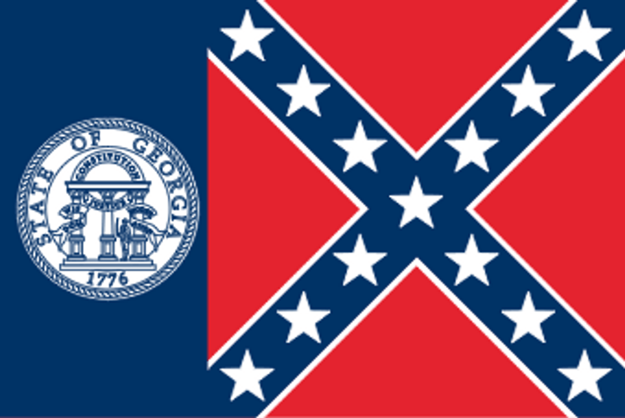
An instant fail, much more so than having the state name, should be if any of the elements are illegible at thumbnail size. A flag has to be legible at a distance, and it’s a fail if there are significant parts you can’t see. Georgia should be an FB at best because of that thing in the upper left. I have no idea what it’s supposed to be, and certainly can’t read the words from a distance. Also, negative infinity points for “In God We Trust”.
Illegibility of course excludes all the state seal flags as well (which would be excluded anyway for lots of reasons).
North Carolina should be a fail not because of the NC, but because of the banners. Again: unreadable.
Utah’s new flag is fine. The beehive does nothing for me and I think it’s a little busy, but the mountains make me think of the western states in the area. I think I’d have a 25% chance of guessing Utah if I didn’t know about it already.
Texas? It’s fine, but you don’t get S-tier for a child’s version of the American flag. An A at best.
I’m biased towards the California flag, but I think the bear is a highly recognizable symbol, and the flag would have a strong association with the state even without the words. And the words are readable in thumbnail size, anyway. It’s a solid B, at least.
That knocks out the US flag. No way those 50 stars and 13 stripes are legible at thumbnail size.
Way back in 1852, the settlers north of the Columbia River petitioned Congress to become a territory named after that river. When it got to the floor of the House, someone rose to object that they already had a District by that name, so it should be changed to avoid confusion. Someone else suggested naming it after the first president and a wave of patriotism carried that motion. One of Congress’s more ironic moments.
This can be fixed just by changing the abbreviation. I know that Wn. used to be a state abbrev, but I can’t remember if it meant Washington or Wisconsin. But whichever, it wasn’t in all that common of use and it’s so long in the past, I think it would be safe to recycle WN for Washington state.
Not that I think it’s likely to be changed. There has only been one change to the two-letter state abbrevs since they were introduced. That was to change Nebraska from NB to NE, which was done in 1969 at the request of the Canadian post office.
The stripes are pretty legible, IMO. The 50 stars I mostly agree with; there are just too many. I’m not sure it rises to an insta-fail, but by no means is it a great flag. I’ll give it a C.
By “thumbnail”, let’s say the size of the flags on the Wiki page:
The text on the Spanish and San Marino flags is illegible, so that’s a fail. You can see the 50 stars on the US flag, but they’re basically points and you can’t tell they’re stars. So, points off for that.
I’ve been a longtime fan of CGP Grey and I loved all the callbacks to his previous videos. Before he got into YouTube, he was a schoolteacher. He’s been using the women/girls with flags on their skirts as representations of countries and states for years, and he also would depict them as little girls when discussing their early history. A while back he and his pal Brady Haran (Numberphile et al) covered the awfulness of state flags more than once in their Hello Internet podcast. I already had a good idea how he was going to rank most of those flags, including Maryland’s. I bet he fell over himself with glee when he saw Utah had a new flag, and with a hexagon and a bee(hive)! He produced this video in record time, for him.
It’s quite a common opinion, among the sort of folks who have opinions about vexology, that the US flag is a pretty bad one.
Personally, one of my standards is that a grade-schooler should be able to draw a recognizable and reasonably accurate picture of the flag, freehand.

or someone a little older
Watched the CGP Grey video yesterday as well.
I actually don’t love the new Utah flag. It’s miles better than the old one, but I agree with those suggesting it looks like a corporate brand logo. I think the flaw is with the choice to add the mountain silhouette and the beehive. It’s one design element and one color too many in my opinion. I might suggest that simply incorporating a hexagon might have been enough, they are already associated with bees and the hive design is a little too on the nose. Similarly, the negative mountain design could be great by itself, but the double border hexagon, beehive and star are just noise. I know stars are de rigueur for US flags, but this one is totally useless. Lastly, red, white and blue are also unavoidable in US flags but here they take what might have been an original design and make it pedestrian.
A field of just 2 colors and a yellow beehive would have been awesome.
The fundamental problem with the attempts to codify the State Flag Rulez is that they always expect state flags to be more distinct and memorable than the states themselves. That might work for a handful of states–Ohio has gotten a lot of mileage out of taking some scissors to its flag–but not all of them.
Lower Alabama (and Florida) were once part of the spanish empire, the Cross of Burgundy - Wikipedia strongly resembles the current flag. I think the origins/intent of Alabama’s flag are murky.
Yeah, but odd that the flag didn’t come out until after the Civil war…
Well, maybe. The Alabama flag is a saltire, like the Confederate battle flag (not the Stars and Bars), but that’s really all they have in common. Racism is always a suspect in any such decision by a Southern state, but the racists weren’t typically that subtle: 1956 Georgia flag, 1894 Mississippi flag.
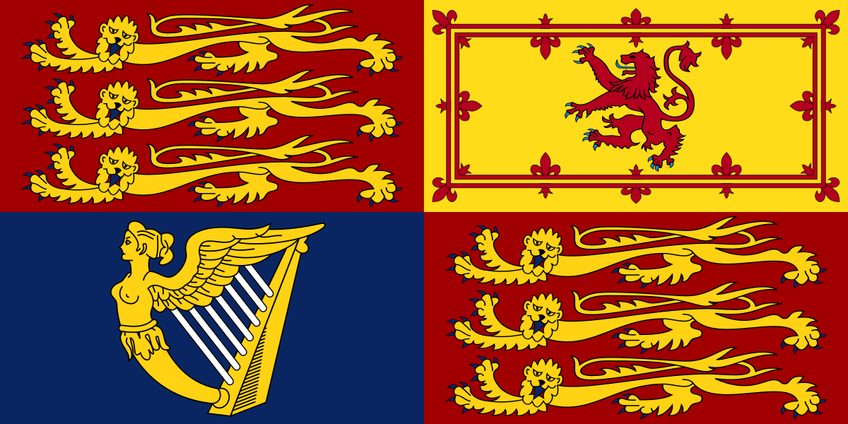
It does seem a little odd that Alabama would adopt the standard of England. Perhaps because Alabama was not in the American Revolution, and England is where White people come from.
The standard of England is the Royal Standard:
The English flag is the cross of St. George:

Not quite the same.
Alabama’s flag is supposed to call back the cross of Burgundy, flown for New Spain, but I’m a little suspicious, as it seems to suggest the Confederate battle flag.
The real problem with the Texas flag is that it is too similar to the flag of Chile: