When people are trying to find you and kill you, not standing out has its place. I expect the Fremen to be drab.
OTOH, I expect ceremonial armor and costumes for nobles to be anything but.
When people are trying to find you and kill you, not standing out has its place. I expect the Fremen to be drab.
OTOH, I expect ceremonial armor and costumes for nobles to be anything but.
That must’ve been what Ben Stiller had in mind in Meet the Parents.
The baron wore anti-gravity devices so he could walk unhindered, the book never remotely, in any way, at all describes him as floating around like a balloon. Lynch’s portrayal of Baron Harkkonen is distinctly at odds with the book, and makes him into more of an absurd caricature than a clever, plotting, gluttonous villain.
The cat milking was part of Lynch wanting to throw in something that was just weird and served no sensible purpose, and that contributes to his making the Baron look less intelligent. The cat milking requirement is just some bizarre harassment (it’s not even really torture), while the book’s Baron giving Thufir a long-lasting poison and then continually giving him an antidote so that he will simply die if he ever escapes and can be easily killed by witholding the antidote is much smarter.
Like I said, I don’t hate Lynch’s adaptation, but it doesn’t do a good job of translating many of the characters to film, and it decides to make a lot of gratuitous changes to major characters and plots like turning Baron Harkonnen into a dumb balloon, using weirding modules, adding the rain at the end, and so on. I don’t mind changes that are needed to fit the book into a movie format or that explain missing information in the books, or editing like removing sections that won’t film well (like Tom Bombadil in LOTR), but I really fault an adaptation that radically alters major characters just to indulge the filmmaker’s taste for the weird. And, of course, Cat Milking is in it’s own special category of changes, lol.
I see that there’s a 3 hour Alternative Edition fanedit of the Lynch movie on YouTube:
 Alternative Edition Redux fanedit (original 480p edition)")
It seems to be highly rated, and seriously and professionally re-edited over a period of years.
Here is a list of all the changes, including a new ending without rain.
There is a bit in the book, where Thufir gets captured, that describes the Sardaukar floating down a cliff face on suspensers to ambush Thufir and the Fremen he’s with. Probably the inspiration for the floating horde of lit-up troops bit in the trailer.
Thanks, GW! That looks very interesting.
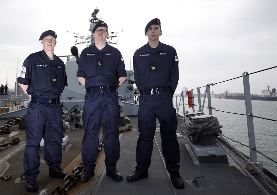
Like the gaudy and elaborate clothing the military wears in Iraq and Afghanistan? The Atreides are landing on a hostile desert planet that they know has been seeded with traps by their enemies; they’re wearing uniforms. Of course, military uniforms can be colorfully bright, even garish; but soldiers and sailors’ working fatigues tend to be subdued. (That last image is Royal Navy uniforms, lest you think me too America-centric.)
By “naturalistic”, I mean that perhaps Villenueve is going for what would seem realistic and appropriate to a 2020 audience. When Lynch made Dune in 1984, the country hadn’t gone through a 20-year war that has made us fairly familiar with images of soldiers in muted khaki or camo. Nor had we then had a decade or so of films that played with the real-world consequences of fantastic elements – Iron Man suffering PTSD, for example, or the consequence of the world’s most powerful telepath developing dementia. Hard to judge from a three-minute trailer, but that’s what it seemed Villenueve was going for.
Yeah the newer picture looks like they are there to attend a conference on corporate real estate or something (which in a sense, I suppose they are).
See that looks way too “Arabian Nights” to me. The description of Fremen ‘formal’ wear is buff/black and I think Bedouin. I guess Tuareg fancy dress would be fine, but it doesn’t quite comport with my mind’s eye from when I was reading the novel. The Fremen became an army of religious zealots and I can’t help but picture them as spartan (not Spartan) in dress.
Similarly the Sardauker are described as wearing gold-trimmed grey and black.
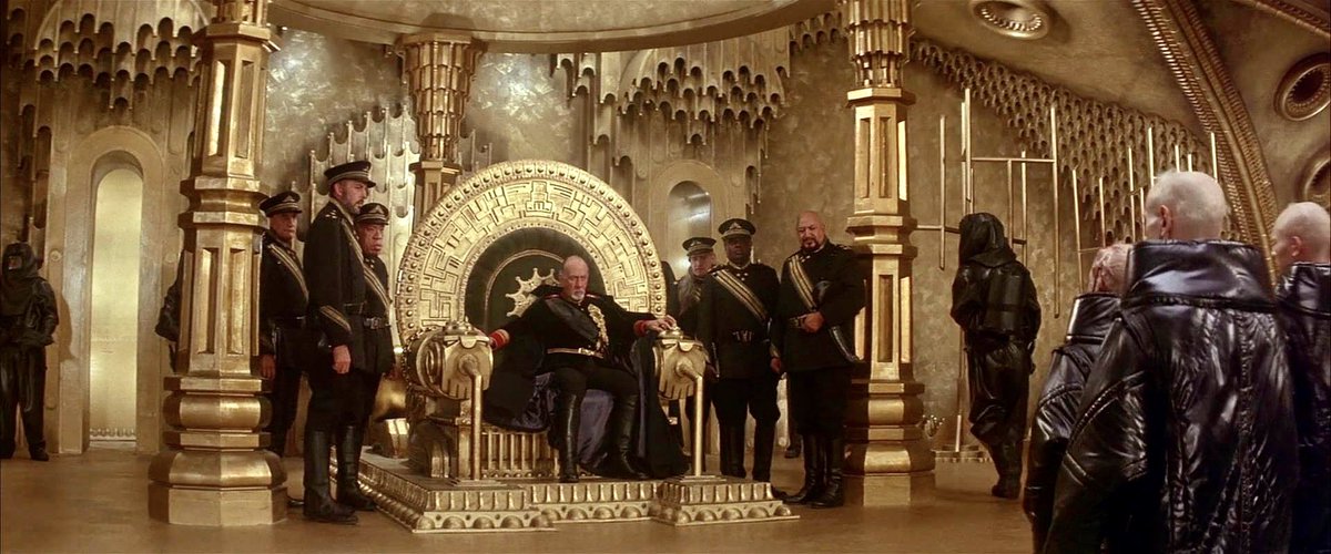
It probably says a lot about me that I vastly prefer the new picture to Lynch’s conception ![]() . I don’t like baroque and bright. I prefer austere and minimalist. You guys are going to hate the imperial fashion sense when I become God-Emperor.
. I don’t like baroque and bright. I prefer austere and minimalist. You guys are going to hate the imperial fashion sense when I become God-Emperor.
Nefud is a character from the book. Herbert likely knew what Al-Nefud was and made a clever reference to it with the character name.
Blocked in the US.
I believe way back when we were discussing the SyFy series in first run, I made a comment to the effect I would have very much liked to have seen the SyFy script with the Lynch aesthetic.
The men of House Atreides and the Corrino high command in the Lynch film tended to go for a look more akin to uniforms of the late 19th/early 20th centuries and the ones royalty of our time still wears – stylish but not overly exhuberant.
But the Lynch version has much less of the indoors court-intrigue material that would really bring up the chances for people to get all fancied up. The SyFy series has more and it went all the waw to the opposite extreme when it comes to flamboyant outfits, including, yes, the absurd hats (which looking at that picture, y’know, are not that bad relative to everything else…).
…
BTW some of the silly hats in the SyFy miniseries may have been another tip-of-the-hat (ha!) deal. Jodorowsky had intended for Jean (Moebius) Giraud to do designs for his film together with Giger, and he could so some far-out headgear when he put his mind to it. Tell me these Navigators are not Arzach homages.
On the topic of the trailer’s aesthetics and color palate. I think there’s basically 2 approaches which mirror recently produced films.
Clearly Villeneuve’s Dune is going to be the former, and since he directed the first that’s no shock, but personally I wouldn’t want to see a Dune that looked like Fury Road. Dune, the book, to me is about guerilla war, a nomadic existence, almost a steampunk-esque style of technology, religious zealotry, industrialism with a sprinkling of quasi-naval warfare.
Extending that idea, seeing the Atreides or Harkonnen or perish the thought, the Fremen, in anything garish or ornamental would feel completely wrong. The Harkonnens for all their gluttony are modeled after Nazis and aren’t really described as vain or ostentatious. The Atreides, being the good guys, probably shouldn’t be characterized as indulgent or showy. At most, the Landsraad or the Bene Gesserit might have a little flair but the latter is a religious martial art sect where vows of poverty wouldn’t be out of place. they aren’t quite monks, but they aren’t Roman Catholic either.
Villeneuve’s films seem to have a consistent theme of subdued pallets, simple monolithic structures and large geometrically shaped ships silently hovering much in the same way a brick doesn’t.
Another aesthetic I’ve seen is the “bright opulent retro-future that kinda works” as portrayed by Luc Besson (Fifth Element, Valarian), the Wachowskys (Jupiter Ascending, Cloud Atlas) and some of the Avengers films. Perhaps not a great fit for Dune as it can appear overly CGI and cartoonish.
Good examples, but for some reason I equate the feeling of Arrakis to a post-apocalyptic wasteland even though it’s not really post- anything. It’s just a mostly empty desert, the aesthetic that my mind jumps to is Tatooine. Those highly commercial and almost leisurely settings don’t belong anywhere close to Arrakis. I haven’t read the book in a while but I don’t have the sense that the space guild ships are pleasure cruisers, not sure what other settings might get a lot of screentime to create opportunities for rolling out the bright colors.
The Atreides original planet of Caladan was apparently pretty lush and green. Would make for a nice, albeit very brief contrast. However they may not want to waste a lot of landscape art budget on the first twenty minutes of plot.
I assume that’s Princess Irulan with the Emperor; who’s the young dude in red, Feyd-Rautha?
Remind me, how much time does the book spend there? It’s been a long time, but my sense is that the book pretty much begins with Duke Leto and crew arriving at Arrakis.
It’s been a long time for me as well, but my recollection is that very early events like the Bene Gesserit test and Paul’s training session with Gurney Halleck took place on Caladan as they were preparing to move.
I remember specifically that it was usually Duncan Idaho that trained with Paul, but he had been sent ahead to prepare the way before the rest arrived. Basically the house was all packed and they were just waiting for the moving van.
That’s ringing bells, think it’s right. This thread is inspiring me to dig out my copy and do a re-read ahead of the movie.