That’s pretty funny, but I was looking for something much more sinister.
Yup.
This is what it’s all about. As the retired Creative Director of a NYC ad agency, I know all too well what kinds of decisions go into something like this. Everything is intentional.
Then why are you being so arrogant as to assume your dislike of this speaks for everyone, when the fact that it is common means that people don’t dislike it as much as you do?
This projection is weird. There’s nothing remotely arrogant about anything that was done here. You just didn’t like it.
Hell, the actual answer was already posted by the time you complained, as it inevitably will be if you wait. That, again, is how this works.
“But - and I am only saying this because I care - there are a lot of decaffeinated brands on the market today that are just as tasty as the real thing.”
Stranger
Of course there’s more to it. But when explaining the joke to an audience that thinks a national magazine cover (to say nothing of something really important, like a Victoria’s Secret catalog cover) is thrown together with clip art and Word fonts and anything not Beavis-and-Butthead obvious is the viewer’s imagination, I stuck with the silly part that made me laugh.
Just a note that there’s a lot of personal sniping in this thread. Let’s tone it down, please. Disagree if you will, but civilly.
That analysis is at least a little more interesting than simply, “They deliberately framed the photo so the M looks like devil’s horns on his head”. Because not to frame it like that would require that Trump’s picture be small enough to sit below the magazine’s name, and that would generate its own controversy.
How about the fact that Trump is shown looking over his right shoulder? Does that, perhaps, imply that he’s worried about opposition from those on the right?
…and did the London Olympics knowingly choose a logo that looked like Lisa blowing Bart? Did the writer of the article intentionally call Trump’s horns/ears “red” while fully aware that the dark “negative space” of the M forms the better horns?
Nah. Accidents slip in at all levels. Time is not the media monster it once was – budgets get cut, and shit happens when you’re putting out a weekly magazine.
I haven’t worked on many national accounts, but I’m another guy with decades of ad agency/design/photography experience. My own fallible opinion is that the Trump picture’s horns look more like kitty ears, but the placement is perfect. The only rivals that I saw in photo galleries were of Bill Gates and Hillary Clinton, which had red color tints and the horns were exceptionally demonic.
I’m happy to believe the battered French chair and dark studio were intentional choices, but specific shadows and poses are often just a photographer having 30 minutes to shoot, and firing from every angle to try to get something striking. The art directors then pick what’s striking.
The problem here is not that you are so much more sophisticated than the average Doper, it’s that you overhyped an (at best) mildly amusing magazine cover as some epic “OMFG what brass balls they must have” pranking of Trump. Had your OP just said that the placement of Trump’s head in front of the “M” struck you as silly and made you laugh, I doubt there would have been much complaint.
Does anyone know where the photo was taken? Did Trump go to them or did they go to Trump Tower, bringing their chair with them? Because he’s got lots of nice chairs there already.
It was taken at Trump Tower. There’s an entire sidebar in Time about the shoot. So the chair is very likely from Trump’s low-key, moderne-stylish furnishings.
Stranger
The responses in this thread have told me that Dopers are a lot more irritable and thin-skinned than in times past. You’d have thunk I gave you a gift-wrapped empty box for your big Xmas present. This just wasn’t that big a deal and I don’t think I made it out to be more than it was; I think some people are still missing the exact visual anyway. (So as not to be mysterious, superior or irritating - I don’t mean the red lines of the M, which do sort of make bunny ears. It’s the negative space inside the red that make very effective horns. IMVHO.)
Naw, I think anything short of WOW TRUMPY HAZ HORNS HAW HAW would have irritated and annoyed the audience here - and *that *would have gotten others all grumpy. Much less going into some of the detail that other posters did, and which I thought was a little too esoteric and questionable to make note of.
It was a minor yuk on the part of the cover designer. I pointed it out as a minor yuk. I used the highly irritating technique that used to be used by newspapers the world round, back in the day, of giving the puzzle solution the next day instead of on the next page. For anyone who found the point-out amusing, you’re welcome. For those who found something to bitch about… next time I’ll put it in the Pit so you can fully vent your spleens. Happy Holidays.
So does that mean the chair/Louis XV connection was intended or serendipitous? And why did Trump allow himself to be photographed in a slightly knackered chair when he’s got lots of others in better - and more golden - condition? Who even chose the chair?
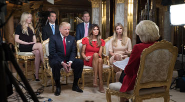
I see Time also photographed Trump’s inner circle (not that one!). I find the photographs quite sinister and off-putting, which perhaps was the intention (or just my own personal bias).
They don’t remark on this, but I think the fact that Trump is looking backward (into the past) is more significant.
I thought he was turning his back on the American people, or at least his primary focus (chair direction) is not towards the camera (the people) but rather, in an insular way, directed away towards his own coterie.
It could just have been that the chair was flawless from the front and that that particular photo was the only angle (of many photos) that captured the decay of the chair, something that the photographer or art director wanted to incorporate.
I don’t know anything that’s not in the sidebar and other comments the magazine has made, but I’d guess that the photographer (and any kind of artistic director involved) controlled the whole process. Trump certainly doesn’t have any staff worth mentioning who might have had input, so a combination of obsequiousness and flattery probably got the photo team anything they wanted.
I’d guess they were allowed to look over Trump’s very fine, expensive, tasteful furniture and choose whatever they wanted; that they convinced him to try the rather unorthodox pose, probably among more conventional ones; that they very much went for the dark, almost gothic tone; and that many of the poses and shots were with the specifics of TIme’s cover in mind. A little selection of exact shot, sizing, position and layout and… voila. A cover that really, really captures everything the man represents without being either flattering or offensive. It’s a mirror of the composite view of a very problematic prez-elect. Very nice work in all respects, silly horns included.
Everyone totally missed the tampon string.
No, you didn’t, and that’s where you went wrong.