At least you’re lucky enough to be receiving Florida quarters. I haven’t seen a single one, and only one Michigan. 2004 is going to go down as the year of the great quarter shortage. Probably making up for the glut of New Hampshires and Virginias I keep getting.
Aw, don’t pick on Florida’s quarter. It seems to be doing better than Ohio’s quarter, the theme of which my Ohio housemate describes as “things that happened in places other than Ohio”. At least Florida has been host to both galleons and space shuttles.
Although if they wanted to opt for truth in advertising they’d put a subdevelopment and a fire ant on it.
The Michigan quarter is out, too? I haven’t seen it or the Florida quarter. I can’t say that the Florida one looks any dumber than many other others, though. Kinda reminds me of one Texas license, to be honest, with the shuttle and the cowboy on his horse, an equally odd juxtaposition.
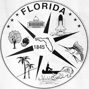
I would argue they picked the worst design of their finalists. Although I do admire the “cover all bases” strategy in this early entry. It features: state outline, orange tree, palm tree, indian and gator, swordfish, capital building, and space shuttle. Now that’s a coin!
So far the great state quarter derby has produced a bunch of uninspired clinkers. Florida is no exception to that. Of course neither is my state’s design. We had a shot at using Grant Woods’ American Gothic, you know the Calvinist looking guy with the pitchfork standing next to his old maid daughter. A wonderful design, easily recognized, suitable for reduction to the size of a $.25 piece and funny to boot. The decision was made, of course, by a committee of bureaucrats who, having no sense of humor, rejected it and went with something that looks like a gingerbread house on a piece of corduroy. Here it is, ain’t it a dandy?.
The only one I’ve seen so far that is any good at all is the one with the tree that covers the whole obverse of the coin. Charter Oak? Connecticut, maybe? A hansom coin whose ever it is.
It could be worse. We could have taken Wisconsin’s insipid design–a cow’s head, a wheel of cheese and an ear of corn with a banner “No parking on even numbered days” or some equally inspiring slogan. Some days you would thing these things were thought up as a second grade social studies project.
I love the Connecticut one. Nice design and a part of the state history that most people hadn’t heard of, other than the Charter Oak Bridge in Hartford. We done good. Thank God they didn’t use a nutmeg.
Something I didn’t know, the Iowa design they went with is actually another Grant Wood painting. It’s still the worst choice of the five finalists. The other Grant Wood painting is better, of course, and even one with the pig and cow heads is a surprisingly good design.
How about next year? Minnesota sucks, Oregon looks unpromising but hasn’t chosen yet, Kansas has a bison (yay!) and a few tiny sunflowers (boo!), and West Virginia went with a bridge. The first option for WV is really trippy (a quilt theme!), you should check it out.
I love these quarters. Too bad so many are horrid groupthink designs.
Always learning new stuff on the SDMB, I am. From SmackFu I’ve just learned that we have a state indian
My personal Florida quarter design was a Honda Civic with wheels that are wider than they are tall and a sticker reading “Puerto Rican style” in the window, because that’s our most common sight, probably.
I’m kinda surprised we didn’t end up with a “lovebug and mosquito locked in mortal combat” theme, or a Mickey Mouse head outline.
You know, I went to the first link because I forgot what the finalists were. In the top row, middle coin, it says, “America’s Spacecoast.” I read it fast and thought it said, “America’s Scapegoat.”
I was about to start a Pit thread about “Why aren’t they making any more state quarters?” I have gotten TWO 1976 bicentennial quarters this year, but no new state quarters.

