What's the deal with the letter g?

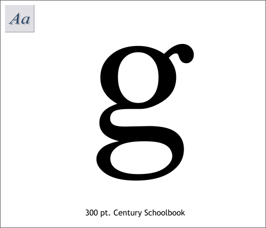
Open up the reply box and type a lower case letter ‘g’. Looks like this, right?

But once the message is posted, it looks like this.

As far as I know, this only happens to the letter g. Not that its simply stylized, but it looks completely different when written vs. when displayed in a font. Sure, the lower case letter ‘a’ looks that weird way that it does, but nobody writes like that and more importantly, when its displayed, it looks exactly like how it shows you. But they change g for some reason. Why? There’s gotta be some morbid historical reason why we do this, right?

good god you’ve got a good point

The reply box uses a different font from the forum itself. And it can probably vary depending on settings on your browser. Nothing to freak out about. :slight_smile:

It’s just that this site uses different fonts for the reply box and for the posts themselves.
eta: got in late.

Anyway, I think this may be a vBulletin thing (rather than a conscious decision on the part of those who administer the SDMB).

The OP is asking why there are two very different variants of the letter g. Here’s what Wikipedia has to say about it.

Actually, I do.

Are you a serial killer?

Same here.

Care to translate that into English?

Huh - the “g” in the subject line of the OP is rendered one way while the “g” in the body of the text of the OP is rendered the other way.

Is it because it’s a bold “g” ?

On preview, nope not that.

The ampersand, &, also looks very different between the Reply box and the post. There was a thread about it a few months back.

Added an ampersand in the title for my post, just for you. :slight_smile:

No, the OP wants to know why one of the variants is used in the reply box and the other is used after the reply is posted.

As others have said, it’s just because the reply box and the default board font are different.

ggggg
ggggg
You can change the font if you want.
If you find the right one it’s barely noticeable.