Some people might ask why they draw people like this. . . Art
If you look at art or study art history you’ll see both the evolution of humans’ ability to draw people and a wide variety of styles based on culture, tradition, personal expression and experimentation.
There was no urgent need to portray anything with 100% accuracy, and the objects in the hands were often merely symbols, not a portrayal as an actual object. Something that looked vaguely like a spear represented a spear.
Because they had no real expectations of realism in their art. Just like the Dynastic Egyptians didn’t walk sideways and Olmec-era Veracruz didn’t really support a population of man-jaguar hybrid babies.
Yup. Naturalism as a desirable feature in visual art wasn’t fashionable at the time, and didn’t really become so for several more centuries. Idealism was all the go.
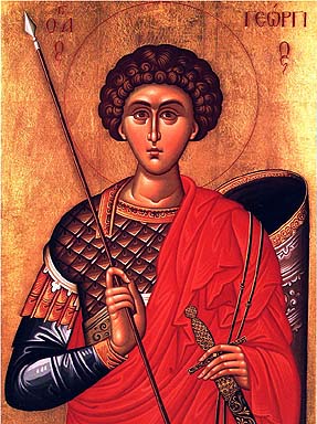
The image linked in the OP is an example of Greek Orthodox iconography. The long fingers are intentional and symbolize spiritual intensity. The grip on the weapons only looks weird because the fingers are abnormally long.
The spear or javelin does not look that thin - thicker than a pen, a bit thinner than a magic marker. If made of hardwood it would be fairly heavy and hard to break; being a throwing spear, sideways breakage strength is less important.
Plus, odds ar a monk or religious artist, unless he’s around warriors, probably would not get a good look at arnaments; would not get a chance to study them up close; probably drawn from memory of what he saw watching a parade, and as mentioned above, realism was not high on the list. Everyone who saw the picture knew what it was, and that’s all that was important.
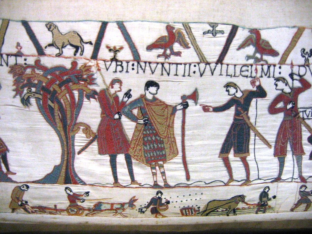
Based on a cursory study of the BayeuxTapestry, it wasn’t all weapons that were drawn that way - just spears and lances. Swords and axes were drawn much more accurately, both in terms of proportions and in terms of how they were held. Curious.
As others have said, that is a Greek Orthodox icon. They are, and were made intentionally non-realistic because they are not portraits of the person’s outward appearance as much as they are images of the entire person (including the spirit).
That’s why you don’t see round bouncing baby Jesus so much in an Eastern Orthodox church, as you might see in a western Catholic church, for example.
You might say these icons are meditative devices, designed to be windows to heaven. The non-realistic perspective may seem primitive or simple but it is mathematical and brilliant, and it allows the source of light to seem to be coming from everywhere at once.
Icons are so important that many people consider them equal in importance to scripture, although in America, the Protestant influence has changed that to some extent.
If you know the symbolism, you can read the icons and mediate on them more effectively. But it’s not necessary to know to have that holy experience.
TL;DR…Specifically on your question, St. George, who slew a dragon (=evil) has a strange grip on his lance to symbolize that it was not actually he who slew evil, but God, working through him.
I don’t know about the other art you are asking about, but my guess is the answer is similar to the above.
Indeed, apparently Jesus was plopped out as a very tiny 20 year old:
Who even at a very young age knew gang signs: http://www.trippintheplanet.com/city/VirginMaryBabyJesus.jpg
Aside from emphasis on religion, what were the main traits of that art style?
It took them a while to go from more or less abstract representational art to realistic art, with the big strides coming in the Renaissance.
For example, if you look at typical Byzantine style art (like your example), it’s flat looking, and stylized.
Go to the 1200s and look at Cimabue, and see that he’s starting to play with light and shadow a bit. Look at Giotto a bit later, and see that he’s taking it a bit farther with even more realism.
Ghiberti and Botticelli go even further with realism in art in the 1400s (not painting though), and then Leonardo da Vinci, Michelangelo and Raphael sort of finish it up in the High Renaissance.
It’s pretty cool to actually be able to see these side-by-side and see how artistic technique advanced; there’s a room in the Bodleian Library in Oxford that has portraits of all of the head librarians in order- you can see the development of portraiture style as you follow them around the room. It’s actually kind of wild.
If, as md2000 posited, they’re actually javelins (throwing spears), they would be thinner than a broom’s handle, which would make those in the tapestry as realistic as the swords. Javelins and infantry lances usually had short or square-based heads, with those of infantry evolving into some seriously scary forms through time, charging spears were often headless or had long heads; a charging or infantry spear would be thicker than a javelin.
Not were, are: orthodox iconography still works along similar tenets as it did back between the falls of the two Roman Empires. It shares a lot of traits with Romanic art (Western Europe in the early Middle Ages): stylized representations, tons of symbolism with not a single meaningless brush stroke (everything from the proportions to which objects appear means something). Icons often use gold or silver as background (thin sheets if on wood, gild or the actual metal if on metal; Romanic artists normally used ochre instead). Lines are very sharp, often with limits actually drawn as lines (as in comic books), colors are chosen for contrast and from relatively limited and again symbolic palettes. Any plaits are represented as sharply-delimited planes, with the parts on the back painted a darker color than the ones in the front or in the same color (no gradation).
Of course, since I’m describing something found in a very large area and time, it all has to go as “oftens”. The last icons you posted look very modern to me, but I’m not an art expert.
I respectfully disagree that this type of art “advanced” from abstract representational to realistic art. Some people take this premise one step further and say that Orthodox iconography began because no one understood perspective. (I know you did not say this, I’m just magnifying what you said for clarity).
Just for fun, try copying an icon, or even tracing it. You will soon see that the perspective in this type of iconography is meticulous and complex. The first time I tried this I thought it would be cake, but my Byzantine style icons were monstrous. My (admittedly terrible) copies of later western religious art were less horrific. At least there I could find the foreground, background, vanishing point, etc. Even under the tutelage of an experienced iconographer, the beautiful perspectives that make an icon what it is were too much for me.
The icons of this style are more complex in some ways than later art, simply because icons are not meant to be “art.” They are intentionally made with very little individual variation for the same reasons you wouldn’t want to mis-transcribe scripture. They are not just representations for teaching Bible stories, as religious art often was in the west. Neither are they representations of individual piety. They are aids in prayer and meditation. The complexity but seeming simplicity of these works are an embodiment of the paradox of holy Mystery.
It is an attempt to do the impossible, to display the spirit of the pictured saint, which is of course impossible, but that impossibility is part of the complexity of the icon itself.
(Another poster mentioned Jesus looking like a little man rather than a baby. Of course this is done with intention, as Jesus existed in The Beginning, lived as a baby, a child, a man, died, resurrected, and will come again. An Orthodox Christian might say that he is outside of time. A snapshot…a portrait, like the portraits you mention, can’t picture someone outside of time. An icon can get closer than a portrait can.
They are often said to be written, rather than drawn (“icon-ography”). They are rarely signed. Some are worked on by a series of iconographers, one writing hands, another eyes, etc, to specifically remove the individuality from the image.
I’m glad you mentioned portraiture.
Your example is why I respectfully disagree that art “advanced” The whole premise of what art is for changed. Rather than attempting to picture the whole of a person, especially their spirit, art actually simplified.
In the west at least, art simplified to primarily show the body of a person as its main feature. It moved from its purpose of being an aid to the entire community of Christian’s piety, to emphasizing the maker’s individual piety. Instead of being an act of writing (by which I mean an act similar to transcribing scripture) it became an act of inspiration from oneself.
TL;DR for your pleasure:
Religious art certainly changed, evolved, met different needs. But I would argue that it became simpler, rather than more advanced or developed.
(Of course I’m talking as if there was no portraiture back in “the day” and as if Orthodox icons are no longer made…neither is true of course, but I simplify)
Note that the knights’ lances were also drawn that way - and a heavy cavalry lance has to be strong enough to withstand the full mass of the horse and rider at charging speeds.
Right. Unless the iconographer and the artisans of the Bayeux Tapestry are embellishing the story, neither is supposed to be representing javelins.
The lance, a heavy spear used from horseback, is not just an incidental part of either story (Saint George and the Dragon and the Norman Conquest) but central to the narrative of each. Religious iconography aside, St. George’s lance firmly establishes him as a member of the horse aristocracy (knightly class) then in power (exactly the sort of people who paid for such art).
In the other case, mounted lancers were the most distinctive feature of William’s triumphant army at Hastings. After considerable difficulty against the line of Anglo-Saxon “huscarls,” mostly axemen who fought on foot, the Normans retreated or feigned retreat (whether it was deliberate or accidental is still debated) and managed to draw the huscarls into pursuit and thus disorder, then their lancers turned on the Anglo-Saxons and rode them down. Rightly or wrongly, the mounted lance would be considered the decisive arm of European battle for the next 280 years or so (going from the date of the Comnquest, 1066, to 1346, the Battle of Crecy, where the knights fought on foot and the longbow established its ascendancy).
Interestingly, Wikipedia suggests the story of Saint George and the Dragon originated around 1100, which makes it contemporaneous with the Norman Conquest. Lances were a big deal around that time, I guess.
Javelins were used only by the earliest legions and by auxiliaries in later times. By the third century AD, when George was around, the only spear carried by the legions was the pilum.
George is usually represented as a mounted knight in Christian iconography, though, so none of this really matters.