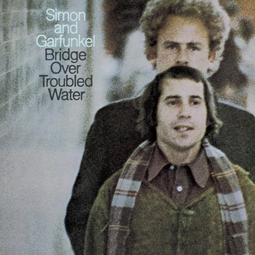
I’ve never particularly liked thisone. Art looks scary, and it just looks like someone took a bad picture of them, blew it up too big and slapped it on an album cover.
Maybe it was a bad Kodachrome?
But could poor quality Kodachrome really account for a total absence of nice bright colors and greens of summers?
Pixies front man Frank Black put this on the cover of one of his solo albums.
That was on the back!
I think they were going for a hazy shade of winter there.
I didn’t know that, I only have the CD, which has that picture inside of the booklet. But I’m rather sure that I read somewhere that it was supposed to be the front cover, but the record company turned it down.
Black Sabbath Born Again. I read years later that the designer was offered a better paying job, so he came up with that in one night hoping it would get rejected, and to his horror (and ours) Tony Iommi liked it.
I hate the cover of the American version of AC/DC’s Dirty Deeds Done Dirt Cheap. Wish they’d have used the Australian one.
Something I just noticed for the first time: check out the gigantic handlebar mustache on Art.
mmm
No, the back cover of Goats Head Soup was a picture of Keef. The soup picture was included inside the LP as an insert.
Genius post. Love the slow reveal. And the pictures are dreadful. I laughed.
If ever I holiday in Sweden I know what I’ll be looking for - a dansband gig.
Even more horrifying, though it’s not an album cover, was seeing an episode of Ricky Gervais’ Idiot Abroad which showed that goat’s head soup is a fucking real thing! I literally almost puked watching that!
The US cover for Andrew Lloyd Webber’s Premiere Collection Encore has to be the worst ever done, particularly compared with the original European one.
Doesn’t take a train engineer to figure out which is which.
I think it’s true for certain values of “kid”… I was doing doodles like that in high school. But I see your general point. What I meant was that, at first sight, it gives the impression of kid’s art… but then so does a lot of well-respected art (Fauvists, Miro, etc.)
Not a big fan of the artwork for Rihanna’s new CD, Talk That Talk… mainly it’s the black bags under the eyes. She looks like a zombie nursing a hangover. (One reviewer also said that she looks like she’s trying to cover a cold sore with her tongue.)
Not on any of ours (somehow, my husband and I ended up with 3 copies of this one). Not that we would have done otherwise, but we were really careful to make sure the cover faced front in our record-holding milk crate, and if I could have got rid of that picture forever, I would have, which I could’ve if it had been an insert.