I agree that Can I Borrow A Feelin’? is fake based on the title and the obvious Photoshoppiness of it. (I say the same thing about Chicken Coupe de Ville and possibly Country Church.) I have no idea where the Chicago Tribune got these from. But I do know that Ali and his Friends vs. Mr. Tooth Decay is a real album. I’ve actually heard Ali’s theme song from this album- it’s a funky little diddy that claims that some people claim that The Greatest put the crack in the Liberty Bell and rode the ride of Paul Revere, then goes on to explain, “Ali’s always gettin’ blamed for stuff he didn’t do/Just because he likes to scrap and maybe sometimes feud.” It’s both insane and wonderful.
Some other thoughts:
Little David Wilkins, King of all the Taverns: Or, “What if some kid from a Krofft Brothers show got really fat and became a lounge lizard.”
Thank You For The Dove: You’re…welcome? Are you thanking God? Or some random person?
Best Friends: ET has really let himself go.
Sour Cream and Other Delights: Does this one even count? It’s obviously meant to be a parody of Herb Alpert’s famous Whipped Cream and Other Delights.
A Hard Day’s Work: Again, another obvious parody of a famous album cover. Also, I like the fact that the Electric Amish bothered to trademark themselves. They may shun electricity, but preventing the theft of their name is no sin.
Understand Your’e Swede: I can’t even understand that title. Is it supposed to be “Understand You’re Swede” or “Understand Your Swede?” Both of those kinda make sense.
I loathe Styx’s “Pieces of Eight” album cover, especially because I keep running across it in racks of used LPs, where it is only slightly less nausea-inducing than things like the Barbra Streisand/Kris Kristofferson seminude album cover.
Exactly. I’ve seen some mighty awful album covers . . . but not these. It’s not a bad album cover because the people are dressed in the style of the '70s, when the album was made. Or if they’re playing an instrument or genre that’s no longer “cool.” And you can’t criticize something for being “bad Photoshop” if it was created before Photoshop existed.
Country Church is definitely real. Here’s a larger image of what appears to be the same copy (note wear at bottom) where you can easily see that it’s a photo of a real LP cover. Note impacted lower right corner and visible spine print.
Count me as one who doesn’t see the utter horridness of a lot of these. Most wouldn’t be amongst the Worst. Covers. Ever if they just used good and modern lighting, and not doing so lends them a charming innocence (even the pornariffic looking covers) that makes my censure of them only go so far.
As was noted earlier, we see these same albums every couple of months. I’d like to know what kind of awful cover art is out there from, say, 2008 by reputable labels that should know better. Any nominations?
This came up on Pandora for me one time. (It was not very good music.) I can’t say what it is in particular about it, but that picture does not look natural. Her head looks like it’s been taken from another picture, magnified, and reattached via Photoshop.
I’ve got to say, I like that the Singing Postman has a “Best of” album. Wouldn’t want to have to pay for a bunch of crappy Singing Postman stuff just to own his hits now, would we? Thank goodness we’ve been spared.
In no order:
*Puscifer, V for Vagina–Hideous. (Seriously, with that title, that’s the best they can come up with?)
*Bowerbirds, Hymns for a Dark Horse–Bland and ugly.
*The Dears, Gang of Losers–Messy composition.
*On the Might of Princes, Sirens–Even more bland and ugly.
*Yeasayer, All Hour Cymbals–WTF? Why?
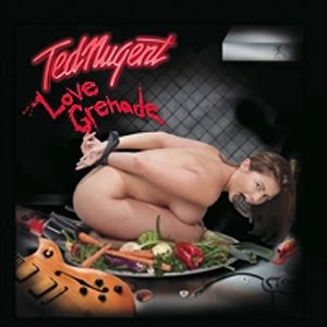
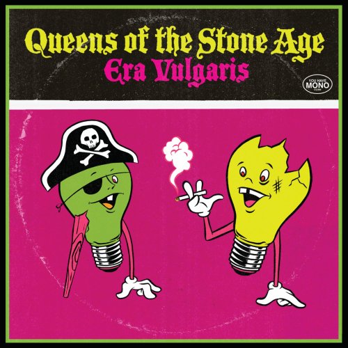
But the winner is… Ted Nugent, Love Grenade–Ew. I’m not even talking about the content; the layout, the colors…just heinous. This Queens of the Stone Age cover is ugly, it must be said, but it looks deliberately done that way. I think it’s kind of cute.
Out in my garage in my box of LPs I have one that comes to mind for this thread.
It is from the late 60s psychedlic era I think, maybe a band that specialized in the brown acid, and by volume.
It is very dark droning music, and it is eponymously titled. The glorious image is an X ray in black and gray with some dark blood red mixed in, all to match the band name: Aorta.
I think the lyrics, such as they are, go something like “Give me back my aorta, I love my Aorta” and some such. Priceless.