“Speed limit c arcminutes^2 per steradian”
“Speed limit c arcminutes^2 per steradian”
This is an actual European TV efficiency label:

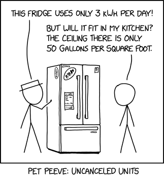
I mean, it’s one thing to not cancel kilohours with days. But they didn’t even cancel kilohours with kilohours!
Of course not – watts are a measure of brightness. That TV’s about as bright as my bedroom lamp.
I think I can see the rationale… When an appliance is marked with a certain number of watts, the expectation is that it’ll be using that number of watts more or less steadily. But a refrigerator might reasonably use twice that amount of power while running, but run only half of the time. Over a sufficiently long time period (such as a day), it averages out, but it’s not an accurate representation of what it’s doing instantaneously.
kWh/day is more understandable than kWh/1000h in that respect. Especially since you can just multiply by the number of days to estimate total use. But kWh/1000h is the worst of both worlds; the timeframe doesn’t easily relate to any long-term time units, and it’s dumb in a unit-cancellation sense. They could have just said Waverage or some such.
Oh, yeah, I was referring to the per-day one. The per-kilohour one just doesn’t have any redeeming virtue at all.
And for a TV, it makes sense to just list the power draw when it’s actually running, because humans turn TVs on and off to suit ourselves, everyone knows that they’re sometimes on and sometimes off, and it’s impossible to predict how much any given customer will keep it on.
It uses the units most people would think in.
I know my electricity cost in kWh. I can make a quick guess about how many hours I watch TV in a month or year.
You rang?
But that assumes that it would occur to a techno-peasant to hover a cursor over images because apparently there might be hidden text in the image, which can become apparent through the mysteries of technology.
Why would it ever occur to a techno-peasant that that is even possible?
But metric system diehards tell me that these sorts of power-of-ten unit conversions aren’t even conversions at all since you’re just moving the decimal point.
And I actually agree with that! It’s easy to see that this is 0.061 kWh/h if that’s more convenient to me. Or 6.1 kWh/100h or whatever. But examples like this demonstrate that the average person really doesn’t benefit at all from this aspect of the metric system, and things have to be expressed in silly ways just because people really don’t know that 1 kWh is the same as 1000 Wh.
I’m not following you. My electric company gives my electricity rate in cents per kWh. If the specs on my appliance give me the efficiency in some other unit, I have to convert it.
Sadly, the number of hours a typical TV is used in a year is probably on the order of 1000 hours, not 100 hours.
So the units on the sticker map to what is most commonly used for each. I think you’re making a mistake thinking of it as a single unit, when its real purpose is two units: 1) how much will it cost based on 2) how long will I be using it.
But there’s no conversion. 1 kWh/1000h can be seen instantly–almost without conscious thought–as being the same as 1 W. That’s in contrast to US customary units where I might have to multiply by 5280 or 128 or some other annoying number.
It’s not that I don’t see your point–I agree that that’s why they did it. It’s just that it’s only useful for people who are bad at using the metric system. That is, for all the talk about how everything converts nicely when things are a power of 10, the majority of people don’t actually receive these benefits, and instead even the most trivial of conversions have to be done for them.
The numbers, units, and factors are imaginary and magical. Called for by laws and regulations. The only meaningful part of the display/label is the comparison to other devices. Does it use more, average, or less than a competitor. Then; does the appearance, features, perceived reliability make a less efficient device more appealing?
In which case we may as well use units of pound-miles per fortnight. If they’re only used for comparisons, the scaling doesn’t matter at all.
Could just do the economist thing, and equalize everything according to dollars.
That would probably be most useful, anyway, for most purchasers. Keeping the $-per-KwH rate used to generate the dollar rating close at hand would allow those folks who need to know a little bit more to calculate back to the energy level. Everyone else could see at a glance how quickly you could save money by going to the more efficient model (though the actual payback time would differ according to the local electricity rate).
That’s mostly what the EPA does. For instance:
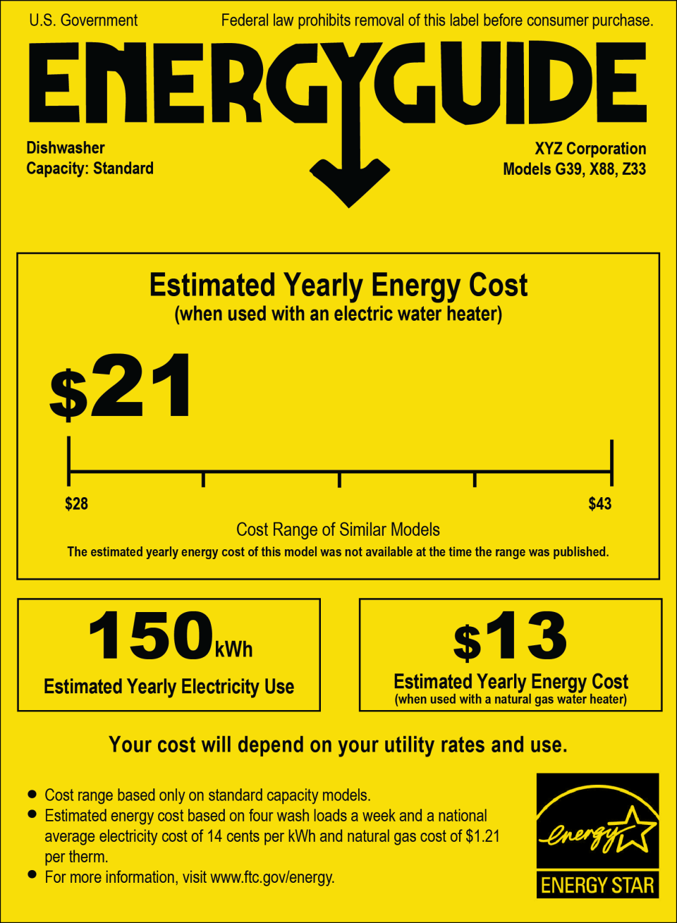
I’m not sure I like that approach any better, though it still gives you the kWh/year value.
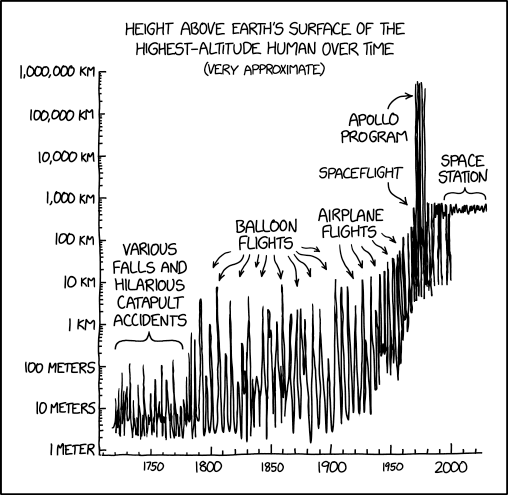
“I wonder what surviving human held the record before balloons (excluding edge cases like jumping gaps on a mountain bridge). Probably it was someone falling from a cliff into snow or water, but maybe it involved something weird like a gunpowder explosion or volcano.”
Hmm. Up until the point humanity had enough air travel to guarantee there was always somebody in flight somewhere, I would have thought the plot would repeatedly go down all the way to zero.
After what date do you think that was achieved? Sometime during the zeppelin era? Later?
Well, the plot as shown can’t go all the way down to zero, because it’s a logarithmic scale. But there’s probably always someone, somewhere, a meter or so up. And yeah, it was probably uncommon for someone to be as much as three meters up. Unless he’s counting the second story of a building as “above the Earth’s surface”?
That should definitely count.
Unless you want to make a separate graph titled “…Highest Altitude Human By Artificial Means”, which would start later, as it would rule out falls… but it would still keep the best part of this graph: the phrase “Hilarious Catapult Accidents”.
“Hilarious Catapult Accidents” would make a great band name, as Dave Barry would no doubt note.