Inspired by this thread.
What say you?
I lilke Phoenix (4)
Unfortunately, Sacramento (40) looks pretty bad.
Check out Tampa (79)
Inspired by this thread.
What say you?
I lilke Phoenix (4)
Unfortunately, Sacramento (40) looks pretty bad.
Check out Tampa (79)
Oh, and if you hate flags with the name of the place on it, sheck out Provo (143)
When I opened this thread: “My city has a city flag?”
After: “I now understand why they don’t fly the flag”
My favorites: Denver, St. Louis, Portland, New Orleans, and Philadelphia.
I didn’t know Provo was a brand of motor oil…
Anyway, I think I’ll have to agree with the results of that poll. (But to this day I’m still surprised that San Francisco and New York City’s flags haven’t had a makeover, yet. They’re at 35 and 37 on the list, see for yourself.)
Hmm, Honolulu just appears to have the state seal as its flag. How boring. Phoenix, Corpus Christi and Tampa are all nice.
Seattle’s kinda disgusting. Makes me think of a swarm of hagfish. Or maybe sperm going for the egg.
Plano’s flag looks like it was chosen in 1976.
I like how the St. Petersburg pelicanis sitting in Pittsburgh.
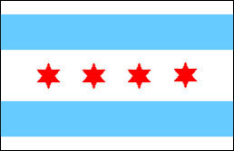
I’ve always liked Chicago’s flag.
This is exactly what I thought. I have no idea how Sacramento scored so high. Except that may others are even worse.
As I said in the other thread, I really like Phoenix.
Birmingham, Alabama (#39) looks remarkably Bolshevik for such a historically non-Bolshevik city–it looks like the flag of the Birmingham Workers’ and Peasants’ People’s Revolutionary Commune (doubtless soon bloodily crushed by forces from the rest of Alabama).
Among relatively low-ranking flags, I kind of like Warwick, RI (#101). OK, it has a bit too much white in it to make a good flag on the field of battle, but it’s not like Warwick, Rhode Island is likely to be going to war anytime soon (“Death to Cowesett!”), and I think it’s kind of pretty in an old-fashioned, looks-like-the-banner-of-a-duchy kind of way.
Tampa–oooh-kay. No, Florida’s not a major drug trans-shipment corridor, uh-uh.
“Proud to be Pocatello!” Good God.
Also, Plano makes athletic shoes, and Baton Rouge is a somewhat pricey aftershave.
I recommend Phoenix for the sixth Magic: The Gathering color’s mana symbol.
Gah. I thought the seal-on-a-bedsheet motive so beloved by US state flags was bad. I was blissfully unaware of the flip-side-of-the-mayor’s-business-card meme for city flags :eek:
“Great People, Quality Service!”? Mesa, Mesa, Mesa. You can’t really believe that belongs on a flag, can you? Oh, dear. You can.
I kind of like Wichita’s, actually. Portland’s is very cool but flapping in a strong breeze that thing would be really bad on the eyes. A few other good ones but in general just too much writing, too many fussy little seals, too many pseudo-corporate logos.
When I lived in Pittsburgh I sometimes saw a variation of the city flag that had a simplified version of the seal, which is based on William Pitt’s coat of arms by the way. I think the simplification worked better. But the busy version is the official one. Of course, now I live in a municipality that uses this symbol, which is about as simple as you can get. It’s supposed to represent an old-fashioned industrial furnace, of the type used in this area to extract lime for building materials from the native limestone. An industrial symbol for a modern-day Yuppieville!
Interesting. I always thought my city flag (Dallas) was okay, but not great, and it seems the people who made this list agree with me, rating it #21 (of 150).
It’s sad that some of the flags at the bottom of the bottom of the list could be so much better. Mesa’s flag could be great if they’d ditch everything except the square shape of that stylized “M”. Huntington, WV, would be greatly improved by ditching ALL the text and moving that stylized “H” to the middle of the top gear. Still wouldn’t be great, mind you, but it’d be okay.
Gah! Some of these look like bad airline logos, that or they’re mutations of the Montreal Expos’ old logos.
That said, I didn’t know St. Petersburg was home of gay pelicans. In general, I like a seal with a few colors in the background. It’s kind of hard to judge these without knowing their context. San Francisco’s is a phoenix rising from the ashes, in honor of the many times the city has been rebuilt, even before 1906. It’s inscribed with the Latin phrase for “Gold in Peace, Iron in War.” Stuff like that is important, IMHO, to judging a flag.
Given the text and logo - I would guess that that became the flag the year we got the Goodwill Games. The colors and logo look vaguely like the games logo.
I kind of like Sacramento’s. Not the colors - but at least it’s interesting looking. Kind of.
Wow, many of those are bad ideas.
I like the optical illusion with the Fresno flag.
Hey, dude, take that flag down, it’s freaking me out.
Until now I had no idea ANY city had a flag. Huh.
I really like the Corpus Christi one, very plain and elegant. The Denver one is cool too; both of those I could easily see as national flags. The Detroit one looks like someone ate a bunch of different flags and threw them up. The rainbow banner on the Provo flag looks like the edging on a bottle of Centrum.
HEY! It’s a little busy, I’ll give you that, but that’s because it has to reflect the many different cultures that contributed to our city’s beginnings; the fleur-de-lis for the French who named it, the lions for England, I think, and the stars and stripes are self-explanatory.
The motto of the city is something about ‘rising from the ashes’, which was written after the 1805 fire that decimated the city.
Whyn’t ya go pick on Worcester, MA? There’s looks like a still from a biology film I saw in elementary school about fertilized eggs.
Denver is my favorite.  What’s with Des Moines? The bridges of Des Moines County?
Can’t forget The Pelican, a new bar in The Castro. It’s next door to The Chesapeake.
Yeah, but it looks like an 8 year old drew it on construction paper. Presentation matters, too.
Washington, D.C. is rightly #1 - classy, elegant and clean (good historical basis, too - it’s based on George Washington’s coat of arms).
I’m partial to Fremont, #20 - based on Gen. John C. Fremont’s flag from his days exploring the West.
I like Buffalo, #32, too - good colors and composition.
I didn’t see my current home of Cleveland, Ohio’s flag anywhere - just as well; it looks like the French tricolor, with the city seal in the middle. Meh.