Well, there’s always the Federal University of Santa Catarina’s Institute of Oriental Studies.
![]()
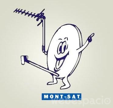
Polish satellite TV provider Mont-Sat is always very happy to see you.
Well, there’s always the Federal University of Santa Catarina’s Institute of Oriental Studies.
![]()
Polish satellite TV provider Mont-Sat is always very happy to see you.
Am I the only one who thinks that the Amazon logo looks like a penis?
In a better world Doughboys and Locum would have some sort of business partnership.
Yeah, the ‘V’ arrow part is totally a not-so-subliminal frenulum. I’d bet money that’s intentional. That logo must have had far too many design iterations and focus testing groups for that not to be noticed by somebody.
Somewhat off-topic but that reminds me of the Torres Strait Islander flag:

At first I couldn’t see the problem, and now I can’t unsee it.
…you are assuming, of course, that this wasn’t deliberate. From a Hanover County School Board member:
A recent editorial:
Logos like this are typical of alt-right trolling, like the stage design at CPAC designed to look like Nazi insignia, or how the OK symbol has been co-opted. It could be a genuine mistake. Or it could be someone having a laugh. In this day and age, we can never really know for sure.
Let’s not overlook this one, seen all over Moto GP events
I thought it looked tamponic myself.
A word I never thought I’d encounter.
It almost sings!