Being a former graphic artist (well, not that I ever really stopped, just don’t do it professionally much anymore) I enjoy listicle-style articles featuring bad logos. Often these bear unfortunate resemblances to embarrassing things that somehow, nobody in the design approval stage noticed until the logo went public.
I realize this is just a local school district, but still, there had to be several pairs of eyes looking at this and giving it the thumbs-up before somebody finally spoke up and said, uh, hey guys…?
Gracious, and we were just talking about a similar issue to the OP’s last month. What is it with school districts’ unfortunate propensity for Nazi symbolism?
(Common-sense guess: School districts are not actually more prone than other bodies to bad logo design, but because there are so many of them and most of them probably don’t have high-powered ad agencies doing expensive focus-group studies on their design choices, there is an increased probability that such cases will involve school districts.)
For the “Women’s Network” logo, at the risk of getting a housecall from Dr. Rorschach, I’m gonna be honest and admit I’m not sure what’s visually problematic.
Is it that the “W” is a bit booby-looking? Or is what people are seeing more of a C&B configuration (well, reading from left to right, B&C) with that one curly pube?
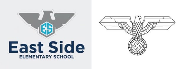
The problem with the Eagle is that people claim it’s Nazi derived but there’s a ton of similar style Eagle logos that predate but also post-date Nazi Germany with that sort of Eagle style. It’s just now people are super sensitive to it specifically because of Nazi imagery because now whenever you see it people claim it’s “direct” Nazi imagery.
There’s a video game called Papers Please made in the 00s that uses that exact same Eagle style all over the game, but it’s meant to evoke the old Soviet/Eastern European useage of the blockish Eagle design. If that game came out today I’m pretty sure everyone would claim it’s “Nazi derived” which isn’t the point.
Actually maybe we should just call it a “Totalitarian Derived Eagle” instead.
Eagles are not problematic (look at the Great Seal of the U.S., etc, and of course the government flag of Germany). It is svastikas that are problematic, therefore by extension also quasi-swastikas.
@Kimstu has a good point- local school districts probably aren’t doing a lot of focus testing. And as @Asuka and @DPRK point out, the Georgia school logo being an eagle is understandable to a point; it’s America’s national symbol, after all. But the Georgia school eagle does have an unfortunate similarity to Nazi iconography:
Haha, yeah, that’s one of the perennials that always show up on those ‘bad logo’ listicle articles. Here’s one of those articles that has a range of from simply uninspired examples to very unfortunate ones that look like something else, very often with sexual connotations.
This one is so clearly a visual pun that, assuming it’s real and not a joke, must have been a disgruntled graphic artist trolling their client. I imagine the conversation went something like this:
Artist: so, what were you looking to spend for a new logo? Dance studio: We’ve seen a website that does logos for $25. Can you make us a nice logo for $25? Artist: um, suuuure…
(Maybe should have set that up as a double click for NSFW)