http://www.boreme.com/posting.php?id=32681
Wow?
I mean really?
Is there anyone over there who approves of these uniforms other than the designer and the people who paid his firm?
http://www.boreme.com/posting.php?id=32681
Wow?
I mean really?
Is there anyone over there who approves of these uniforms other than the designer and the people who paid his firm?
Oh god.
How embarrassing.
This does not bode well for the rest of the games.
Like 'em.
…well, maybe the big coats are a bit much. And dammit, when are miniskirts going to come back? 
But the two tone thing is quite fresh and it means you can be in no doubt: this is a HE staff member who is here to help me. Which is good, because HE use busy stations where there’s underground and national rail staff too.
Much of the objections centre around the bright yellow colour. But I assume that’s to be consistent with the train livery. So that’s an issue with the colour scheme they’ve chosen rather than the uniforms specifically.
They’re just keeping in style with the Olympics logo.
That bright yellow would give my ex a migraine. I mean literally.
It’s not the yellow that I object to in particular. It’s the fact that they look like they were hoisted up by a crane and dipped into a vat of grey paint up to their stomachs.
It’s not the grey that bothers me to be clear–it’s just the “dipped in paint” look in general which seems ludicrous.
Fugly. And the whole world will be able to see just how fugly.
Shoot the designer and whoever signed of on those monstrosities.
That was exactly my impression. I thought they’d all stepped into a very deep puddle of gray water.
That is a bit odd. And it doesn’t look like it’d be a uniform that’s easy to keep clean. I quite like the shape though, actually.
They look like something out of Doctor Who - and not the new, cool-ish Doctor Who, but like something you’d see in a Tom Baker episode. Just add some tinfoil and bubble-wrap and they’d be perfect.
Another shot of the same group
I think it is the big guy in the bigger coat that does it. He looks like a villain from the fifth element.
ETA: Alessan beat me to the comedy simile punch
This is classic British decision by committee, where that committee got taken in by a slick presentation. “The yellow is to represent vibrancy, creativity and a go-ahead attitude; the grey [del]because you’re a bunch of boring old farts[/del] the solid underpinnings of the organisation and its focus on safety. We decided to make some of them in a colour that is just off the yellow in order to remind passengers to wash their hands after using the toilet.”
The cut of the trousers is immensely unflattering on the otherwise quite attractive lady.
The level of the waterline is really awkward. Also, when they’re in a group the waterline is different, so it looks messy. They should have gone “OK it’s at exactly 1 metre above the ground” then changed the colour at that point regardless of the height of the person.
Having the waterline at the waist on the greatcoats makes them look like skirts.
And that waistcoat… :barf:
That said, this is for the Heathrow Express and of all the times I’ve ever travelled on that, I’ve never once seen a member of staff, so maybe my country won’t be subjected to the indignity that the first thing arriving international travellers will see will look like a bunch of egg yolks dropped on a pile of shit.
The coat on the guy at the left loks like a classic Mad Scientist labcoat from Girl Genius.
Except for the colour scheme, of course.
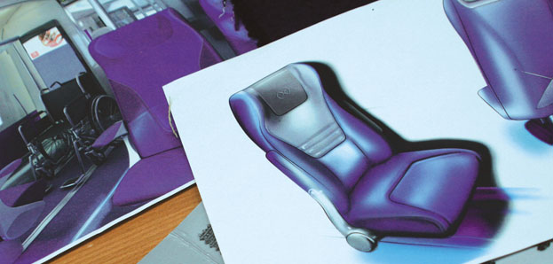
The new upholstery would look better on them. And come to think of it, their uniforms would look better as upholstery… Maybe there was a mix-up and nobody pointed it out.
I’m almost convinced that the ahem bold design choices being made for the London Olympics are a deliberate ploy - no such thing as bad publicity etc…
Unfortunately, there is such a thing as looking like a complete prat.
Considered alongside the one-eyed monster mascot and the Lisa Simpson logo, this is further proof that Twenty Twelve is not a mock documentary at all.
Pug fugly!
Looks like they’ve also just revealed the new Olympic kit
Wow, I don’t think I’ve ever seen an Olympic outfit that actually messed with the colors of the country’s flag like that.
Compared to the other Olympic design choices, that’s wonderful.
Looks like a superhero team for a Syfy original movie. The only thing missing was the Mega-dino-croco-shark.