I don’t know if I’m alone in being obsessed with and passionately opinionated about colors. For me, the color of something is as important as its other aspects- if I’m looking for notebook binders, for example, and one has a lot of handy compartments and is bland, and the other is more bare-bones but a nice shade of blue, I’m probably going to buy the blue one. I don’t quite understand the idea of liking a color in certain contexts and not in others. Why should bubblegum pink be good for a shirt, weird for a car, and hideous for a house? I love almost the Platonic ideal of colors- if I like a blue or green, I like it for everything. Color is everything thing. I know there are subtle differences between one type of Little Black Dress and another, but I don’t see it. All I see it boring black, and black, and more black. I don’t believe I own any entirely black items of clothing. Yes, it does make a good contrast for some other colors, but in those cases I’d get a shirt that was already striped.
Just as there are some colors that can have me salivating and grinning like an idiot, there are some colors that I hate. HATE. Not just colors that I don’t like, but that make me sick to look at. They’re colors that come up a lot in life (two of the bottom three are default Microsoft settings :mad: ), and there’s nothing I can do but write long rambling message board theads about them.
Number 1 is what I call “default grey”- the color of Windows tabs and the background of this message board. Light grey, that is supposed to substitute for white for some reason, but isn’t. I’m including the general light grey area of the spectrum. Also, I write “grey” instead of “gray” because the latter makes me think of this color.
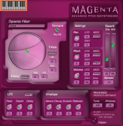
The disgusting shade of pink that is often mislabeled magenta. No, folks, this is magenta. See the difference? One is a synonym for hot pink, the other is… not. Metallic not-at-all-magenta is just as bad.
Dark teal. I’d like to clarify that teal as a color can be very nice when shaded or mixed with other colors. But it just doesn’t bear up as well on its own, and dark teal grosses me out.
I’m sure you’re not alone in it, but you are notable for it: I saw this thread title on the main page and thought, “I bet Malleus, Incus, Stapes! posted that.”
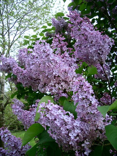
I agree with gigi - your magenta looks more like a fuschia to me. I think of magenta as darker and more purpley; something more like this.
Me, I hate a certain shade of orange - that cool, pale, pinky circus peanut color. I love nice, warm red-oranges and yellow-oranges. But that one particular shade always looks flat and really unappealing. Bleah.
Pale yellow, like post-it notes or legal pads. I can deal with deep, vibrant yellows but as the saturation (?) level decreases my blood pressure increases.
I love teal too, and I agree it should be more like Mostly Clueless’s swatch. And I love hunter green, but it’s more of a dark green than a dark blue.
The colors I hate are Puce, it’s cousin Mauve and Chartreuse. Actually I don’t like any greenish yellows.
See, I passionately love colors. There really isn’t any color I dislike. I thought I did until I realized that, for example, the color orange that I hated because it looks horrid as clothing on me will look fantastically gorgeous in a sunset, a bowl of citrus fruit, or whatever.
So call me a dirty hippie, but I think that every color has something in the world that it’ll look nice in.
Chartreuse is bed, I agree. Puce, imho, isn’t bad, but the name is horrible (whereas, I think “chartreuse” is a great word, sound-wise, too bad it’s connected to such a horrid color). The only color I hate worse is olive green. Bleh.
I’m not sure you could say I “violently” hate it, but my least favorite color is one I call “bug green”–it was very popular for women’s clothes awhile back, and it’s hideous. Kind of a yellowy green, mostly green. This is kind of an approximation, but the color I’m talking about is darker and a little more yellowy.
