An example, so far across the seas, of the same thing wrong with a lot of the American city flags: it’s not a flag, it’s a display of a letterhead logo or publicity poster or airline livery tiles, and apparently in this case deliberately so.
The prior versions for Cape Town at least were trying in a good direction on the “be distinctive and/or related” principle: The Table Mountain profile as distinct geographic identifier, the multicolors of the national flag as the related link. But instead of building up on it they built it down. The theme remains in the logo roundel but it has been rendered small and indistinct.
Personally, I far prefer the pale blue. It’s distinctive, and is more evocative to me of water (which it represents) than navy blue. Otherwise, it’s just another red, white, and navy blue striped flag with stars. There’s a nicer contrast between the red and pale blue, and it feels “friendlier” to me, as well, than navy blue, which feels a bit militaristic.
This may or may not be the official Fort Myers flag. Hard to tell from the way it’s used as a logo. However, my hometown of Rockville, MD has an awesome flag.
I should mention that one thing I really liked about my new home is that it has a flag mount next to the porch from which I display (most of) my flags on a rotating basis.
Yes, agreed. I would have preferred something more geometric, though, and less colours (blue and white, and red if you must, being the traditional Cape Town colours.) The mountain outline used in the top of the old municipal logo is more my taste than the sqiggly ones of later designs - ignore the rest of the logo
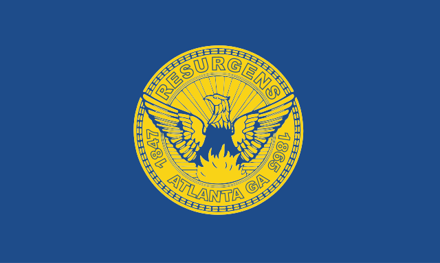
The flag of Atlanta was already mentioned*; and, well, meh–for a city flag with a phoenix on it, Phoenix, Arizona is much better than either Atlanta or San Francisco. (I actually think ours is better than San Francisco.) The Phoenix, Arizona, flag has a bit of a Japanese mon vibe to it; alternatively, I can see it as the logo of the Good Guys in some sci-fi space opera epic, as they suit up to fight the Evil Empire. (“Never give up! Never surrender! The Republic/Federation/whatever will be re-born!”)
*And besides, I don’t actually live in the City of Atlanta anyway, just in the Greater Atlanta Metropolitan Blob.
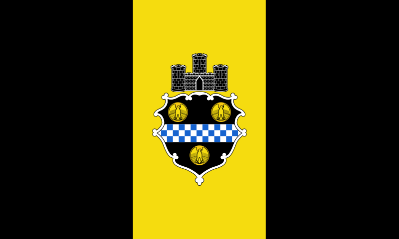
Another place I don’t live but that I think has a cool flag and that I don’t think anyone else has mentioned yet is Pittsburgh.
Oh, Louisville, why? I mean, apparently it was something to do with merging with the surrounding county, but that’s just too darned bad!
And props to Pocatello! They really took the (very, very justified) criticism to heart, and emerged a better, stronger city! Well, OK, a city with a much better municipal flag, anyway.
No - the seven-star flag was Theodore Herzl’s suggestion for a Jewish national flag; the seven stars were supposed to represent the seven days of the week, which he considered one of the Jewish people’s greatest contributions to the world. His flag never caught on, with the Zionist Movement adopting what would later be the single-star Israeli flag instead (designed, incidentally, by one Morris Harris, an upholsterer from Harlem). The Israeli shipping company ZIM ended up using a versionofthe Herzl flag, with the stars now representing the seven seas.
I don’t know why the stars are positioned the way they are, or why they have five points instead of six. Apparently, the original design from 1923 was symmetrical. I have no idea when they changed it, and why.
You want geometric and with less colour. I give you the flag for Durban.
It is not a hat, or the teat from a baby’s bottle or even a stylised boob, it’s the dome of City Hall. In a city most famous for its beaches and tropical weather and enormous harbour they honour a landmark you can’t even see from said beaches or harbour.
Well, that example clearly illustrates the difference between necessary, and sufficient conditions
“identifiable” would be necessary too, IMO. Cape Town’s blessed in that regard.
Pretoria’s probably the least offensive, but not distinctive.
I expected to this be what inspired the OP. Pretty sure this thread has been done before based on that.
I feel like these basic rules should be included in the discussion.
Most flags grievously violate #1 and #4 which almost assures you of also violating #3.
I’m too lazy too look up the origins of those Japanese flags, but I get the sense that they were inspired by Corporate flags/logos and not the other way around. They were almost certainly designed by a single entity which totally removes any real individuality or distinctiveness. They look like the the sub-brands of of a multi-national conglomerate.
Agree, I love the Chicago flag. If it were boring navy or indigo or plain old blue it would look like it was just another adapted US or UK flag. The baby blue has become the color of Chicago in the way yellow and black is the color of Pittsburgh and green is the color of Seattle.
I also quite like the Chicago Municipal Device, a symbol of the city that shows up in logos, on buildings, bridges, etc. It’s basically a Y, often in a circle, symbolizing Wolf Point where the branches of the Chicago River come together. That would have also made for a nice graphic element in our municipal flag if we had decided to go in a different direction (instead of the two light blue bars for the river.)