Australian researchers, looking for an ugly color to use in cigarette packaging, did a survey, and decided that a color called “opaque couché” is the ugliest color in the world, and therefore are applying it to Australian, and now UK, cigarette packaging.
That looks like an fairly innocuous color to me, although perhaps they could rebrand it as diarrhea brown or loose stool rather than opaque couché.
I might have chosen puke green.
Nah, that’s just plain boring brown. Avocado is worse; too much of it give housewives evil thoughts!
Today apparently doesn’t have the proper color on that page. Here’s the right one.
Yup, I think “puke green” is pretty much rebranded “avocado” (or vice versa) isn’t it?
This reminds of
Ok, that’s a little better. By which I mean worse.
It does have a poop look to it.
But I don’t smoke, so I don’t care what they color the cigarette packages.
All colors are contextual. There are no colors that are inherently ugly.
This could be a Postmodernist view, except that you need to express it more incomprehensibly.
A more scientific (and funnier) version of gender differences.
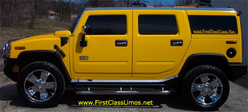
I go with baby-poop yellow. Makes me doubly nauseous at the owners of certain vehicles.
That’s Number 2 pencil yellow.
I like it.
What was up with those? They looked like AMC Gremlins on steroids.
Looks to me like the Grauniad messed up. Though I concede, that’s a much worse color than the real opaque couché.
And what the hell does the name opaque couché mean? Google says that couché translates to “layer.” Opaque layer? Is that really the name? Or was someone looking at a can of primer and thought that was the name of the color?
“Opaque” also means “dull.” I doubt that’s what they were going for-- the color pf primer may be exactly it-- that is a pretty ugly color. Imagine if a certain dull pinkish brown were called “Bondo.” (Heck, if it weren’t copyrighted, it’s be a nice alternate to racist words like “flesh”). “Couche” pretty much has to mean “something applied to a surface” in this context.
Invisible Armchair was already taken?
That’s a cute wordplay.
Ok, the more I investigate this, the more I think my joke about primer was close to the truth. It doesn’t sound like the sort of name companies usually come up with. And nowhere that I can tell does Pantone identify the color that way, as they do with other colors. But if not them, where does the name come from?
Tracking back rewritten news story to rewritten news story (Seriously, is journalism dead?) I eventually found this article, which seems to be the source of the name. Interestingly, the article itself never calls it that, even though it spends considerable length discussing what the name of the color is, and how it was changed. (Pantone 448C was originally called “olive green” by the Australian government agency that petitioned the study, but complaints by the Australian Olive Association led to its being changed to “drab dark brown.”)
So where does the supposed name opaque couché come from? In that article describing the actual saga of the name of this color, the.accompanying image is of a Pantone color sample of the offending color. It is labeled:
PANTONE Opaque Couché
Pantone 448 C
Pantone provides colors apples in many forms, including plastic color chips, fabric swaths, painted paper chips, etc., with different finishes. This was obviously the label for the type of sample the image showed.
This/ article, about the change to UK cigarette packages, seems to be the source of the current spate of lazily rewritten news items. It cites the article I linked to above, from a few years ago when Australia made the change to their cigarette packages, and identifies the color as “Pantone 448 C opaque couché,” clearly a direct misreading of the label in the image from the earlier story.