Major bugs in SDMB re-skin fixed. What do you think?

I am reviewing from my desktop computer using Microsoft Edge.

Multiquote is working for me. That is, the multiquote button is working, the text link is not.

[quote=“Bone, post:22, topic:795663”]

[ul]
[li]The font size in quoted text is reduced from the post itself. eta: same thing happening with text in the bulleted items [/ul][/li][/quote]

Yes, reduced font size in quote boxes and lists is not good.

That’s mildly annoying, but livable. I think.

[quote]
[LIST]
[li]It looks like the width of the display is now resized based on the length of the post title, which scrunches up the screen.[/li][li]The button to go to the last post in the thread is gone, along with the who posted last. Those are functions I use every time I visit the boards. They are visible on my laptop, but not my mobile.[/li][/QUOTE]

I have noticed on the Forum page listing threads, the spacing between lines is controlled by the length of the contents in each box. So

The first line has the thread title, a spot for a sticky icon, or active thread icon (check), a gap, number of replies, number of views.

The next line has the name of the thread starter, last post date and time.

The next line has a carryover of AM or PM from the previous line on post time.

The next line has “by” under the AM/PM above. That is all.

The next line has the last poster’s name, or by last poster. This depends on the username length, I guess, where if the name is too long the by is carriage returned and left justified in that “box”.

This behavior is what appears to me to create the extra white space between lines in the thread list. Zooming the page text larger bumps the last poster by and date/time info, and closes the gap accordingly.

Zooming out sufficiently gets rid of the AM/PM and by line carriage returns, but makes the text too small for me to comfortably read.

These appear to be formatting issues associated with default column widths in the table. I think adjusting those a bit could make this behave better.

I think this was already occurring on the old skin. The full menu line in the blue bar visible on the desktop is a pulldown menu on the mobile version (three gray parallel horizontal lines).

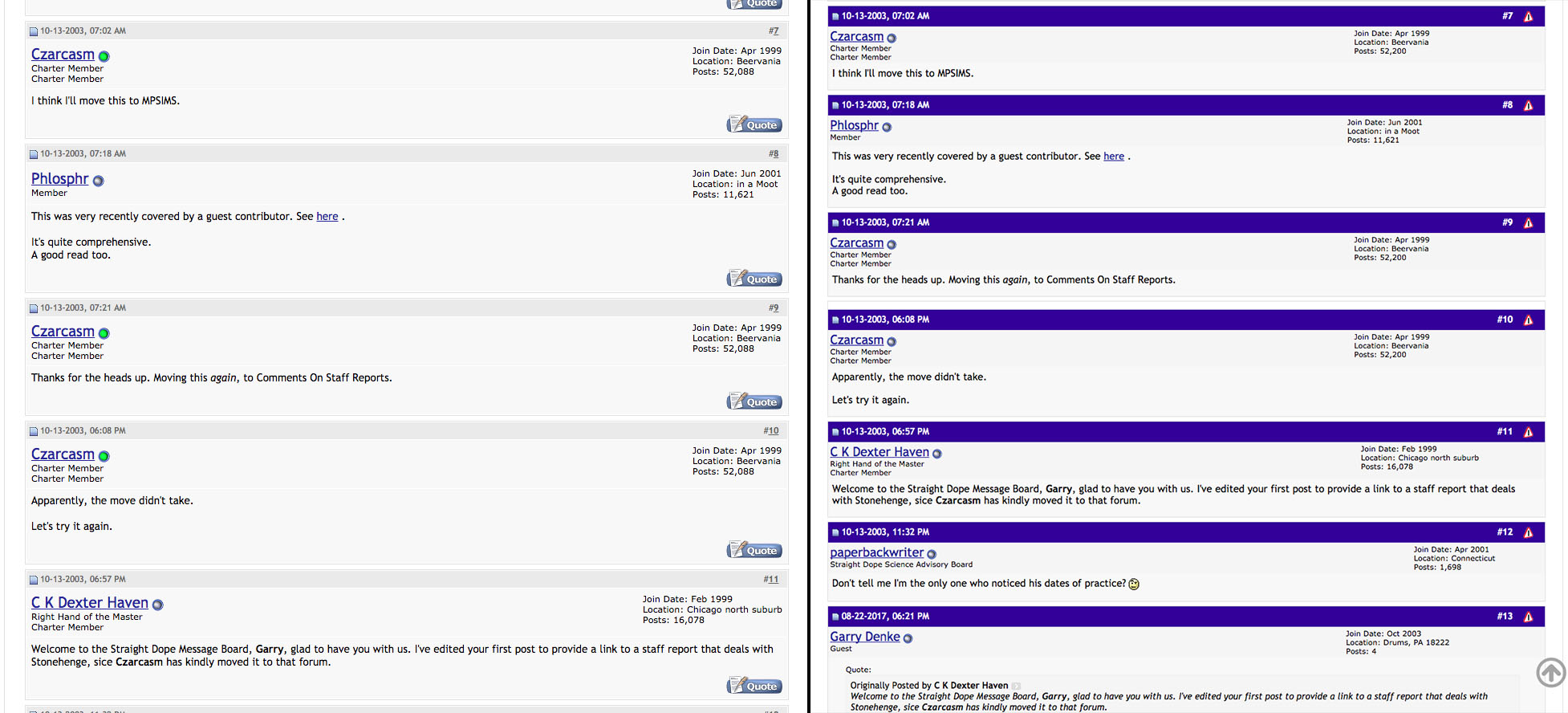
Seriously, this is an annoying “feature” that happened the last time the board was upgraded (or some previous upgrade). It was shown to be a simple line in the code that sets how quote box content for autoquote blocks is formatted, which is default set to italics. It can easily be set to not be italics by tweaking that one line in the code. It was a simple request to fix the previous time, but how likely that is this time is unknown. I prefer the quoted text to not be default italics because it screws with people’s intentional font choices in the quoted material. I also prefer the font size to be the same as the response content, with the quote box lines sufficient to distinguish the two. On my screen the box is sufficient, but some browsers are not seeing it, perhaps because of zoom level.

Yes, bold is almost indistinguishable from non-bold text. I think it is the font. This needs to be distinguishable across platforms.

I think the blue bars are an actual skin from the prior version of the board - I think it was the skin I was using because I like the differentiation. I don’t see skin selections available any more.

I mentioned in another thread, one improvement I do see is the performance of the post edit window. In the old version, using the edit window on a mobile platform the text in the box would center on the screen. Enlarging the box sufficient to see the text made the text box extend off the sides of the screen, but the window stayed centered, so you could not set the cursor and see what you were typing. That pretty much made using the regular board software unusable for posting, and drove me to Tapatalk. This new version fixes that so the screen follows the text/cursor. I may still prefer Tapatalk - I’m trying to decide which works better on mobile for bumping between posts and forum lists. Neither really works fully to my preferred method.

Oh yeah, let’s make it that light shade again. :slight_smile:

What about the repeating banner ad after every fifth post? That’s annoying. It’s just the same ad over and over.

Since nobody mentioned it yet, the blue (looks like purple to me) bars are an identical color to the main banner of the site. I’m sure they’re an attempt at site consistency and/or branding.

On my PC it hurts my eyes though. (Firefox on Windows 10.)

I didn’t even realise it was better on mobile until Ed mentioned it. I have to say, it’s really much improved on mobile. On desktop, though… all that whitespace. Ugh. The font size. Double Ugh.

It does look a lot better on mobile. This is probably one of those changes where I’m going to end up browsing the board a lot more on mobile and stop on my actual computer, because the formatting on the computer pretty much makes this unreadable on here.

eta: For whatever reason, it’s giving me a headache. I tihnk it’s something to do with the white space/contrast.

Here you go. To the left is old; to the right is the same thread new. (At least on Mac running Chrome. I myself haven’t noticed any font size difference on the desktop version.)

Multiquote works for me, just like before. You click the buttons, then you click Reply at the bottom. And they do have buttons–though they look a lot better in Chrome (except after I tweaked them in my Userscript.

I don’t touch the whitespace, though. It doens’t bug me, so I didn’t think about it.

I agree with half of that. It’s not like I post here with any regularity anyway, and it’s not worth it to me to put up with the new format if it’s going to be permanent.

In terms of mobile being “better,” this is what I see on my device when I use it in my preferred orientation, portrait. Words cut off in mid sentence at the right.

Landscape orientation isn’t much more useful for me. The post is zoomed in way too much, and there’s no way for me to zoom out to get more of it on the screen. For me, it makes it annoying to try to follow a thread just a couple of sentences at a time before needing to scroll.

I’m not six and this isn’t a plate of broccoli. My major objection is that it looks bad, not that it looks different. I’m perfectly capable of being objective about a change and avoiding a kneejerk “change is bad” reaction, but the implication that anybody who doesn’t like it must be jerking said knee is really frustrating because it just handwaves objections away.

My major objection, though, is that I can’t go into the settings and choose what theme I want. It’s core functionality of vBulletin and I do not understand why, if we’re in the process of adding new skins, it’s not an option.

What are the chances of making this happen? Ideally, in fact, it would be automatic – mobile users get the mobile UI, PC users get the standard one. But changing it manually is fine, too.

What is NOT acceptable in my view is the present mess, which seems to overlook the fact that even if lots of folks use mobile devices, lots of others still use real computers and real monitors! To make the site almost unusable on real computers seems more than a little short-sighted. Plus lots of things look broken, like the permanent embedded ads and the inconsistent font sizes between posted text, preview text, text in quotes, and text in lists, just to name a few. I know I keep harping on this, but the default font size in the body of posts is just wrong for desktop and laptop displays, and the reduced (normal) size of quoted text is distracting and unnecessary, as are the italics.

I like the font size (old eyes and all that).

I like the arrow to go to the top of the page, and the drop-down forum menu, so that I don’t have to go out to “Main” to got to a different forum.

Not a fan of the big blue bars. I really think they interrupt the conversation.

On multi-page threads, the page number that you were on used to be bolded, and the other page numbers were normal type. Now they’re all bold, and you have to look at the “Page 1 of 2” thingie to see where you are. I don’t like that, as it undercuts functionality of the page numbers.

The rest I can live with.

Looks fine. I don’t really see any improvement, but it is not really worse. Ads a a bit of a pain, but ignorable. I never use it on phone. Works fine on my creaky home box.

Yes, the text size problem is very annoying. If I zoom to a reasonable text size in a thread, the text on the forum display is too small. And IMHO, the text size in the quote box should be the same size as the text in the posts.

There’s also a noticeable inconsistently: the text on the preview page is the same size as the text on the forum display, including the text in a quote box.

Please make all these font sizes match.

Well, now you’re going to get a lot of complaints that it’s not desktop/laptop friendly.

Are we just going to cycle between mobile and desktop/laptop optimized sites every few years as the complaints from the other side come in?

I have an ointment for that.
Bolding Mine

No, because in a few years they will have to Re-Skin the site to work with cybernetic VR implants. :stuck_out_tongue:

If that size change is a regular thing on these boards (I never paid much attention before, as I had no reason to), I might have to stop visiting.

I had to zoom out to get away from the giant text, which, on Chrome at these levels (I’m at 80%), makes the text thinner and runs smaller text together.

So, on my monitor, your “Bolding Mine” looks like “Bold rg Mire”.

Obviously, in this case, context and whatnot made it apparent what I was reading, but if people shrink the text to add caveats or what-have-you, that’s going to be a real pain.

Nope, still hate it.

Well, happier.:smiley: