WOW! Much angry, so sad.
Could we please fix the page numbering issues? If I had a test backend and 30 minutes I’d make the code myself; it really couldn’t be that hard, it’s just changing a bit of CSS (and I even showed you which CSS), and every single time I want to check what page I’m on I’m annoyed by having to search for the number, rather than just being able to see if the one that isn’t blue is the last page. Similarly, the quotes being replaced with italics is just bad. This isn’t my opinion, this is just straight-up poor usability - stripping the formatting from quoted posts sucks.
This. This change made the forum less usable for me. It is a straight-up downgrade in functionality, in some ways objectively so - not just a matter of “I don’t like the blue bars or increased space” (I don’t mind them). Quotes are harder to read. Lists seem disjointed and disconnected from the rest of the post. Do spoilers in quotes still get broken?
EDIT: yup. And I can’t close the spoiler for some reason. The button doesn’t work.
This x1000. Seriously, if you want a skin more compatible with mobile, make this the default, and give us the option of going back to the old skin, which was almost identical, but worked better.
You mean this
https://farm5.staticflickr.com/4424/36930961921_a89b92b518_h.jpg
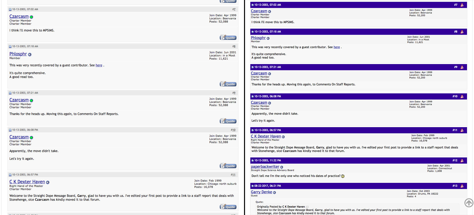
Using firefox 48.0.2 seem like any other message board.
Unless the blue bar looks bigger on your browser.
It lust looks like any other message board out there.


https://files.staticfsr.org/files/images/vBulletin%20Homepage.preview.jpeg

https://cdn.sourcewp.com/wp-content/uploads/2016/06/simplepress.jpg
https://files.staticfsr.org/files/images/phpbb3-screenshot.preview.jpeg
http://cdn.inmotionhosting.com/support/images/stories/edu/phpbb/overview/forum-overview.png


So unless some how it looks bigger on your browser pretty mush every message board out there has it.
Like this blue one dead on
I’m starting to think the whole site needs a complete modern revamp. Go hard or go home.
The gray ‘back to top’ arrow is pretty pointless on an iPhone, since all you have to do is tap above the URL field (where the time is displayed), and it scrolls you back to the top.
So many places doing it wrong.
![]()
None of those sites, except for the very last one, show the annoyance we’re talking about. It’s the deep blue lines in between posts within a thread. Look at the example of the old vs new I linked to in my previous post.
ETA: Better yet, here it is again. The post separators are much less distracting and annoying in the old version.
So many people are seeing things I do not see. In the beginning the font looked really big. So I made it smaller. The ugly green color of some buttons bothered me for a couple of minutes. Etc.
I think one reason I like coming here is that it’s the one place in the world where I am not the crankiest, crabbiest, pickiest person in the room.
I only visit SDMB on my desktop. This new look is harder to use, with so much wasted space. My 2 cents.
No,no,no!
It should read: The Straight, but NOT Narrow, Dope. ![]()
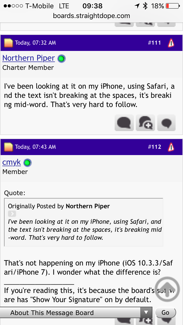
I’ve been looking at it on my iPhone, using Safari, and the text isn’t breaking at the spaces, it’s breaking mid-word. That’s very hard to follow.
That’s not happening on my iPhone (iOS 10.3.3/Safari/iPhone 7). I wonder what the difference is?
I’m also noticing that quoted spoilers are automatically revealed. Uncool.
Dump this skin already. Yikes.
When I use search I can still only see 3/4 of the page, the right 1/4 is off screen. (iPad mini, safari)
The dark blue line after each post is a titch annoying, but the larger print is nice.
My 2 cents.
On my iPhone 5 the site is significantly worse. It is really quite a mess, whereas before it was quite readable.
The floating thread selector and jump to top button are sealing easily over 5% of the screen real estate and are distracting. They have to go.
If I hold the phone vertical the words break at odd letters making the text wretched to read. Held horizontally the text breaks correctly at word boundaries.
I never had any issue with anything that the new style is supposedly fixing when using my iPhone before, but the style has made things much nastier.
The entire style looks like the work of a child learning how to code for the Web. It reminds me of stuff one would see in the 90’s. Strange spacing, inconsistent use of icons and text, gratuitous colours. I struggle to believe this has been implemented by anyone with any sort of professional training.
<grumpy_mode>
Given the consistent denial that there would ever be the time spent to upgrade the broad to a later version of vBulletin, I find it disconcerting that time has been found to put into this ill considered botch job.
<\grumpy_mode>
What are you talking about? This theme has been a total FAIL.
From the other thread, it now breaks the functionality of the
 tags:


[quote="RTFirefly, post:207, topic:795610"]

Tried doing anything with
yesterday or today? It’s a disaster.
[/QUOTE]
I’ll second this one as well. Could we also make links in general a distinctively different color so they can be differentiated from underlined text?
And one last request: Could the “go to new post” button be either fixed or eliminated? Now that they are colored red, I am even more aware that the feature does not work on this site.
Hmm. Weird. Are you looking at it in portrait mode? Here is how your post looks on my iPhone (iPhone SE, Safari, iOS10.3.3). I’m assuming it’s the fact that you have a bigger phone with more screen real estate.
The other oddity I noticed is that on some of the pages, the hyperlink in landscape mode drops a couple font sizes, as in this case. Also, note how obnoxious it is that that is my entire iPhone screen, and I can only see a very small portion of the thread, as if I’m looking at it through a magnifying glass, with no apparent way to zoom out or make the font much, much smaller.
And the bit about us who are not happy with the changes being a bunch of change resistant grumps is a steaming dog turd. I don’t believe I’ve ever complained about any changes in the board before; I generally am an early adopter of new technology (the instant a new OS comes out, I get it–I’m one of those people who loved the “flat” look of more modern OSes and wasn’t bitching about it; in most cases upgrades truly are upgrades, even if they require a slight bit of readjustment), and I happily use several other boards with different layouts and interfaces, and this is the only one so far that has annoyed the crap out of me.
Yep, portrait mode. Landscape as well, all the breaks are after words. Could be the screen size/resolution. Dunno.
That is utterly bizarre and abysmal. It’s so blown up as to be obnoxious and almost unreadable.
Agreed and same here. This isn’t moaning over aesthetics or just because it’s different, and will take some getting used to. A lot of stuff is truly borked. I’d just go back to the old theme, as I don’t trust they’ll be able to squash all, or even most, of the issues across all these different devices and browsers.