I’m doing a little design project where I’d like to write some words that are not used in musical notation, but I want to use the same (or at least ascetically compatible) font that is used in traditional musical notation for mf (mezzo forte), crec (crescendo), etc.
That’s a cool set of fonts but I can’t find one that just gives a font for the direction asked for in the OP. They seem to be symbol character maps with notes and other special symbols. There seem to be two collections of fonts, one starting with Reprise and the other starting with Opus. For example, Opus Text has an f and a p used for forte and piano, but it doesn’t have the whole alphabet, just those letters and m and n; other characters map to thinks like flat, coda, sign, etc.
On musical scores I’ve seen, those annotations (“mf”, “cresc.”. “da capo”, etc.) are in an italic font of moderate boldness, and visualizing them from memory, I suspect strongly that they’re one of Lynn’s relatives. (A Bodoni family font, in other words.) But I have no evidence or proof to confirm this, so count it as a WAG, pending someone with actual knowledge of music publishing showing up with an answer.
It looks like GIMP comes with an “Opus Text” font, but only the characters used in music notation have the font treatment applied, which is only 2 characters of the 8 that I’m trying to use. Other characters get some sort of default font. I’m looking at the Bodoni fonts next…
Sorry for the bump, but, I’m thinking that if this hasn’t worked for ComeToTheDarkSide it won’t be for naught …
I was working on remaking the logo for my national anthems site, since it’s about music, I wanted to do similar to what you did, ie include writing in “musical notation font”. I looked at the characters used in Noteworthy Composer’s font file and, while there was only a few useable letters there, I found that italicized Arial comes really close.
I eventually came up with this logo, you can definitely see the “f” was used from the Noteworthy Composer font file - I believe the other letters in the logo that are also used in musical notation (ie the “s”, “m”, and “o”) were also from the Noteworthy file, but the rest are Arial italic. IMHO, you can’t tell as they blend in well.
Thanks for the suggestion. I’ve been trying a few fonts out in GIMP that look pretty good, but none of them are slanted at enough of an angle to match the “piano” p that I am using as the first letter of both words that I want to use this font for. My next foray into hacking my way though this project is to try and further slant the angle of the font’s text layer with GIMP’s tools.
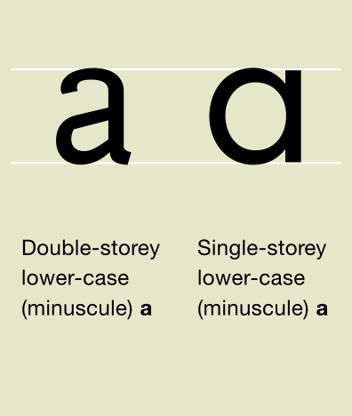
Other factors of the musical notation font include that it is very rounded in the tip of the r, etc. When I find that particular feature in a font it usually means that the lower case a is double-story vs single story, where I would like to use a single-story a.