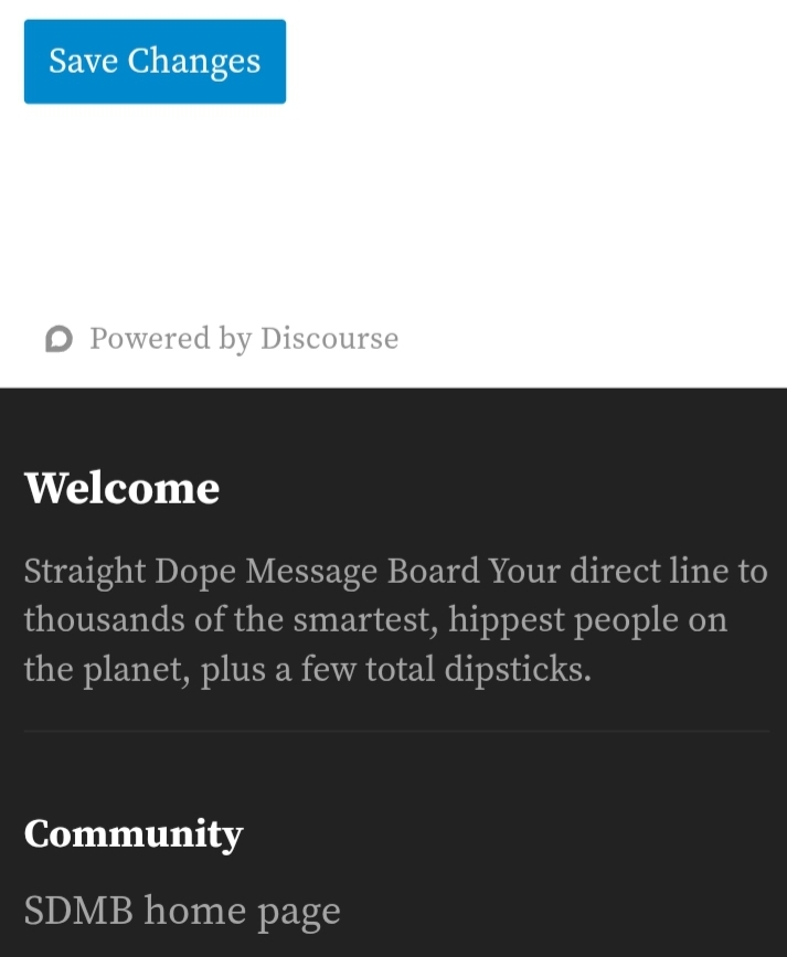
I have an issue that the bottom of every page on the SDMB is in the opposite theme in terms of Light and Dark. I’m talking specifically about the area that comes after the “Powered by Discourse” text that has the “Welcome”, “Community”, “Forum Jump” and “Quick Links” headings. Screenshots:
Dark to Light

Light to Dark
I don’t want to be blasted by bright white light while browsing using a dark theme.
I can make the whole page dark if I switch to a light theme on the SDMB and turn on the “Dark theme” button in my browser, but that inverts some images like emojis which makes them more difficult to read.
Themes are switched using “Theme” under the SDMB “Interface” settings with Cromite mobile browser on Android 9 OS.