Of the eight original teams who are wearing them to celebrate the 50th anniversary of the leagues founding.
I voted for the Chargers. I think their powder blue’s look sharp.
I’m not going to vote, as I didn’t notice any of them except for the Broncos.
But without seeing any of them except for the Broncos, I will wholeheartedly vote for the Broncos as the ugliest.
The Jets’ Namath-era uniforms were waaaaaay cooler than the generic green ones they adopted later.
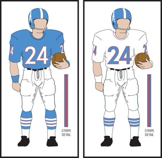
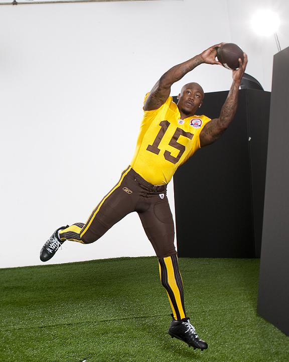
Seconded. It takes a lot to make the early Elway era uniforms look snappy by comparison. But those brown and yellow abominations sure did the trick.
Another vote for the Chargers.
Yeah, the Bronco unis are UGLY. IIRC, the Broncos, like several of the AFL teams, were on a shoestring budget, and they got the original yellow-and-brown uniforms from a defunct college all-star game. The vertical-striped socks are amazingly barfy.
I also think that the Jets (Titans) uniforms are pretty ugly.
Throwback? I remember when they wore most of these uniforms.
I think the Jets/Titans seem to work the best, mostly because they are so retro – more like something out of the 40s. Like the colors, too.
Having them wear retro when they played Tennessee was brilliant. Not only did you have the Titans vs. Titans, but people don’t remember that the Jets and Oilers were big rivals in 1967 and 68.
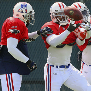
I always liked the original Patriots helmet, so I’ll vote them.
You got that right. Those vertical striped socks have to be the stupidest looking things I’ve ever seen in football.
I didn’t see them play but based on that link, I really like the Jets/Titans.
They look like they should be guarding the pope.
I really wish they’d use a little more variety for the throwbacks. They seem eager to go back 50 years, but how about sometimes going back 10-25 years and wearing the uniforms from the '80s and early '90s that (coincidentally) I grew up with? I’d absolutely ***love ***to see the some of these uniforms again:
Giants (road)
Jets (road)
Broncos (road)
Bills (road)
(If anyone here can name all 8 players above without having to look them up, you’re a rock star.)
I mean, there have got to be more fans who’d get a kick out seeing the uniforms the Broncos wore when they lost all those superbowls than fans who enjoyed looking at the ridiculously ugly brown and yellow throwback they wore on Sunday.
Also, I never really thought about it this way, but I seem to have a thing for road uniforms that are all white. How many current-day teams regularly wear white tops and bottoms, with only minimal highlights (i.e., the Cardinals road unis don’t count)? Off the top of my head I can think of the Colts, Browns, and Bears. Any others?
I like the Bills’ uniforms just fine, but the Chargers are always the Kings of the Throwback. And I’d be happy to see some of those '90s uniforms come back. They’re less samey than a lot of the current unis.
Raiders’ look the best, but the Broncos are the awesomest. They’re so terrible they’re awesome.
Also, LOUE, that’s not the Raiders’ throwbacks (or at least, not the ones they’re wearing this season for the AFL Throwback games).
Just to be nitpicky, the Chargers are wearing their 1963 throwbacks, cause it’s the year they won the AFL title. Therefore, not LA - definitely the San Diego Chargers.
And the Broncos look completely ridiculous, but I think it’s great they chose those unis. If you’re gonna go for it, go for it 100%. Be proud of the hideousness.
I think some teams need to be a little more judicious when taking some of these throwback jerseys out of the mothballs.
The Broncos jerseys were putrid. It’s obvious that whoever designed the original jerseys had a brainfart, and fortunately someone came up up with a much better color scheme really, really quick.
Same with those horrible Philadelphia Eagles light blue-yellow abortions 2 seasons ago. Those uniforms were made to commemorate the Eagles 75th anniversary. The problem is those 1933 colors were from back in the days when players wore leather helmets, and just do not translate well in 2009. They were ridiculous. I’m also a hater of the Steelers and Packers throwbacks. Awful.
Sometimes, there is a very, very good reason they are “throwback” uniforms, because in many cases, they should be “thrown back” in the garbage.
I picked the Bills. That primitive looking logo seems to capture the era in my opinion. When the Broncos did away with those uniforms, there was a bonfire in the stadium to burn the socks!
For all of you Bronco uni haters, this story should make you all happy.
Everyone hated them, including the players. They thought the socks made them look like clowns. So when the Denver team finally got enough money to replace the uniforms, they took those ugly brown things with the vertical striped socks and burned them in front of their fans in the middle of the field.
No original Bronco uniform exists.
As it should be.
I forgot to mention… someone upthread slammed the Eagles and Steeler throwbacks from a few years ago, and rightly so.
They were brutal. The Eagles uniform was based on the colors of the flag of Philadelphia, which is where that hideous combination came from.
The Steelers uniforms came from the same idea. Pittsburgh’s flag is black and gold, and I believe the markings on the old Steeler throwbacks were from the flag. I could be wrong on this one though. That whole season had some bad throwback uniforms.
The best throwback helmet is the Patriot hiking the ball. I still hate the new logo. Sometimes, you just have to stick with what works.