I sent these 2 photos in for a (food) photography competition. (Yes, I’m one of those people who takes pictures of food) How could I have made them better?

I sent these 2 photos in for a (food) photography competition. (Yes, I’m one of those people who takes pictures of food) How could I have made them better?
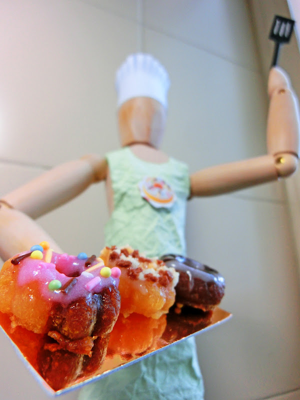
The first one (with the “chef”) has a depth of field problem: only the foreground is in focus. You could have avoided this by stopping down, assuming you had the light for it. If you didn’t have the light, you could have put the camera on a tripod to cope with a low shutter speed.
Still on the first one: I’m not crazy about the framing. The subject is cut off on the lower left and upper right, and there is a little triangle in the upper right. I think the right angle in the right side of the wall is a distraction - it might have been better to position the subject in a spot where the background is more uniform.
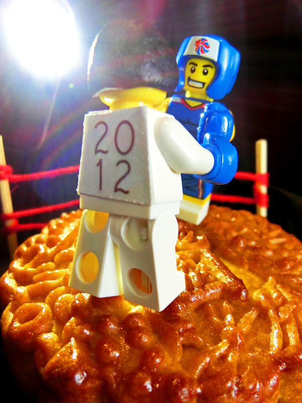
The second one (with the “boxers”) has some lens flare, which can happen when you shoot directly into a bright light. It’s probably easiest to fix this with Photoshop, if the competition allows this. I think the light is too bright - it dominates the picture. You might also want to extend the red strings to make them go out of the right side of the picture to make the “ring” look complete. There’s also something protruding into the frame on the lower left, and the table the subject is sitting on is visible on the lower right.
Instead of commenting on the technical issues of the photos, I’ll approach it from a less professional perspective.
The 1st pic does have a focus issue but to my untrained eye, it simply emphasizes the pastries as opposed to the chef, making the pastries the subject matter. If that was your goal, I’d say you succeeded.
The boxing photo is more confusing. I’m not sure what the subject matter is but perhaps a caption would explain this for the editors/readers. Regarding the flare, a casual viewer may simply interpret this as a spotlight cast upon the ring but it is distracting.
In both pictures, your composition is…less than optimal.
In the first picture, I can’t tell if you intended to feature the food or the chef. Is there some reason the chef has to be there?
In the second picture, if you have to have the boxers in the shot, I think it would be more effective if you could frame it so as to show both of the faces…and get rid of the spotlight.
:smack:You are joking, right? The foreground is the focus. The chef is meant to be out of focus; it wouldn’t work otherwise.
I like both pics, but the first one doesn’t have as much impact as the second. To me, the tiled background in the first pic is the wrong colour - the chef blends in to it too much, plus I find the grout lines, although they are out of focus, distracting. (The corner and shadow in the right-hand side is also a distraction.) I like the idea of the picture, but the left-hand edge of the food tray is cut off, as is the chef’s elbow. Also why use a reflective tray? It distorts the shape of the cakes and we don’t need to see the underside of them.
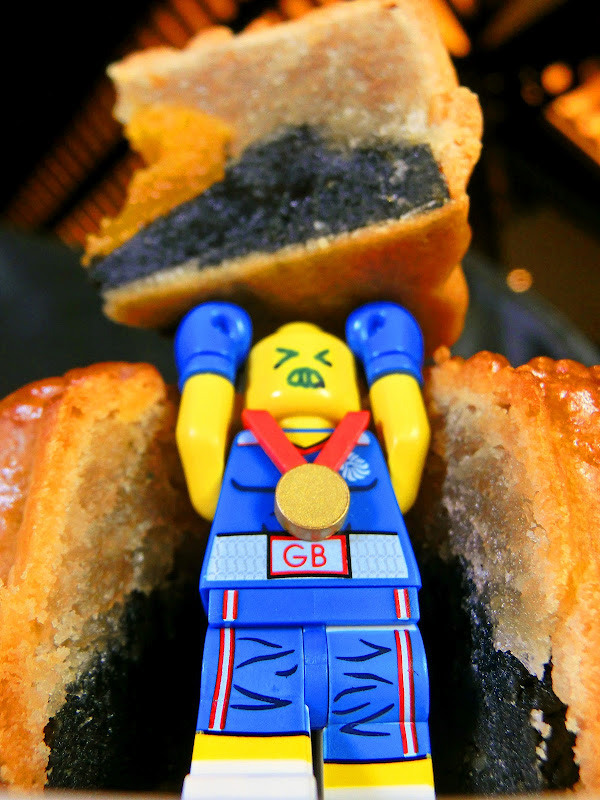
The second pic, I like a lot. It’s exposed very well and the spotlight shining into the lens creates the right atmosphere. (I think Jeff missed the point there, too.) There is a bit of distracting detail in the black shadows, though, particularly above the right-hand matchstick (light leaking from outside the room, perhaps?) I also agree that a complete “ring” would be more effective.
Totally disagree. Why do you think films rarely show a static shot from the side of two people talking/fighting whatever? Because it’s boring. Over-the-shoulder shots are much more dramatic.
In the first picture, I can totally see what you’re going for. The focus is the food and the chef is supposed to be the background. The problem I’m getting with it is the lines. Every line leads back to the upper right corner. The tray holding the food is pointing that way. The chef’s arm and pancake turner as well as the lines on the tiles are all pointed that way too. Unfortunately, that isn’t where the focus is or should be. The cropping on the left and right side is a bit too sharp and cuts off the chef. But I really thinking the lighting on the food is great.
In the second picture, the lines of sight for me move up the white legos back up to the light and then over to the blue lego man then back to the white lego. It’s a triangle that seems to be forgetting the food on the bottom. The white lego also creates a little bit of a problem with its back turned to us. If you want the back turned to the audience, that’s ok, but the mystery of the face detracts away from the picture for me. The lighting also emphasizes the figures more than the food. A light source on the right would help eliminate the shadows.
Critiques aside, I liked 'em 
Both are really cute.
In the first one, is the chef homicidal or victorious? The way the spatula is poised makes it look like he’s going to whack the food.
In the second one, I agree that the ring ought to be finished. Also, while I love the setting, including the flash, IMO it’s missing one key element: the audience. I’d put in some faces in the background, even if they were just hand drawn faces with various expressions on a piece of paper.
Good luck!
Great work on both. The only 2 minor quibles I have are: Pic 1 - the sides of the arms and the edge of the tray are cut off. I just would have kept those in the pics. Pic 2 - The light is giving all types of odd effects in the upper left corner.
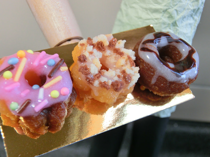
I really like both of them, especially the first one. The only change I would make is to possibly center the pastries to bring more attention to them since it’s obviously the focus of the picture. I’m not even sure about that, but centering seems to be a common theme among the main focus. Heck, I even like it when it’s off centered like that. If not exactly centered, I would try to get in the entire pastry tray in the snapshot at the cost of sacrificing some of the background model.
Thanks everyone for the comments and compliments! Yes, the low depth of field and lens flare are intentional. Besides drawing attention to the food, it lets me get away with simple decorations on the chef, e.g. otherwise you could see that the lines on the spatula are painted on. Looks I could have been less aggressive in my cropping though.
I thought the chef made the picture more interesting, and emphasised the scale of the food (they’re mini donuts). Without the chef, the picture would just be https://lh4.googleusercontent.com/-HGcx_5yTTxc/UBYbcLKhpUI/AAAAAAABBJQ/9PQXi0bbfdA/s800/CIMG1161.JPG He was supposed to be victorious, like, “look at what I baked!”
I never noticed the lines leading to the top right corner in the first picture, though. Maybe I was too concentrated on the food. If I had a choice, I wouldn’t have used that background, but that was the best place in my tiny apartment (enough light, near a power source, almost uniform background, but apparently not uniform enough). https://lh5.googleusercontent.com/-FAtzmpnxbgE/UBYbKIY6RwI/AAAAAAABBI0/xlRTrQ1dk7k/s800/CIMG1151.JPG
The reflective tray idea was from an article on how to take pictures of food. I can’t find the original article, but http://www.handmadeology.com/studio-quality-product-photography-with-a-12-set-up/ is similar. Tracing paper on a window and aluminium foil below.
I’m putting more hopes on the second photo, since the first was for the preliminary round and the second could win the prize. It’s a mooncake photography competition. If you search for images of mooncakes, they’re all cut in half and in front of teapots. I didn’t think I was going to beat professional photos in that kind of photo, so I tried to be different. It was Olympic season, so I thought of using the mooncake as a boxing ring (I’m glad it’s obvious they’re boxers!) since it’s about the correct size. The 2012 was as close I could get without infringing Olympic trademark.
Personally, I would have liked to have ropes surrounding the entire boxing ring, but there wasn’t enough time to put them up. As for the people, I chose that shot because it was more dramatic, but also https://lh5.googleusercontent.com/-pFBI_3_EqV8/UCifzJ8g5kI/AAAAAAABBoU/6p8XJ8rcVHM/s800/CIMG1357.jpg I only had one pair of boxing gloves, and it wouldn’t look nice if one of the people had normal Lego hands. Also, if you have 2 people facing each other, you’ll only be able to get shots of sides of their faces.
Actually, I was trying to put audience in the second picture - the light is supposed to be a camera flash. It was too hard to prepare that many more figurines though. Maybe I should have used a smaller light, or not have brightened the image as much.
I also considered submitting https://lh5.googleusercontent.com/-tSDU3-2ZpiE/UCihZYM_uII/AAAAAAABBrk/G8IdC80x6tc/s800/1384.jpg instead of the second photo; this was taken at a lower angle.
Another photo I submitted was https://lh3.googleusercontent.com/-7KxhjqFKqk8/UCigXyIPvtI/AAAAAAABBq4/p-ckDzvU7l8/s800/Aaron%2520MO%25203.jpg
No, I’m not joking. Putting the chef out of focus doesn’t work as a means of isolating and emphasizing the food. The chef is an integral part of the picture - it’s intended to be seen - so having it out of focus means that a part of the picture that the viewer is supposed to look at is blurry.
I think it would work better to use lighting to emphasize the food and de-emphasize the chef. If it were me, I would put the subject in front of a seamless background and put a spot on the food.
It’s not that I don’t like the light. I just think it’s too big and bright relative to the rest of the picture.
I would suggest the following in addition to what you have read:
“The Chef”
While not always true, shouldn’t pictures of food make the food look good to eat?
The mini donuts, IMO, do not look appetizing at all. Perhaps it’s the reflection?
If you are going to use a “chef” prop, spend more time on it. The apron seems too wrinkly. It has a disconnect to me. People that wear homey aprons like that don’t wear a chef’s hat. A white crisp apron says “chef” to me.
The positioning of the arm does not look natural to me.
In short, it takes a lot of time to set up a photo shoot. This looks like you set it up in 3 seconds, messed with a few dials and called it a day.
The moon cake one is more successful but it leaves me wondering why they are boxing on it. I was expecting a bigger reveal other than “it’s Olympics time”.
Wanted to add: why be concerned with Olympic infringement and not Lego’s?
It’s funny, I would have set up the angles opposite of what they are now. The donuts over the chef’s head and the camera above, and the boxers angled even lower, looking up with the mooncake more prominently in the foreground, which I think would make the pastry more the focus with the lego men smaller and less a focal point.
I don’t know.. shallow DOF seems to be used in every food photography picture I see. But using lighting instead of focus sounds like a good idea as well (and I don’t see many pictures like that, so it would stand out), thanks!
The IOC has very firm guidelines on their copyright Olympic Licensing - IOC Global Licensing Programme If I were to use it, that would mean using their logo on another product. But I’m not using Lego’s logo, just their products. It’s not against the law to take pictures of products, I think.