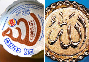
Burger King was forced to change the logo on the lids of ice cream desserts sold in Great Britain after a British Muslim declared jihad against them because the swirl on the lid resembled the Arabic script for Allah.
With those bright colors and the “modern, fun” design, I’m thinking some sort of youth outreach organization.
Really though, there’s a lot of logos as ambiguous as this. What type of company do you think the Travelers Insurance logo would be for if you had never heard of them before? Nike? Dove? ING? Apple? (granted, logos usually develop from specific to streamlined due to brand recognition, but still, I can’t say those logos are self-evident)
No idea why but my first thought was also frozen yogurt.
Me too, for whatever reason.
The Y is misleading a lot of people. It’s not youth nor yogurt. (Actually, the Y is a name.)
Logos don’t need to be pictorially representative and you can always find a successful outlier like Apple. But for Nike, the swoosh represents the grace and power of almost every athletic endeavor. Dove (I assume you mean the soap) represents grace and delicacy and elegance and (for some values of dove) purity and whiteness. All good associations for a women’s facial soap. ING uses an orange lion because it’s a Dutch company and (the House of) orange is the national color, and the lion is the national emblem. Again, good strong ties to the company in some form, if not representative of what they do. They’ve all become iconic, which is one purpose of a logo, but except for Apple they all started in some related theme, root, association or something.
Simply throwing together a graphical construct does not make a logo. That’s why this one particularly irritates me - not only did they not hire [del]me[/del] a qualified person for their re-branding and marketing efforts, but they hired someone so inept they should be run out of the game on a rusty saw blade.
The purple is nice and a good association. The green would be better except that it’s a horrid, just-olive color and looks good only in high-quality printing. In everything else, it tends towards that color American Graffiti so aptly described as “a cross between piss yellow and puke green.” The embroidered patches are particularly vomit-colored after a few washings.
Okay, the logo is for
a family orthodontics practice. (Hence the “fo” part.)
Now, does ANY part of that logo say
dental, medical, human service, cleanliness, care, comfort, concern, straightness, appeal, beauty, or much of any other adjective you would want associated with a dental practice? Is there ANYTHING about that logo that falls more heavily on the side of association with such a business than on the “I can draw this cool thing in Illustrator, just watch me!” side? What in dentistry or orthodontics is represented by a circle or target?
I think it looks like the logo you’d find on cleaning products, or just maybe the ickier end of first aid products… in Spain or Albania.
This one is bad on so many levels…
The New York Mets keep changing their logo because they can’t decide if they want the skyline in the logo to include the UN building or not. Somebody needs to decide, instead of changing the logo every other day or so on their website.
Nope. I too thought “frozen yogurt”. Weird.
That says all the opposite of what I want to think about when I think of
orthodontics
It’s actually better in isolation, when I thought it was for frozen yogurt. But combined with the knowledge of what it’s for, now it says:
“green, pustulant, infected…goopy.”
IANAProfessional, but yeah, I agree, that’s a *horrible *logo.
Unless you’re running a frozen yogurt shop, I guess. Then it’s a great logo!
Sure, it’s a crappy logo. But doesn’t really fit the theme of the thread. There are lots of uninteresting crappy logos. But logos that look like anal sex…those are really really unfortunate.
/end hijack 
Does anyone have any candidates that haven’t been on net lists for a decade?
I saw that one awhile back, and it actually took me a second or two to figure out the intended image.
What about the Square of Quality? “Logos” that are just type in a square are boring after a while.
There’s always the Office of Government Commerce, in the UK. Here’s an article that shows how it was meant to be interpreted, and what a 90 degree rotation can do.
My usual contribution to these threads isn’t one that looks dirty or anything but just puzzling…
I don’t know what the face of “success” is, but I’m fairly sure that isn’t it.
So, it’s the initials of the business name, whatever business that is. What would you think this logo is for, if you didn’t recognize it from before? I don’t find your example to be significantly worse.
Clearly it stands for Yellow Fuckin’ Organization!
I didn’t even notice there was a picture, I can’t take my eyes off the horrible kerning.