old logo
older logo
newer logo
Too early to be a TV aerial. Is it an Eastern cross?
I post at Fathom
old logo
older logo
newer logo
Too early to be a TV aerial. Is it an Eastern cross?
I post at Fathom
According to this site, it’s:
“The colophon, the symbol for Nabisco, is a trademark usually placed on the title page of a book or as an inscription at the end of a book giving facts pertaining to publication.”
-And if you look close it’s on the face of the oreo Itself.
And though I can’t confirm it, it appears that a company called “Colophon Company Limited” is a holding of Nabisco (now Kraft). And since Google tells me that Nabisco was created as an amalgamation of several bakers, I would wager an estimated guess that the “Colophon Company Limited” was one of the companies that joined to form Nabisco originally. -But’s that’s just a guess.
Just for the record, RumMunkey, “colophon” is a generic term for any trademark or symbol placed on the title page of a book–it doesn’t refer just to Nabisco’s logo or any other specific symbol.
It looks like a “croix de lorraine”. Maybe there’s some historical connection ?
I’m drawing a blank right now, but I am almost certain that I remember reading an explanation for the symbol in Barbarians At The Gates, the book about the RJR Nabisco takeover in the late 1980’s. Maybe someone else remembers, or it at least provides someone with a lead.
Well just look at the darn thing! The original logo contains the full name, “Nabisco”, in its shape!
Lookie:
I always thought it was from the Fifties, influenced by TV antennas and space and orbital paths, what we would now call retro-futuristic, like the design of props in the (later) Jetsons cartoon. I<m surprised to see that it’s older than that.
Well, yeah, but by the same logic, it also contains the full word, “labia,” in its shape. Just saying.
Heh, kind of appropriate that I should reply to this thread. However, frustratingly I can’t remember the exact details. What I do remember is that back in the 1980s (?), a certain pack of Nabisco brand biscuits featured an explanation of the red-triangle device (i.e. this version). Unfortunately I can’t even remember which type of bicuits it was on :smack:
It certainly wouldn’t have been Oreos, as we didn’t have them in the UK until quite recently. I think it was a savoury cracker…
Is that the intent of the logo design? There are a number of words you can spell with that formula!
Check it out, I can spell “BOOB”!!!
Whoosh!
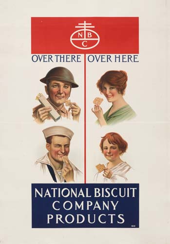
The N, B, and C are on that logo because they stand for the National Biscuit Company.
To take it back a little further, it seems that the figure appeared on the original packaging for “Uneeda Biscuits”, the first product sold by the National Biscuit Company in 1898:
Note that the lettering inside was different, then used to promote their new “inner seal” packaging to keep the crackers fresh.
Another interesting tidbit from a page about the Roycroft Community, a late 19th centery artisan’s guild which also used the colophon:
Bolding mine. I would hazard a guess than one of the founders of Nabisco was aware of the derivation of the symbol from the middle ages as some sort of a mark of quality, and it simply appealed to him.
I’m from the UK too, and the logo appeared on the side of Shredded Wheat boxes, at least as far back as the late 60s. From memory, the blurb said little more than that the red triangle had been used for a long time by merchants as a symbol of quality. It didn’t get around to explaining the ‘antennae’ aspect of the corporate symbolism.
I expect that the symbol is probably part of a very large conspiracy involving big companies, big money, geo-political power struggles and the Da Vinci code. Anyone who denies this is, of course, part of the conspiracy and just trying to cover up.
Incidentally, for those who haven’t quite made the connection, National Biscuit Company…
Well, given the suggestive advertising on the Oreo cookie, I can only say one thing:
I just knew there was something I was supposed to lick in the middle!
Tripler
:: ducks and runs ::
:smack:
Sorry, all I could think of was “boob”. I’m sure you understand.
[sub]boobies[/sub]
I was googling Lorna Doone cookies to see how old of a logo was on them and came up with this link mentioning the Straight Dope and Cecil. Interesting.
http://ask.yahoo.com/ask/20020425.html
I came back to this thread to say “Shredded Wheat”, because it suddenly came to me last night that that’s what I was thinking of – the biscuit link was a red herring. However I think you are right that it only explained the red triangle part of the logo.
Now I’m certain you’re right.
Actually, you may be closer than you think :eek:
You see, it all makes sense…