What's your LEAST favorite album cover?

Once again, a thread spinoff, this time from the “favorite album cover” thread.

As with the favorite, I can’t think of one in particular, but one that comes to mind as a good candidate for a Top 10 (or Bottom 10) list would be Prince’s “Lovesexy”.

A couple years after it came out, I dated the owner of a used record store, and he said that EVERY.SINGLE.TIME someone purchased that, they would cringe and say, “…the cover…”

Please don’t chastise me for using ellipses, because they’re appropriate in this case. :wink:

The White Album.

There are a lot of bad covers for bad records, but I assume you want professionally made, indended to be good but failed covers.

I nominate Voice Farm, The World We Live In. In the days of vinyl, I’d never leave it out, lest people start looking at me funny.

The Scorpions Love Drive isn’t much better.

In the other thread, I mentioned that Within Temptation has one of the best covers.

Here is their good one.

They also have one of the worst. Here is their follow-up album.

Within Temptation - The Unforgiving

And unforgivably bad album cover.

The album Crust by the Austin, TX band of the same name. It was so disgusting that when I lent it to a friend, I got it back with duct tape covering the front of the jewel case.

You’ve been warned. NSFL.

Lola vs. Powerman and the Moneygoround, Part One. Not as cringeworthy as some, but it has the lowest album cover quality to album quality ratio.

I’ve never been quite able to figure out whether the Rolling Stones Get Your Ya Ya’s Out is the greatest or worst album cover ever.

I see a red eye. Is there something more disgusting?

Well, definitely as skeevy: “How About You”

From that album. Not bad vid. accompaniment, I gotta say, though.

The runaway winner for me is “Vertical Smiles”, an early 80s album by Southern rock also-rans Blackfoot.
Not safe for work cover.
Congradulations guys. You tried for sexy and hit creepy.

Anyone else really not care for the one where John Lennon and Yoko Ono are naked?

Yeah but it’s got the great Dylan inside joke going for it.

Ha! Called it in the other thread! (For the record, I think it works fine, but many people don’t)

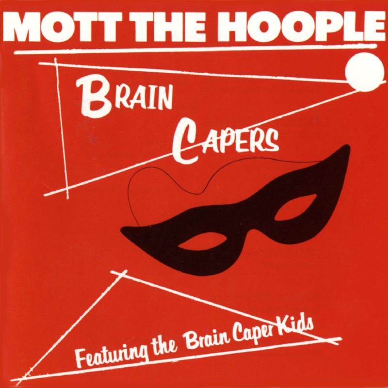
My choice is Brain Capers by Mott the Hoople. Ugly red and looks like it was given about five seconds of thought. Hard to believe a professional designer worked on it.

Atom Heart Mother

Back when CDs were still a thing one browsed, I was always looking through the Pink Floyd area when considering buying new music looking for albums I knew were good that I hadn’t acquired yet. That stupid cow was always present, often in multiples. The album is probably their worst, and the cover is really, really stupid. It’s just awfulness on top of awfulness.

The worst Scorpions cover has to be the original one for Virgin Killer (not linking even with two clicks since it definitely is not NSFW)…

The disgusting ooze? Admittedly, that’s a small thumbnail with less impact than the full-sized image.

A couple years ago, I re-discovered the late 1970s Midwestern prog band Starcastle. This is the front cover of their debut album.

https://www.google.com/search?q=starcastle&rlz=1C1LDJZ_enUS504US504&source=lnms&tbm=isch&sa=X&ved=0ahUKEwj2vIeZ5LzWAhVHPCYKHXfVDgcQ_AUIDCgD&biw=1024&bih=679#imgrc=KVmGuNEacckOMM:

Pretty cool, eh?

In time, the record company wanted them to be a Top 40 band, and this ultimately led to their breakup. Not only is this a IMNSHO terrible album cover; the band itself did not put tunes from it on their website for downloading. The guy on the far left is their drummer, Stephen Tassler, who graduated from medical school about a decade later. :cool: He has a picture of the band in his waiting room, and it’s a pretty safe bet that it isn’t this one.

https://www.google.com/search?q=starcastle&rlz=1C1LDJZ_enUS504US504&source=lnms&tbm=isch&sa=X&ved=0ahUKEwj2vIeZ5LzWAhVHPCYKHXfVDgcQ_AUIDCgD&biw=1024&bih=679#imgrc=BWZw9GukQ2RcUM:

:eek:

Excellent call. Two Virgins is blinding.
(And while I’m at it - don’t watch his “Woman” video just after a meal.)

Oh no you di-i-in’t!

That’s an AWESOME album cover! It’s totally lovable! How can you not love a cow on an album?
Most Iron Maiden album covers.

After giving it some thought, I’m gonna go with Frampton Comes Alive–a fuzzy/out of focus pic of a slack-jawed guitar player. Now don’t get me wrong, I love the music, but the cover sucks!

That cover was part of the reason the album was so popular with teenage girls. :o

The followup album was worse, in my opinion. Two Virgins at least had a shock quality that was almost artsy. It certainly got people to buy it.

The followup, Life With the Lions had no artistic quality. It was a blurry pic of John and Yoko in a hospital room.