Bad Logos

I don’t mean here the kind of clueless logos that look stupid or obscene, although, Og knows, there are plenty of those.

a logo ought to be simple, stark, and aesthetically pleasing and ought to be immediately understandable, or at least comprehensible with a minimum of effort. If you come up with a logo that is a.) ugly and b.) incomprehensible, then you have failed. People will scratch their heads and then shake them as they contemplate the disaster that is the symbol of your company. People will remember your company, but not in a good way.
One example of this, which I have brought up in the past, was the logo for the Chessie System, a railroad holding company that got its name fom one of its constituents, the Chesapeake and Ohio Railway. When I first saw a railroad car with its logo, I thought it was supposed to be a perfect yellow circle fro which some of the paint had blistered and cracked:

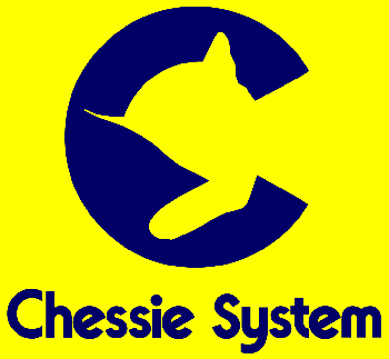
When I saw more cars with exactly the same thing on them, I realized that this weird shape was intentional. It clearly made a stylized letter “C”, but what the hell was that weird silhouette within? It looked like a weirdly misshapen cat, with one normal ear and the other pared down to a wisp, one paw reaching forward as if to guide the poor mutilated creature on its way.

And I saw it every day, since their railroad cars brought in fuel for the university power plant. What the hell was that misshapen creature? It wasn’t until years later, with the Internet as a tool, that I learned the answer. The image was derived from this image from their old ads:

Yes, it’s a sleeping kitten, covered with a blanket, one paw outside the covers. The implication is that you’ll “sleep like a kitten” on one of their passenger cars (although not in a coal car). It makes perfect sense – if you already know their old ads. Otherwise, it’s a mutant house pet.

There’s a similarly weird logo on a building’s sign that we pass continually going up route 95 north of Boston. It’s pink, and looks kind of like one of those ribbon twists that people put on the back of their cars to show solidarity with some cause, kind of like this Cancer Awareness one:

http://sz-wholesale.com/uploadFiles/Product_04/Breast-Cancer-Awareness-Magnetic-Ribbon-SZ131004.jpg

Only it doesn’t look like a clear image of a ribbon twist, as if drawn by a four year old, or an incompetent artist. It looked like it might be a misshapen squid, with some tentacles hidden (“Sleep like a squid”?). Since it was , by its own admission, a fertility clinic, and the thing was pink, I thought it might be some attempt to picture some portion of a woman’s reproductive system, like half a uterus or something:

well, I sought them out on the internet, and when I saw their logo on the screen, it was immediately obvious. It wasn’t in pink, as the road sign was, and there were features drawn in with black that made the intent unmistakable. But I never would have guessed from the billboard:

[spoiler]

http://www.resolve.org/assets/images/freedom-fertility-logo.jpg

It’s a woman with her hands encircled over her head. There’s possibly a partner behind her, but, if so, that person has no legs showing. The ends of the ribbon/tentacles of the squid are the lady’s legs and feet. I swear that none of the fine detail is there on the sign visible from the road.[/spoiler]

Historic logos often lose their cultural matrix, becoming somewhat baffling to later generations.

In the early 1900s, the Eerie Lackawana railroad had a major advertising campaign based on the fictional character Phoebe Snow, and named their crack express for her (my grandfather was a conductor on the Phoebe Snow).

So, who was Phoebe Snow, and what was her point? In contemporary advertisements (1900-1920), she was a young, obviously well-to-do woman who wore white from head to toe. Why? Because the Eerie Lackawana’s trains all burned hard (anthracite) coal! Thus, Phoebe Snow’s white garments would stay white as she traveled, because hard coal generates less smoke, with less particulates, than soft coal. Were she to travel any other railway (at least according to the advertising), her clothes would swiftly become grey.

The coal-burning railroad engine is long in the past, and the image of the pristine whiteness of Phoebe Snow has long since lost all cultural meaning.

I feel your pain.

31 Incomprehensible Black Metal Band Logos

Phoebe Snow I actually knew about, but it’s not as if the Erie and Lackawanna had a silhouette of Phoebe “in white upon her bed of anthracite” on the side of the car to confound future generations. If those folks tried to use her as an unexplained and untethered image to publicize their railroad, I’d justly complain about them, too.

It’s the unexplained and confusing images as advertising logo I’m complaining about.

If you want to see some Bad Logos, by the way, just google (or otherwise search for) “Bad Logos”.

https://www.google.com/search?q=Bad+Logos&source=lnms&tbm=isch&sa=X&ved=0ahUKEwi8p4jvzIPUAhXMQyYKHQWoC0oQ_AUIBigB&biw=1440&bih=708
But most of the ones you turn up that way are the clueless kind where someone did a bit of graphic design and didn’t show it to others to see what they really saw, which was unexpected and often risqué. The kind I’m talking about are ones that are incomprehensible unless you know either the logo history or the actual intent.

The Montreal Expos logo is an incomprehensible blob of two patriotic snails mating. I think.

The belated explanation is that it’s an ‘e’ for ‘expos’ (they never did well enough to warrant a capital letter, I guess) and a ‘b’ for baseball. Only the Trudeaus know what the slabs in the middle are for - supposedly there’s an M for Montreal in there.

I’ve always seen it as an “M” (as in, since I was 4 or 5 and first started becoming interested in baseball.) It was many, many years later that the “e” and “b” were pointed out to me.

Puig, shown from a magazine’s page because their official site has blinky music and moving images.

It’s a family name meaning “acme”, “mountaintop” or “hillock” and a company making mainly colognes and other perfumed stuff. What are those four lines supposed to mean? No idea.

This one isn’t exactly bad, because it wasn’t necessary to understand it, and because it just looks like a graphical design flourish, but the old logo for Optikos (an optical engineering company) looked like this, until a year or so ago:

That diamond pattern in the background, however, is significant. It’s a stylized depiction of a focal line in the presence of pure primary astigmatism.
I know, why use as a symbol of your company the image of a system with a defect? but companies do this all the time – I still get annoyed at mechanical logos that feature three linked gears, even though with all three sets of teeth engaged, they wouldn’t turn. Or the "fouled anchor’ symbol used by navies and marine companies.

Not a “bad” logo (in fact, I like it) but the Rorschach test of logos was the one for Saturn.

Not a defective logo, but a culturally insensitive one; my old mental health agency (I was a clinician) wanted to redesign a more hip and interesting logo than the boring one that actually had the name of the agency in it. They spent a lot of money having a company rebrand us, only to find the “starman” logo they came up with featured a band of varying colors going up the body culminating in a red head. Turns out a red head was a slur against a bad or crazy person in some of the populations we served. Clients stopped coming to appointments and several parents pulled their kids out of programs, all because the company who got paid to design the logo didn’t do their homework.

Not a “bad” logo (in fact, I like it) but the Rorschach test of logos was the one for Saturn.

It’s pretty easy to see the two circular shapes are supposed to represent the planet Saturn. Now look again. They’re angled in such a way that if you completed the loop at the top, it would form a script letter S. But the topper is the NASA style lettering of the name. Was that supposed to represent futuristic, scientific progress, or was it much too late, coming 15 years after the NASA logo?

ETA: Damn time out function!

Hey! I always liked the Chessie Railroad cat! I was always disappointed if a train didn’t have a car with that logo on it. It always seemed completely cat-like and unweird to me also.

Maybe it seemed okay to you, especially if you were familiar with the logos history. But to me, it was clear that I was missing something – that cat didn’t look natural. the weird thin ear, the way its body shape was all wrong, the angle that tentative paw came out at. Once you know it’s a partially-covered kitten lying in a bed it makes sense, but otherwise it’s disproportionate, weirdly shaped, and badly posed. I could make no sense of it whatsoever.

I think I have posted this before. Bechtel (which is a huge international construction and engineering company) has a logo that looks like it belongs to an “Evil Corporation” from some kids show. Their desire is to rule the world and fill the oceans with blood.

I remember that one, too. Always knew it was a cat, but had no idea it was supposed to be a sleeping cat on a pillow. I did always think it was drawn a little funny. And, as a kid, I thought it was some reference to the Cheshire Cat (Chessie/Cheshire?) Now I know it’s based on an old ad.

Hah!

You think that’s bad, what about the Sherwin Williams paint logo:

http://logosandbrands.directory/sherwin-williams/
“We Cover the Earth”, indeed!
Other people have noticed this before:

http://www.thelogofactory.com/the-most-sinister-logo/

Back in the 1970s, a comic strip in National Lampoon had a poster on the wall of an underground Communist cell office with that logo in the background, only with a hammer-and-sickle emblem in place of the “SWP”.

The Daewoo symbol looks like a jockstrap.

The Xerox logo where the upper corner is disintegrating into bits always bothered me. I know, it’s supposed to symbolize coming together/imaging dots/etc. but the way it’s arranged looks like it’s dissolving instead.