All I can see is a penis ![]()
And then shopping ensued.
I never did understand Lucent’s coffee stain logo.
Here (upper left) is one logo I love though…Fuchs is a foundry/metals supplier, and also means “fox”. That logo design is genius.
Excellent!
Fiat Chrysler Automobiles. One auto commentator summed it up perfectly: “I sincerely hope that nobody spent more than about 9 seconds designing [that logo].”
I always thought Bechtel’s logolooks like something that an evil comic book corporation would have.
Here’s a logo I did recently for a client. Thots?
(And NO, I did not approve the placement of the word “news” laid over the logo.)
I’m not reading/understanding the dot over the first i …
Sorry, my bad, I didn’t even see the first list (which was indeed awful).
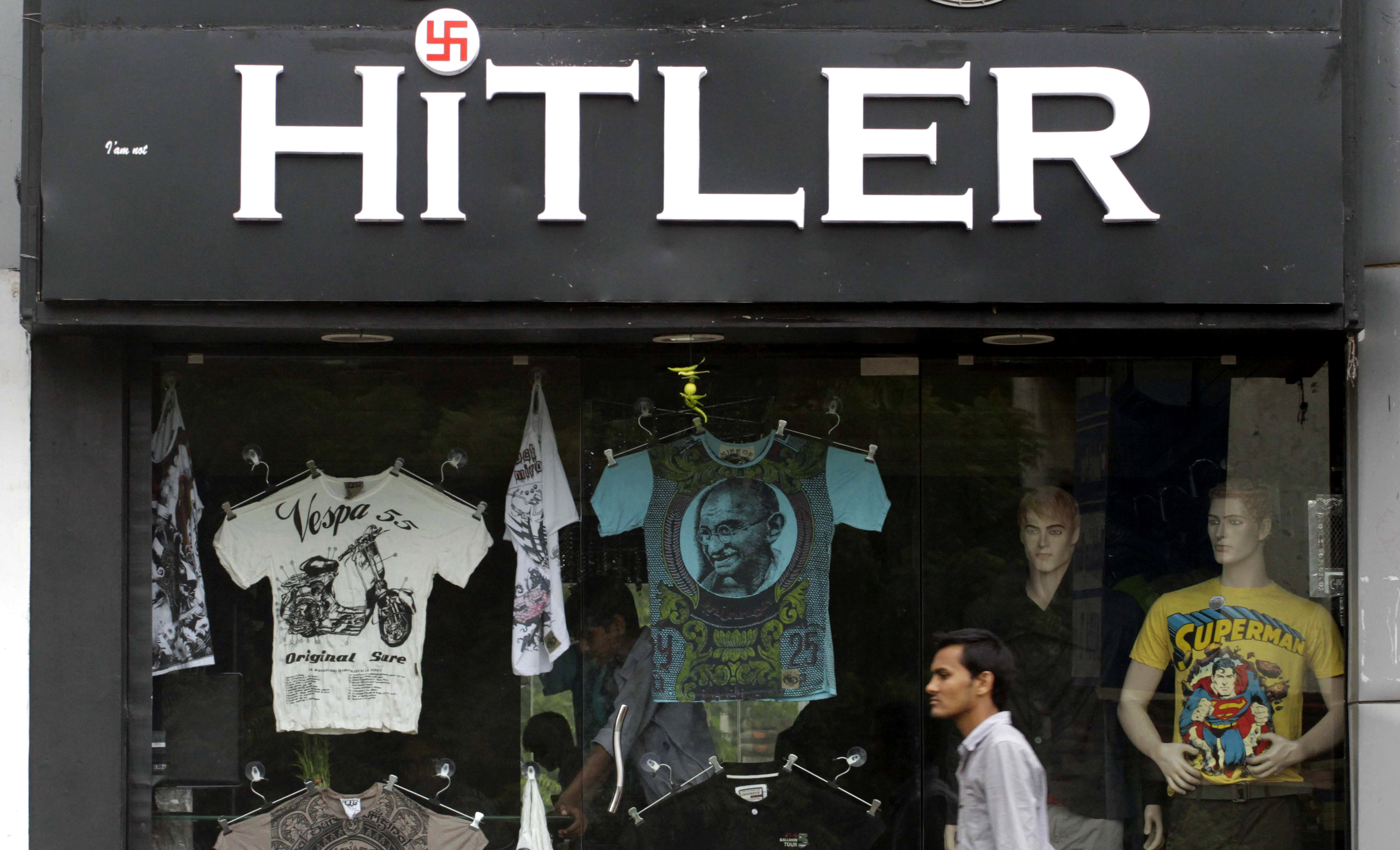
The winner for most racially and historically offensive:
![]()
It even dates back to when the US was actively slaughtering Native Americans!
The winner for most creepy:
I understand that it is supposed to be a sweet image of a young child running with a pinwheel…or is it some shadowy monster from your nightmares chasing you with a weapon! And, why are they in shadow, anyway?
Ever read “There Will Come Soft Rains”?
The logo for The University of Santa Catarina’s Institute for Oriental Studies (original address http://www.cfh.ufsc.br/~oriente/) appears to be real but hasn’t been used since 2005.
And here I was thinking, “aww, cute pinwheel-as-flowmeter and pigtails!” :eek:
That’s not even a logo, it’s just letters in a dumb font. :smack:
My company recently updated our logo. Designed to show we are not the same company we were 20 years ago when the original logo was designed.
Thoughts?
What am I missing? They look similar enough to me,
so, in 20 years you went froma streamlined, young company to an older, wider one, but haven’t really learned anything…
.
much like real life.
Not a company, but I used to like the Big Ten Conference’s logo when they had 11 teams.
But now that there are 12, it just looks bland.
Sometimes you can have a logo that starts with a bad idea andjust makes it worse.
After a few more replies I’ll tell you what our marketing dept said it represented.