Damn. That was useful, iirc it was labelled “Quote entire post” or words to that effect.
WHY CAN’T THEY JUST LEAVE IT ALONE FFS ?
Damn. That was useful, iirc it was labelled “Quote entire post” or words to that effect.
WHY CAN’T THEY JUST LEAVE IT ALONE FFS ?
“We’re always improving the customer experience–whether customers like it or not!”
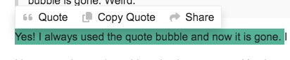
Yes! I always used the quote bubble and now it is gone. I have to highlight with Quote instead.
I have not changed anything else in my set up. It’s always worked before until today.
At least Quote still works.
Yeesh, would someone please do a screen shot of this thingie you keep referring to as a “quote bubble”?
I have no idea what you’re talking about.
When I’m quoting a post, this is what I see and what I’ve always seen since vB gave way to Discourse:
To the left of the “B” along the top:

Well, i asked on the discourse forum and that was pretty much their response.
Several other discourse users have also complained about it.
One user has created a theme component to put it back
Here’s their response from that topic, if anyone is curious about their (stated) reasoning:
“We’ll be continuing this work in future iterations…” sounds a bit threatening to me.
At my store we have a cloud-based POS that regularly gets ‘upgrades’ and I’ve regularly complained to them that they’ve got to give us a heads up about these things. Having a line of customers and then realizing a button has been moved or a procedure has been changed isn’t the fun surprise the company seems to think it is.
Thanks! Can anyone add this to their Discourse “experience”? How? (I know it’s probably “follow the instructions,” but I’m on Firefox and don’t want to mess anything up…)
I don’t buy their reasoning:
The space on the composer toolbar is quite limited, so we needed to find a way to reduce the number of actions. We’ll be continuing this work in future iterations, so you may notice more movement or changes as we make progress there.
On my interface, the bar doesn’t even go much more than halfway across the box in which text is typed–so what are they saving space for?!
Also, the old system on the Dope (pre-Discourse) had a “kitchen sink” icon that brought up a bunch of other formatting options. Why doesn’t Discourse make use of something like that? It seems like a no-brainer, and that is a space-saver.
Their stated reasoning also seems specious to me. But they’re making it clear that it’s intentional, like it or lump it.
I remember @codinghorror also being prone to staking out an unpopular decision on design characteristics and then letting post-hoc justifications fly. But they’re quite clear that it’s their way or the highway, unless someone else creates a tool (extension, theme tweak, css magic, etc.) to tailor it.
Poking around the code in github, it looks like a theme component, so our theme guru would have to incorporate it into one of our available themes.
I suspect this is for exactly the same reason that a full quote of an immediately preceding post is automatically deleted – it’s not “elegant” to fully quote a preceding post because it should be obvious who you’re replying to. Except it isn’t, because there’s no way to distinguish between a reply to the preceding post and a reply to the OP – an unintended consequence of over-design.
This just makes a bad thing worse. The idea here is apparently to prevent users from making lengthy quotes – “quote exactly the part you’re responding to” seems to be the design goal. The unintended consequence here is that it can be awkward to quote anything at all on touchscreen devices because of quirks in the way that highlighting works.
The overarching design philosophy here seems to be “users are stupid, but we’re going to make the site elegant in spite of them”.
I can see the final iteration in which Discourse is the shining epitome of perfect elegance when users are prohibited from making any posts at all. All we will be allowed to do is read and grunt while Discobot makes all the posts. ![]()
Discourse is, overall, a very well designed platform. I much prefer it to our old vBullletin. But at the same time, I can see it at some point in the future being used in some CS class as an example of analyst-driven over-design: “we know what you need better than you do”.
Oh yeah… there’s a toolbar. I forgot there was a toolbar. I don’t think I ever noticed the quote bubble thingie.
Yes, it should be made clearer. Instantly clear, that is.
Lol, yes, it’s like Apple taking all the ports off the MacBooks, cuz having a blank piece of aluminum as your computer is, like, so modern, doood!
Neither did I. I post on my phone the vast majority of the time and I just select what I want to quote (which might be the whole post). Even though getting the quote popup to appear can be awkward, it still seems like the most intuitive way to do it.
The “highlight and quote” method is buggy. It doesn’t capture coding, so that you lose italics, bold, strikethrough, and underline.
There is a solution to that in this post …
but no one seems interested in implementing it.
On the discourse site, the “Quote” option can do the same
thing that the “quote whole post” button did, ie, it will include all the text,
including embedded codes, which doesn’t happen here.
![]()
Oh, it seems they’ve fixed three of the four bugs.
I realize that you’re talking about a Point Of Sale system but that three letter acronym could easily mean something else in this context. ![]()
In this case, they’re interchangeable. This POS is quite the POS.